Adapt Mortgage was built to serve a specific need within a larger organization: providing loan officers with a more cohesive and design-forward brand experience while still leveraging the infrastructure of CrossCountry Mortgage. The work spans branding, web design, UI systems, and campaign execution.

Logo Concept
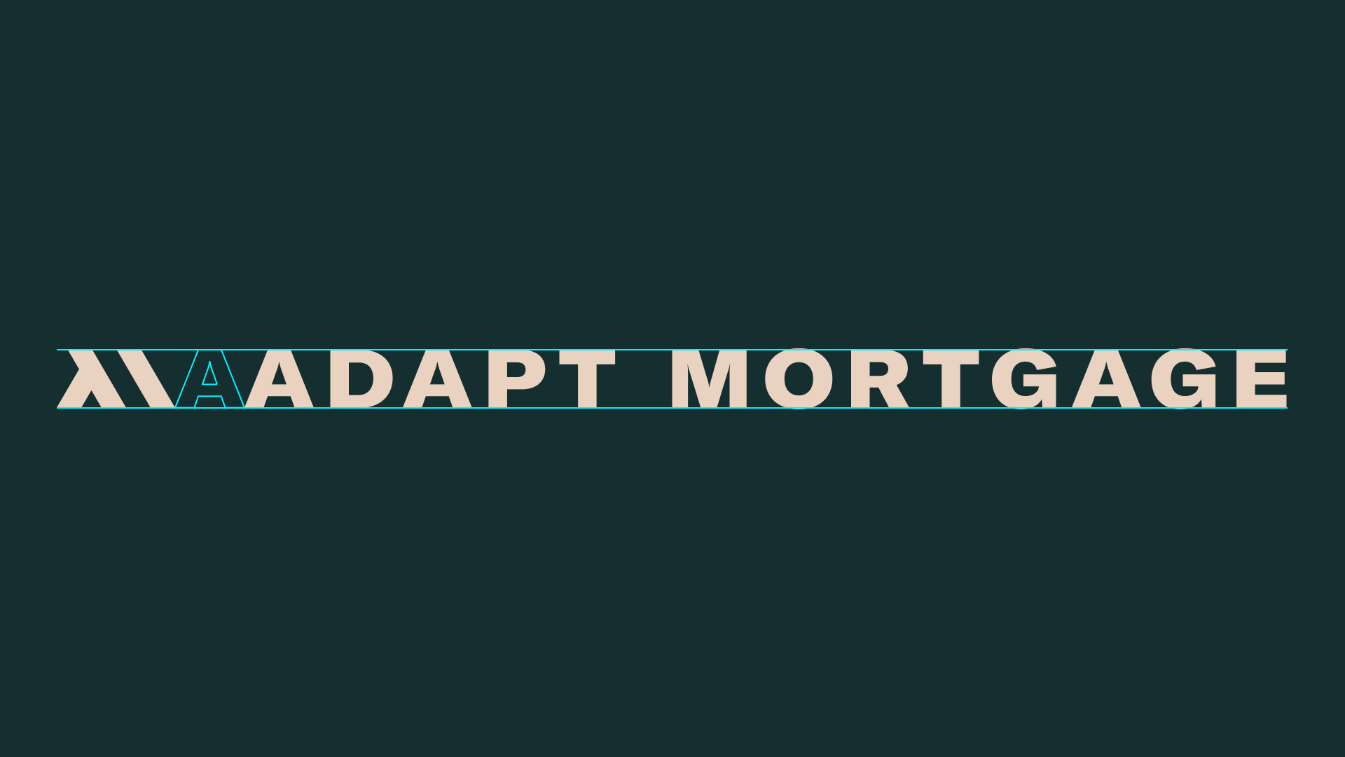
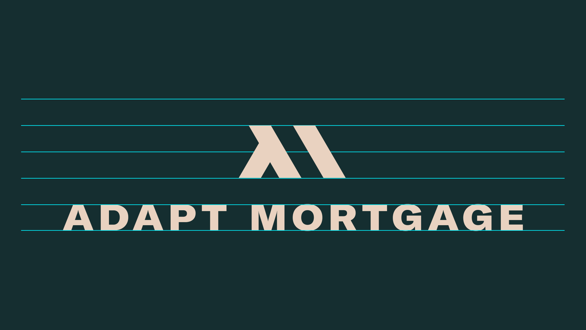
The Adapt Mortgage logo is built from a simple but intentional idea: an abstract “A” and “M” forming an isometric roof. This creates an immediate connection to homeownership while maintaining a modern, geometric feel.
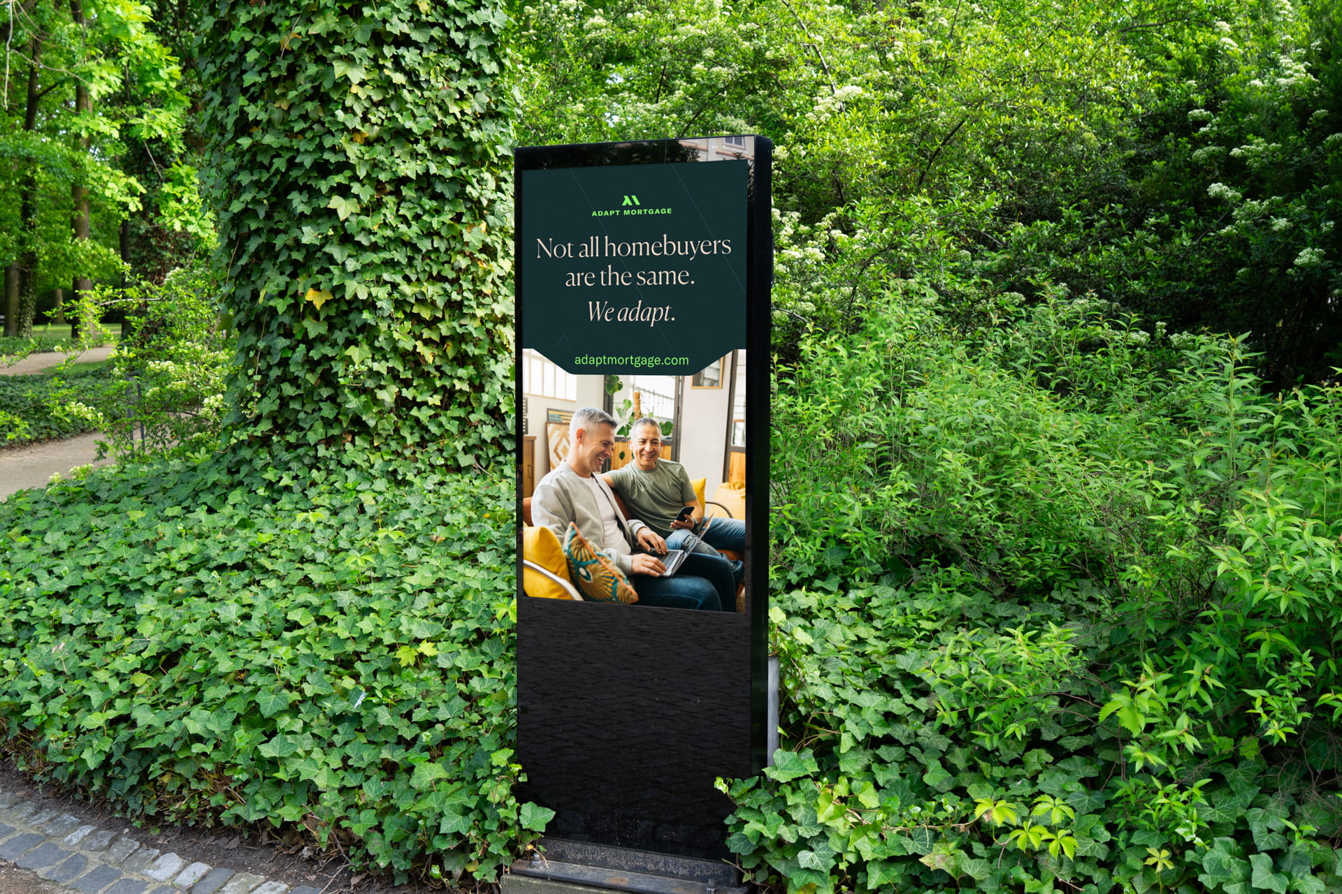
The mark is designed to be flexible across applications—from digital interfaces to environmental signage—while remaining instantly recognizable.
Color and Tone
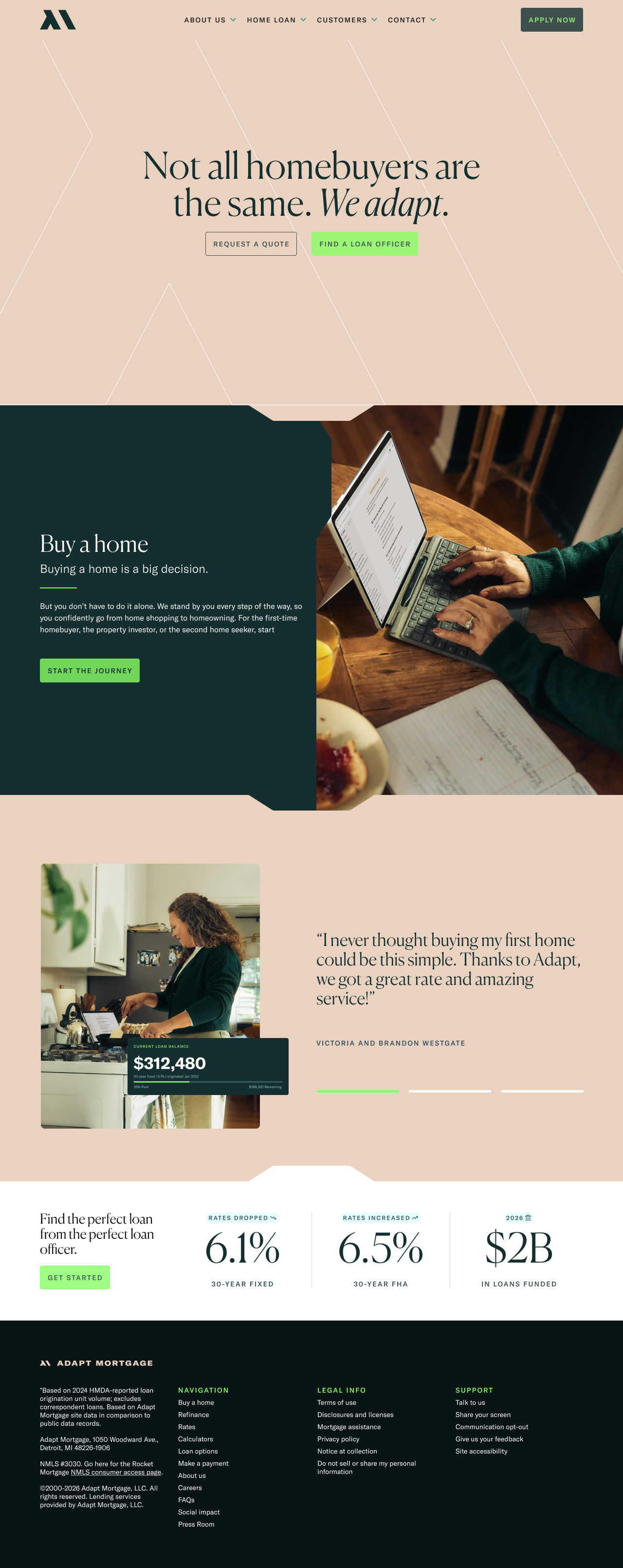
The palette balances deep, desaturated greens with bright, high-visibility accents. This creates a dual tone: grounded and trustworthy at its core, with moments of energy that guide user interaction.
The system avoids overly traditional financial palettes, instead leaning into a more contemporary aesthetic that feels both professional and approachable.
A system designed for consistency at scale
One of the core challenges was creating a brand that loan officers could adopt easily without fragmenting the experience.
The system addresses this by:
- Establishing clear layout patterns across web and campaign assets
- Defining a consistent typographic hierarchy
- Creating reusable UI components for marketing and conversion flows
At the same time, it allows for controlled flexibility:
- Loan officers can personalize content within a structured framework
- Campaign assets can adapt without breaking visual consistency
- The brand maintains cohesion across varying levels of marketing effort
This balance ensures scalability without sacrificing identity.
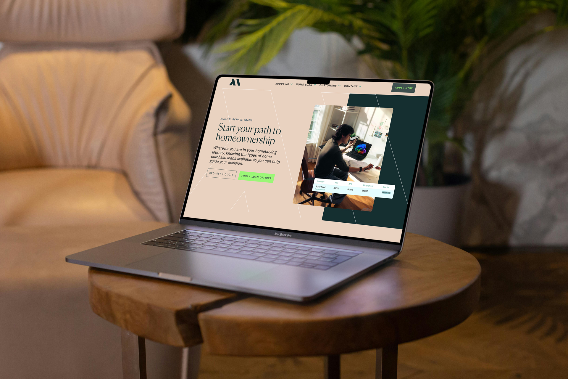
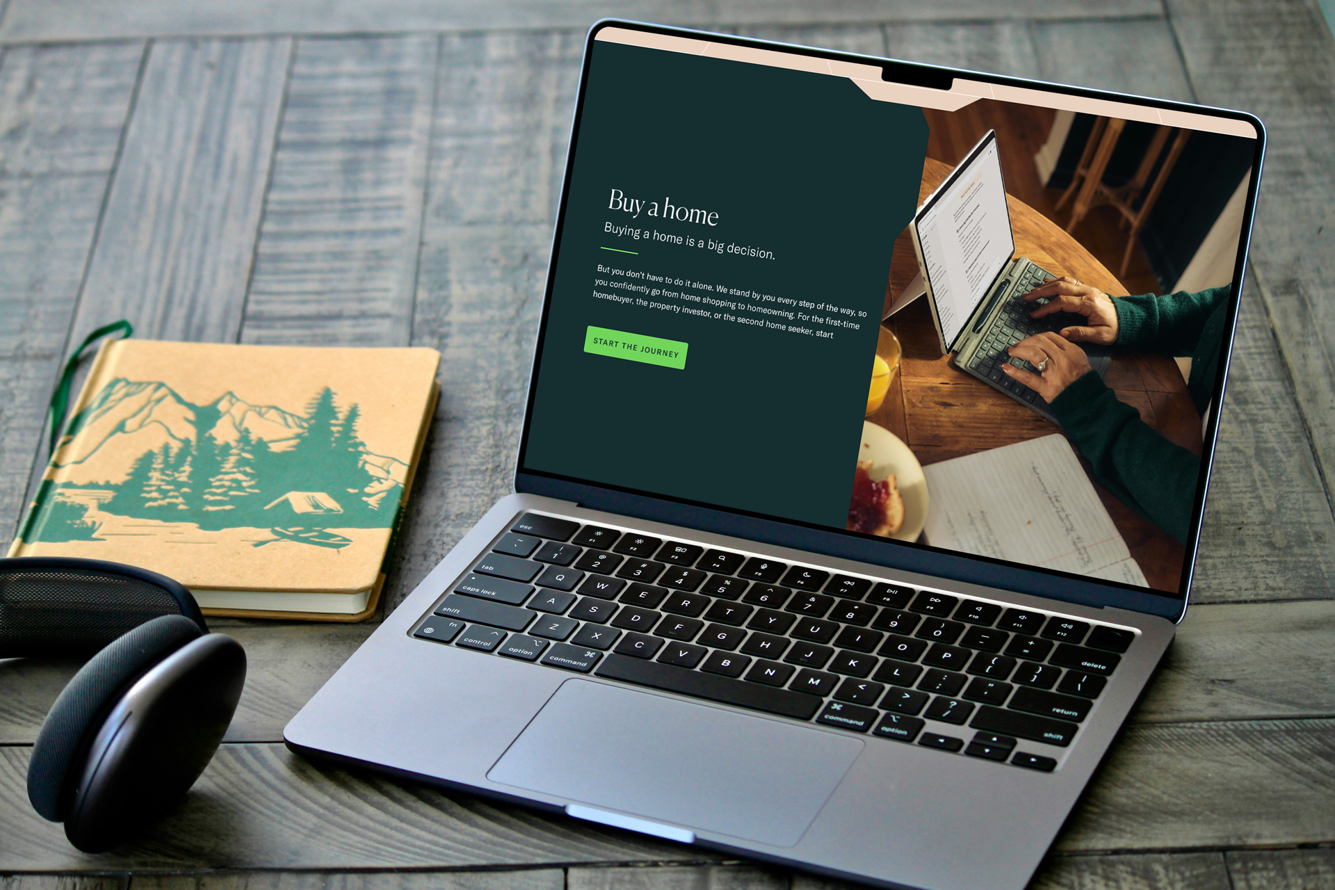
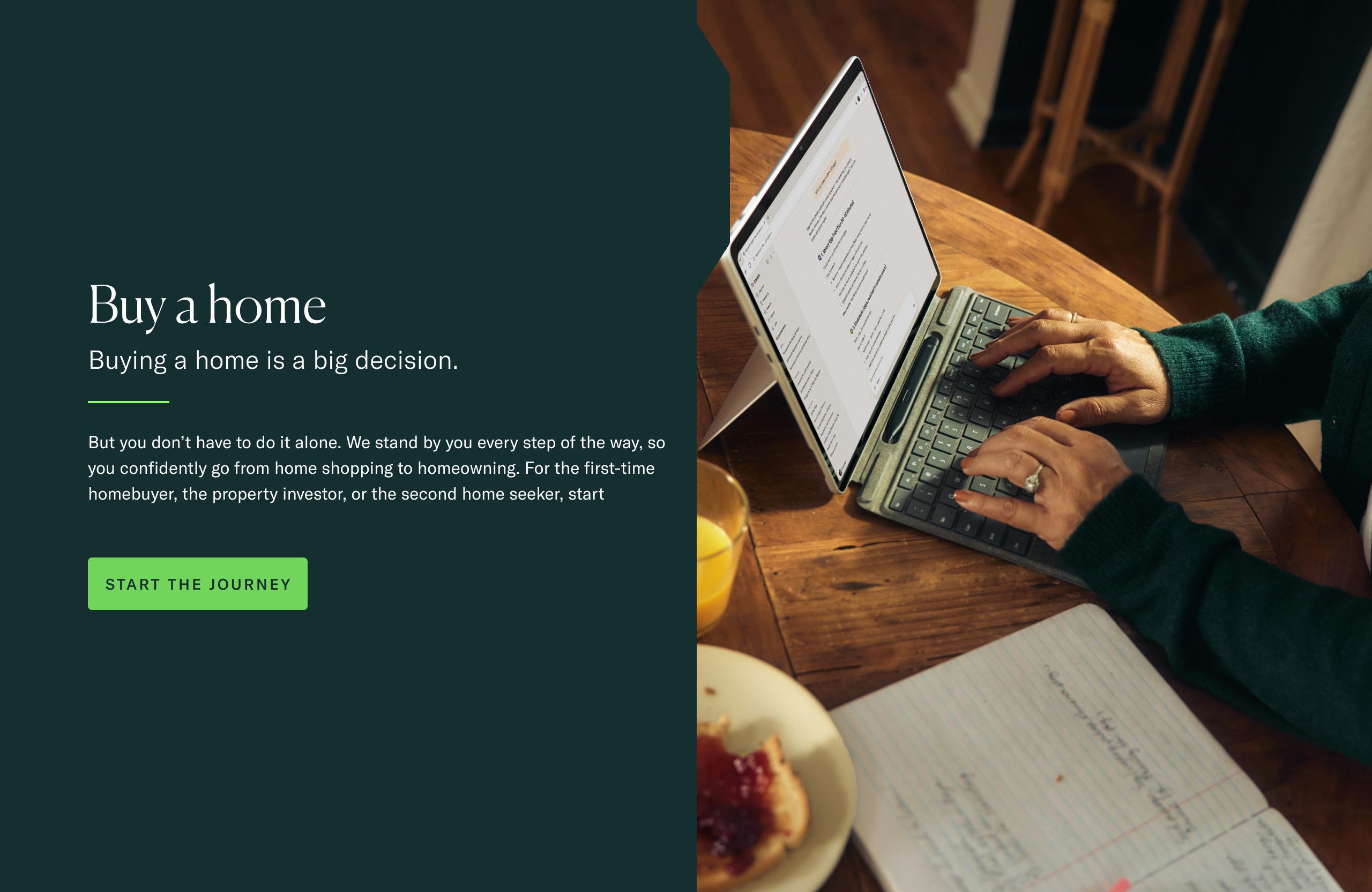
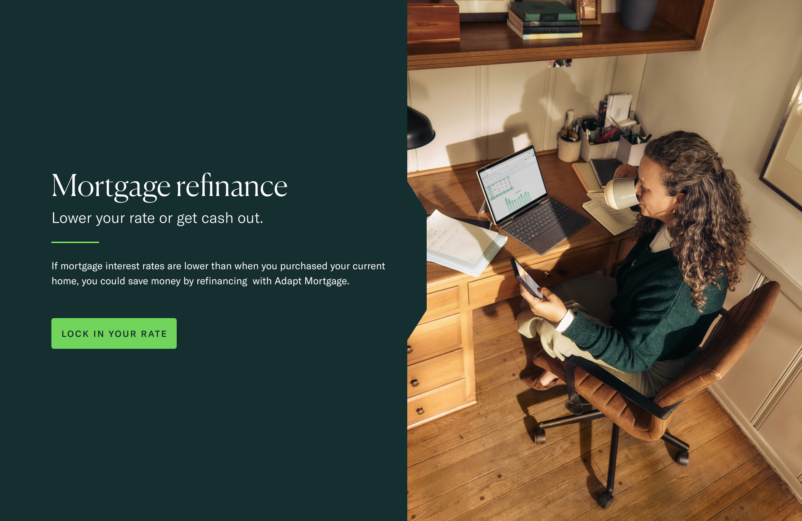
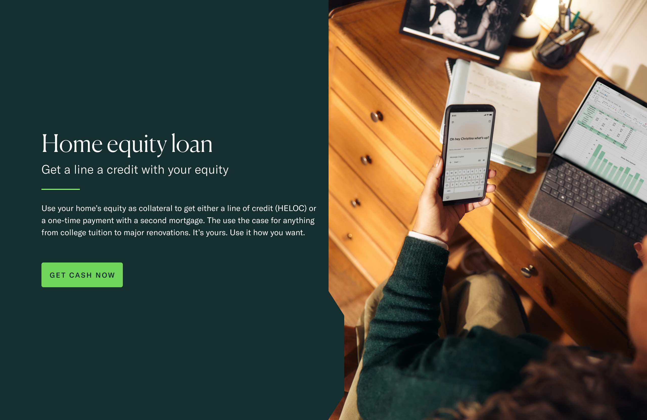
Designing for clarity and conversion
The mortgage process is inherently complex, requiring users to navigate financial decisions, rates, and long-term commitments.
The design simplifies this by:
- Prioritizing clear content hierarchy
- Using modular sections for easy scanning
- Highlighting key actions through color and spacing
The experience avoids common industry pitfalls:
- No overwhelming data-heavy layouts
- No aggressive or overly sales-driven messaging
- No reliance on inconsistent, one-off marketing pages
The result is a more approachable and understandable user journey.
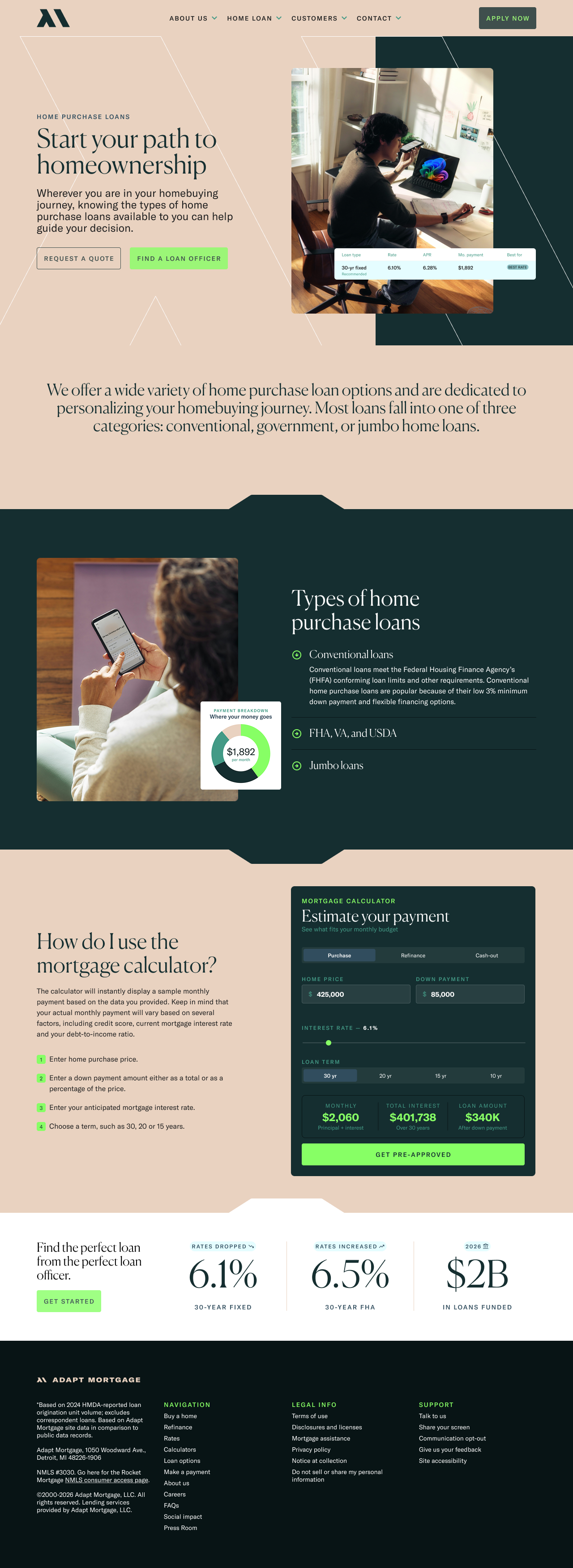
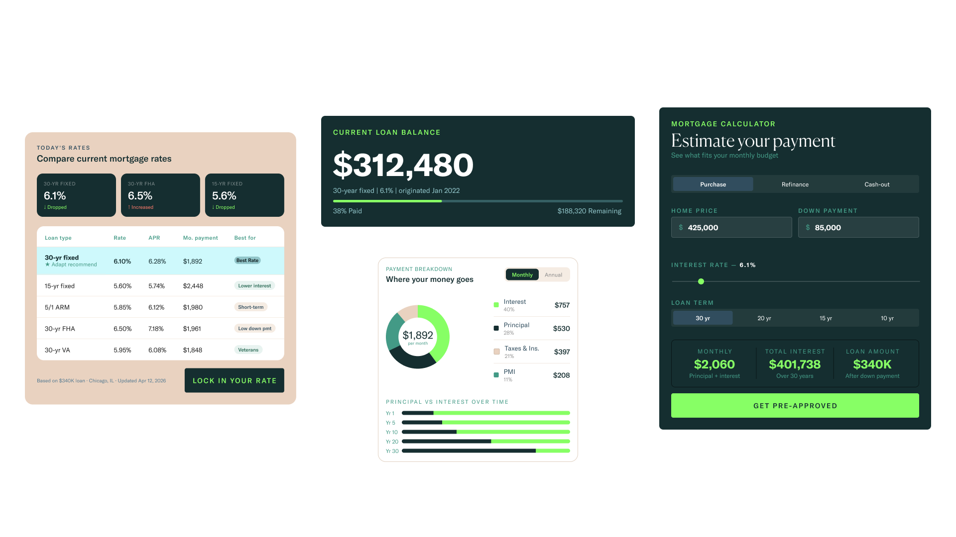
UI and tools as part of the brand
Interactive tools such as mortgage calculators and rate displays are treated as core brand experiences rather than add-ons.
They are designed to feel integrated, not separate—sharing the same visual language and interaction patterns as the rest of the site.
This creates continuity across the experience:
- Users move seamlessly between content and tools
- Data feels accessible and easy to interpret
- The interface reinforces trust through consistency

Before Adapt, marketing efforts often varied widely depending on the individual loan officer. This led to inconsistent experiences across touchpoints, making it difficult to build a recognizable identity. The Adapt system introduces a unified approach—ensuring that every interaction, from digital to physical, feels connected.
Impact
The Adapt Mortgage brand creates a clear alternative within the CrossCountry ecosystem.
It allows loan officers to operate within a more refined, cohesive framework while still maintaining flexibility in how they engage their audience.
- A more consistent and recognizable brand presence
- Improved clarity across digital experiences and tools
- A stronger sense of trust through cohesive design and messaging
- A scalable system that supports both individual and team-level marketing