The Process
At the start of the project, I conducted a comprehensive audit of all the channels where Alight was active, including display advertising, paid and organic social, web pages, landing pages, and other digital touchpoints. By collecting representative assets from each channel into a centralized Figma file, I identified recurring patterns and inconsistencies across the brand.
Using performance data from display and social campaigns alongside the visual audit, I determined which creative approaches were performing well and which were not. These insights informed the foundations of the design system and ensured the patterns and components we standardized were rooted in both brand consistency and real performance data.

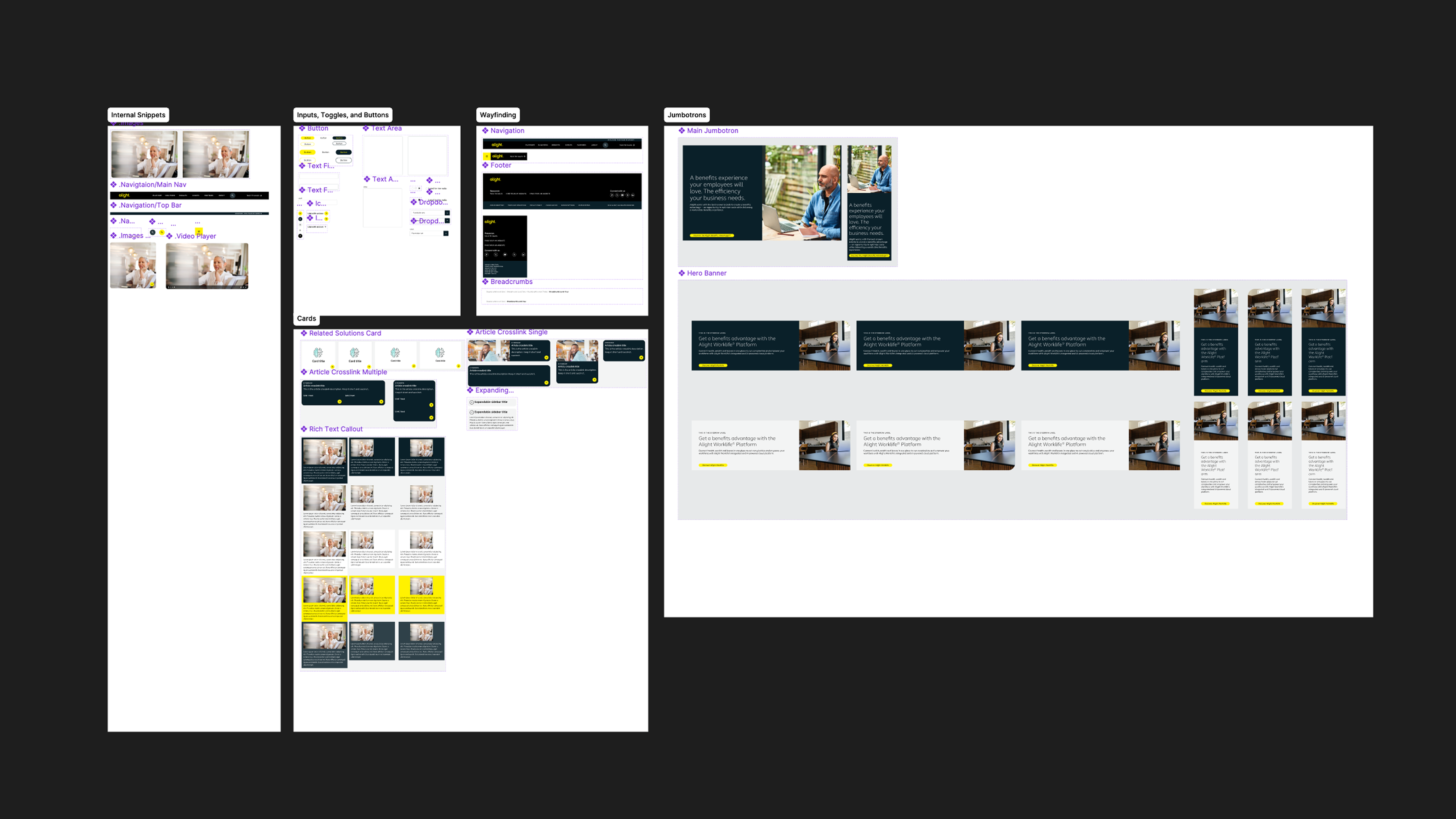
Inventory, Audit, Structure
After identifying the elements that were performing well, I audited the remaining assets and organized them into clear categories. This work informed the initial structure of the design system.
During the ideation phase I interviewed designers and key stakeholders to understand how the system needed to function across teams. I evaluated models used by organizations such as Atlassian, Salesforce, and Brainly, which typically separate foundations and tokens from channel-specific systems. While effective in theory, this structure created friction for campaign work, a major part of our production model. Campaign files would often require components from multiple systems depending on which channels were activated.
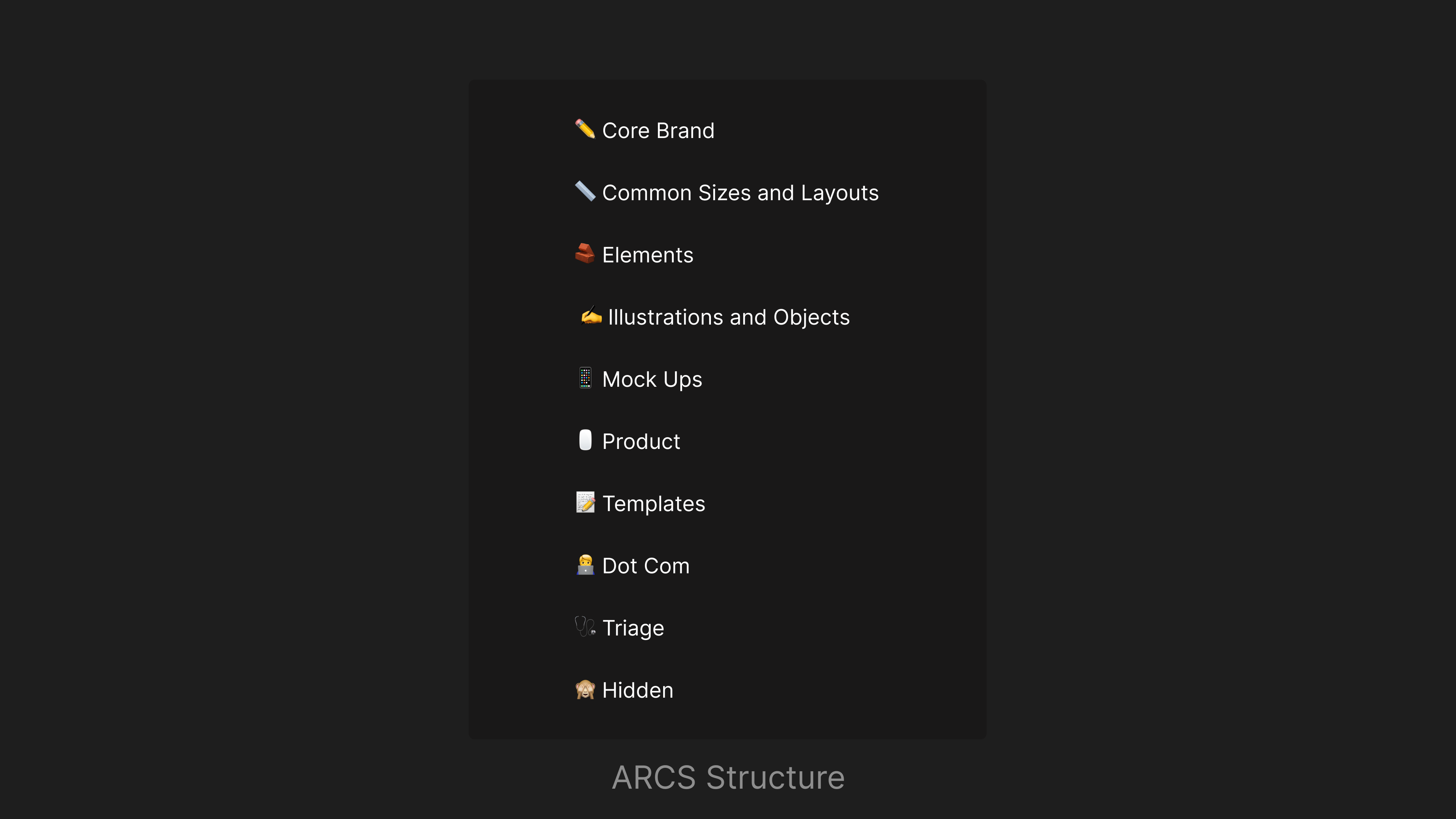
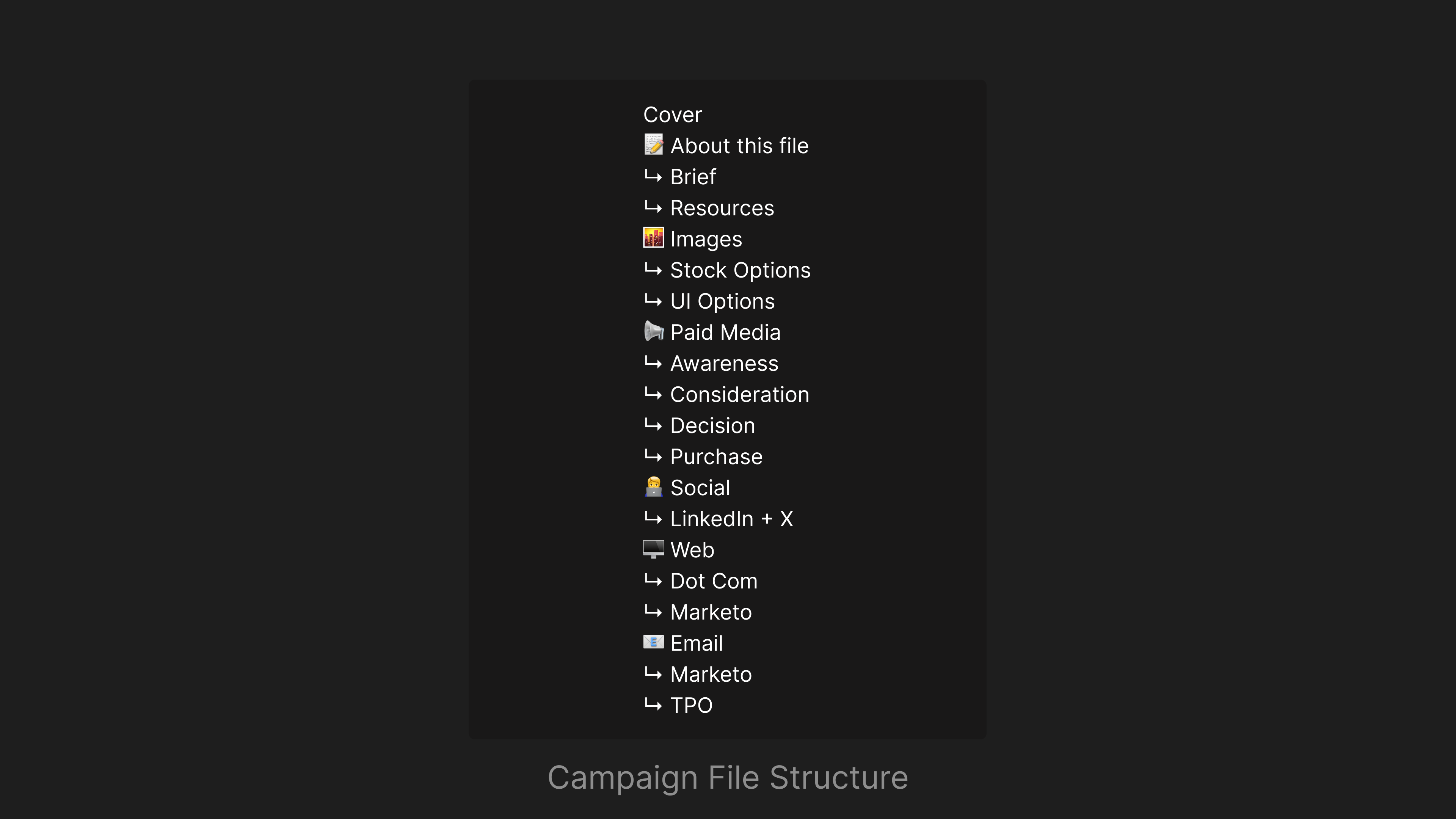
Instead, I implemented a unified system that used pages as channel-level categories and sections for subcategorization. This approach kept all brand elements within a single system while still providing clear organization. Because many designers worked across multiple channels and frequently collaborated in shared campaign files, the unified structure reduced library switching and streamlined the overall design workflow. It also simplified campaign files that housed most, if not all, creative assets across channels, making them easier for teams to manage and scale.
Coworking and Collaboration
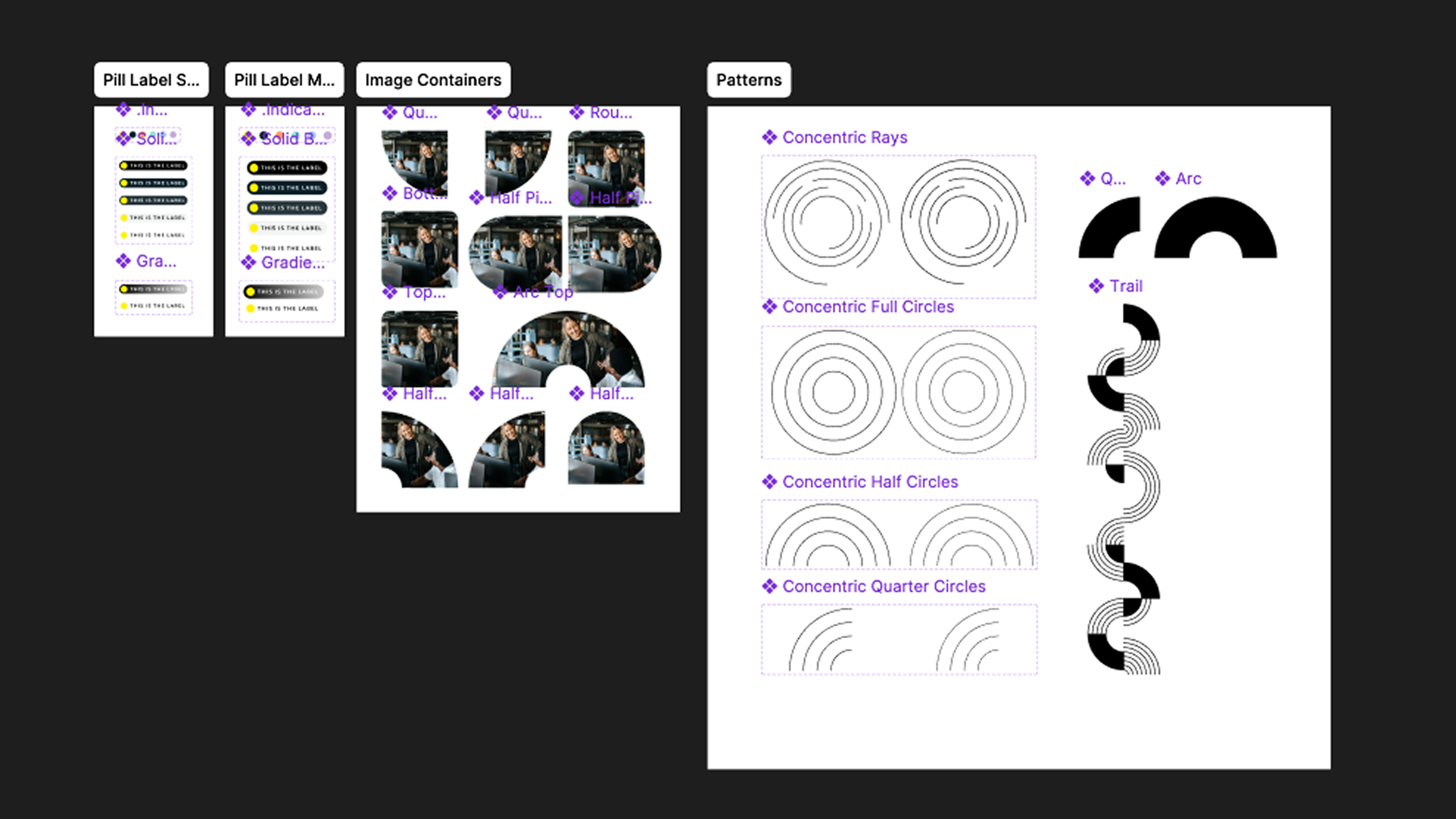
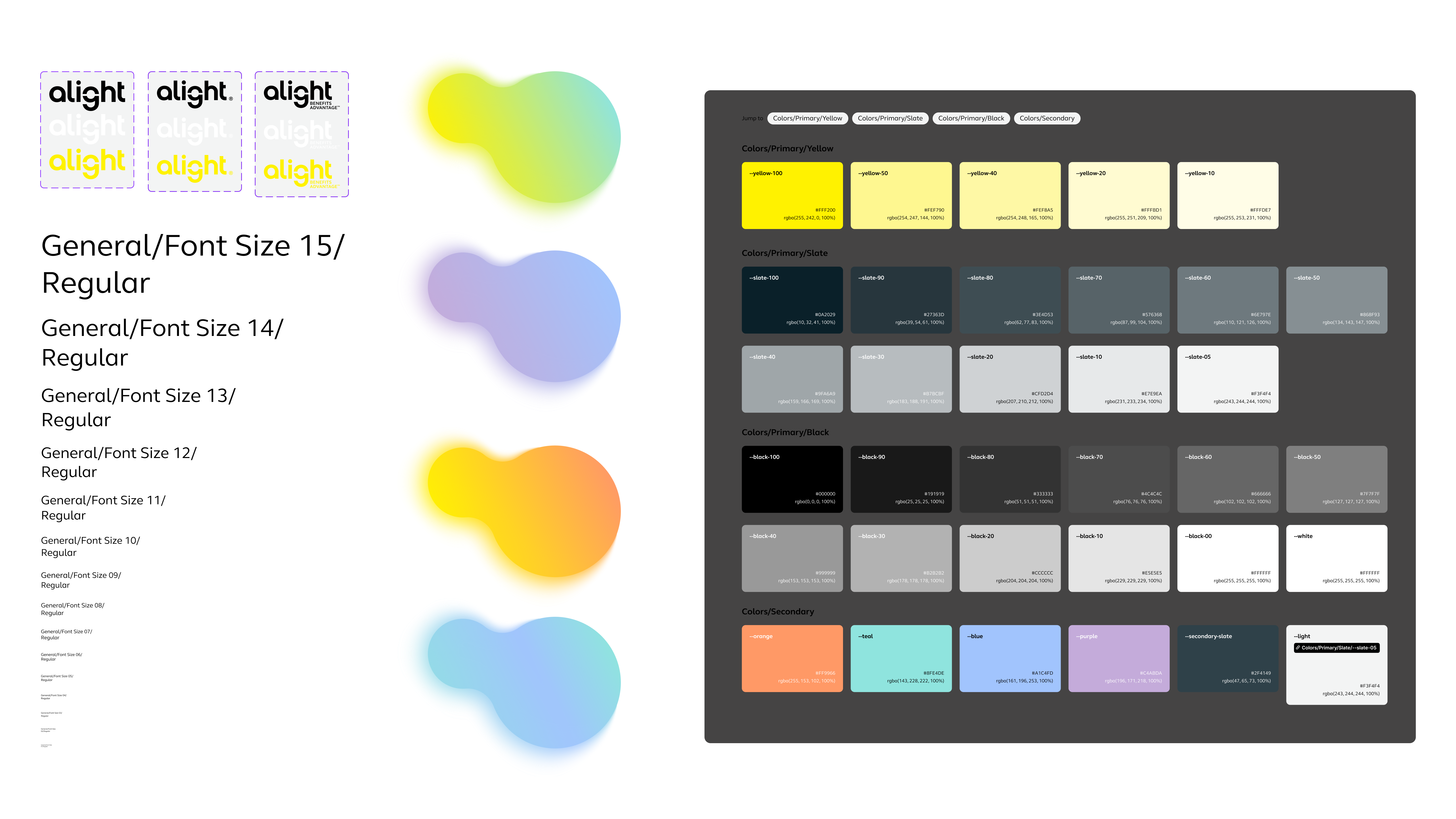
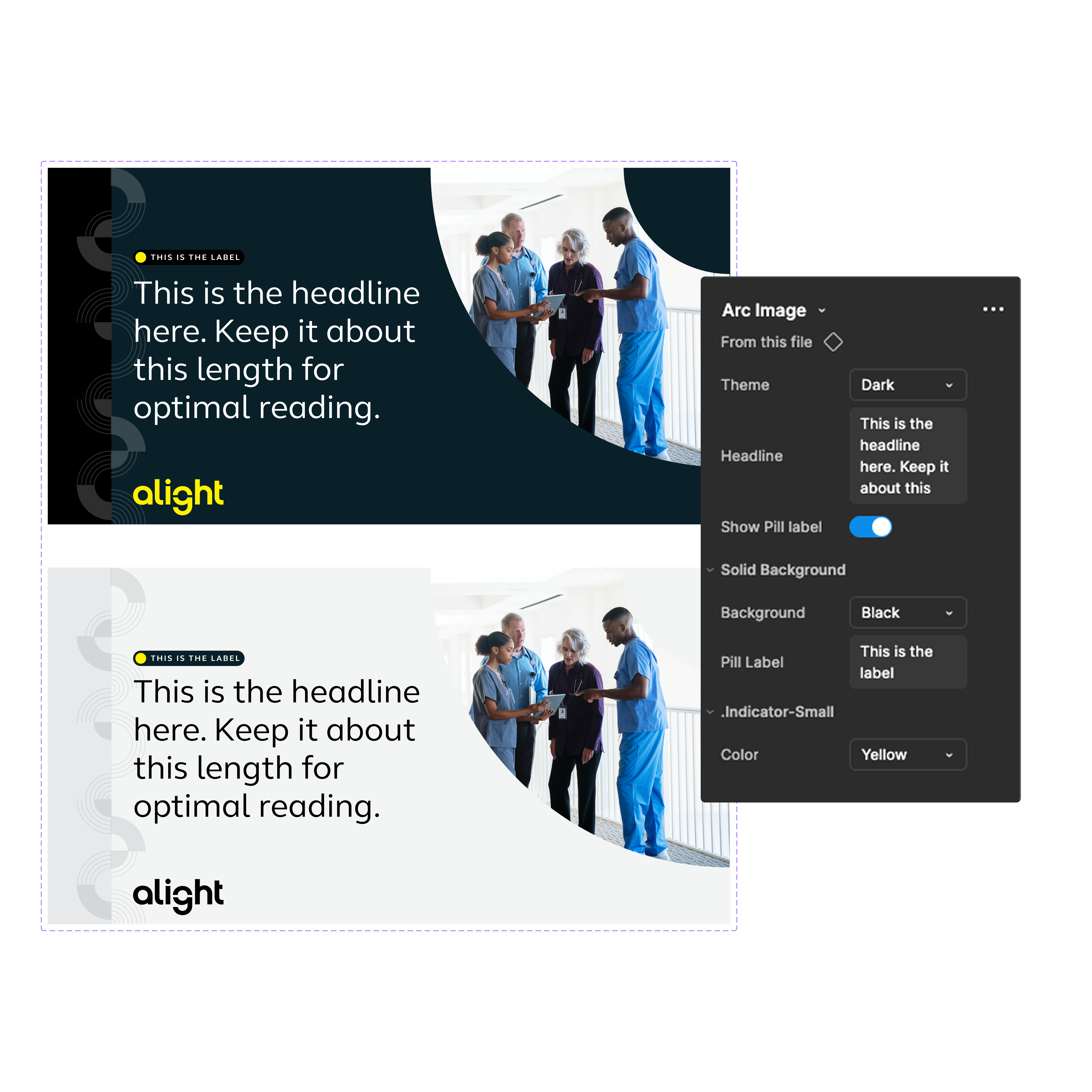
Some of the more complex decisions involved naming conventions, variant and mode strategies, and token organization. Because the system supported brand and campaign work rather than product UI, many designers were less familiar with concepts like tokens, variants, and Figma library structures. To reduce this learning curve, I prioritized clear, descriptive naming conventions such as '--font-family-headline', helping designers quickly understand and adopt the system.
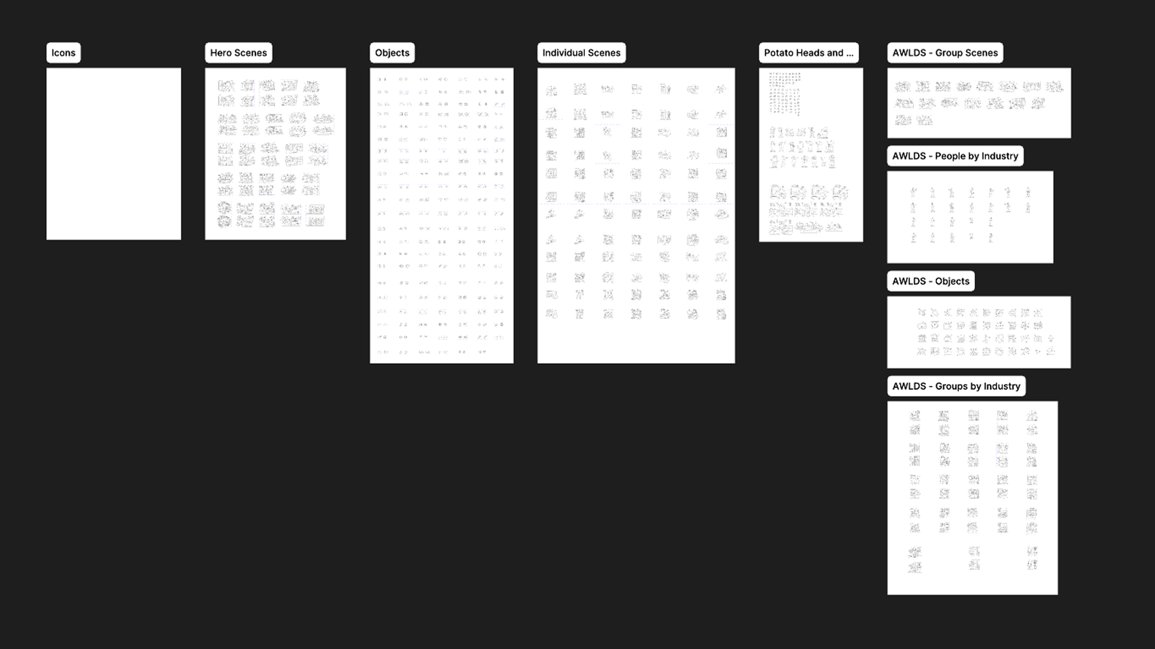
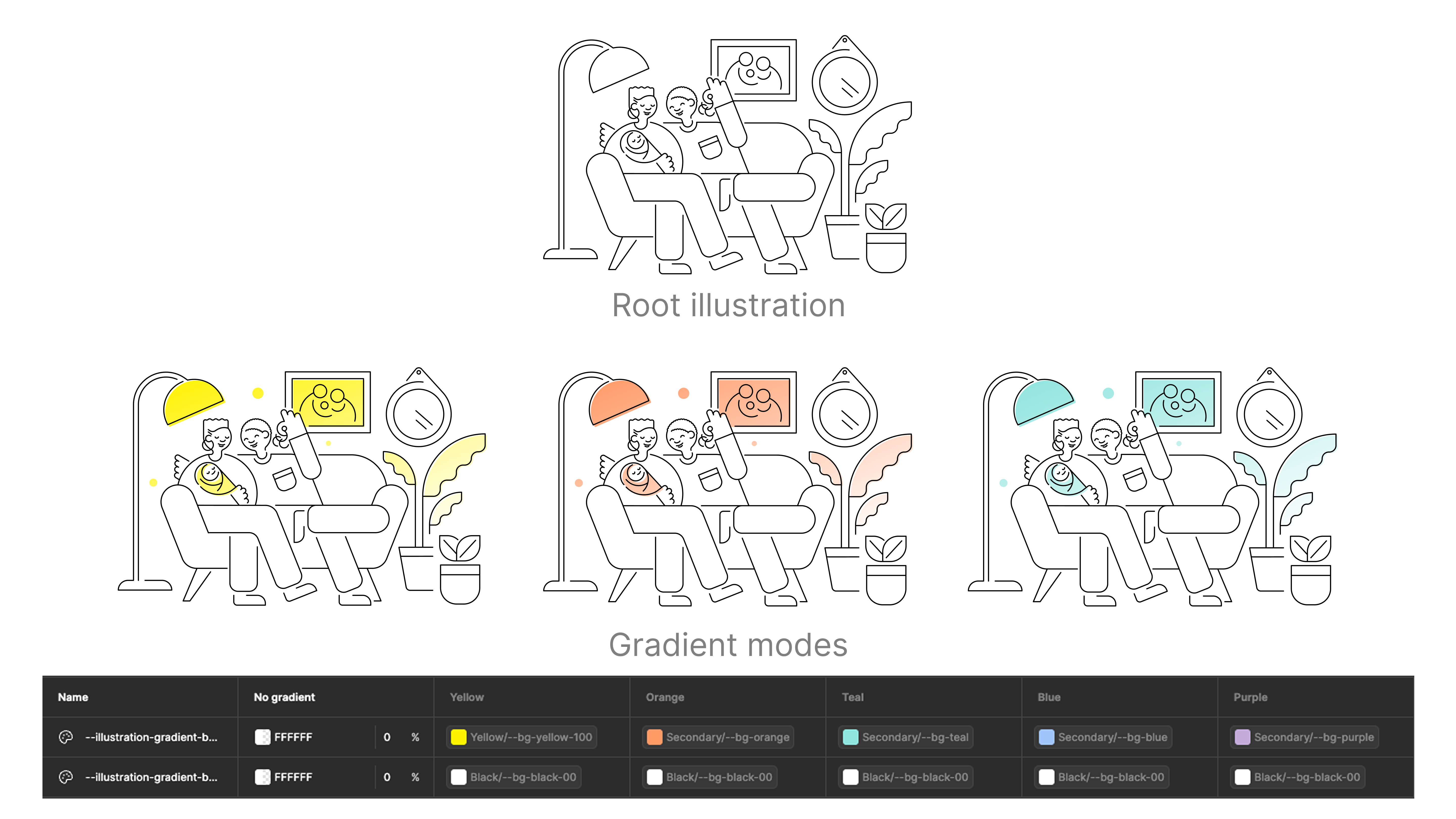
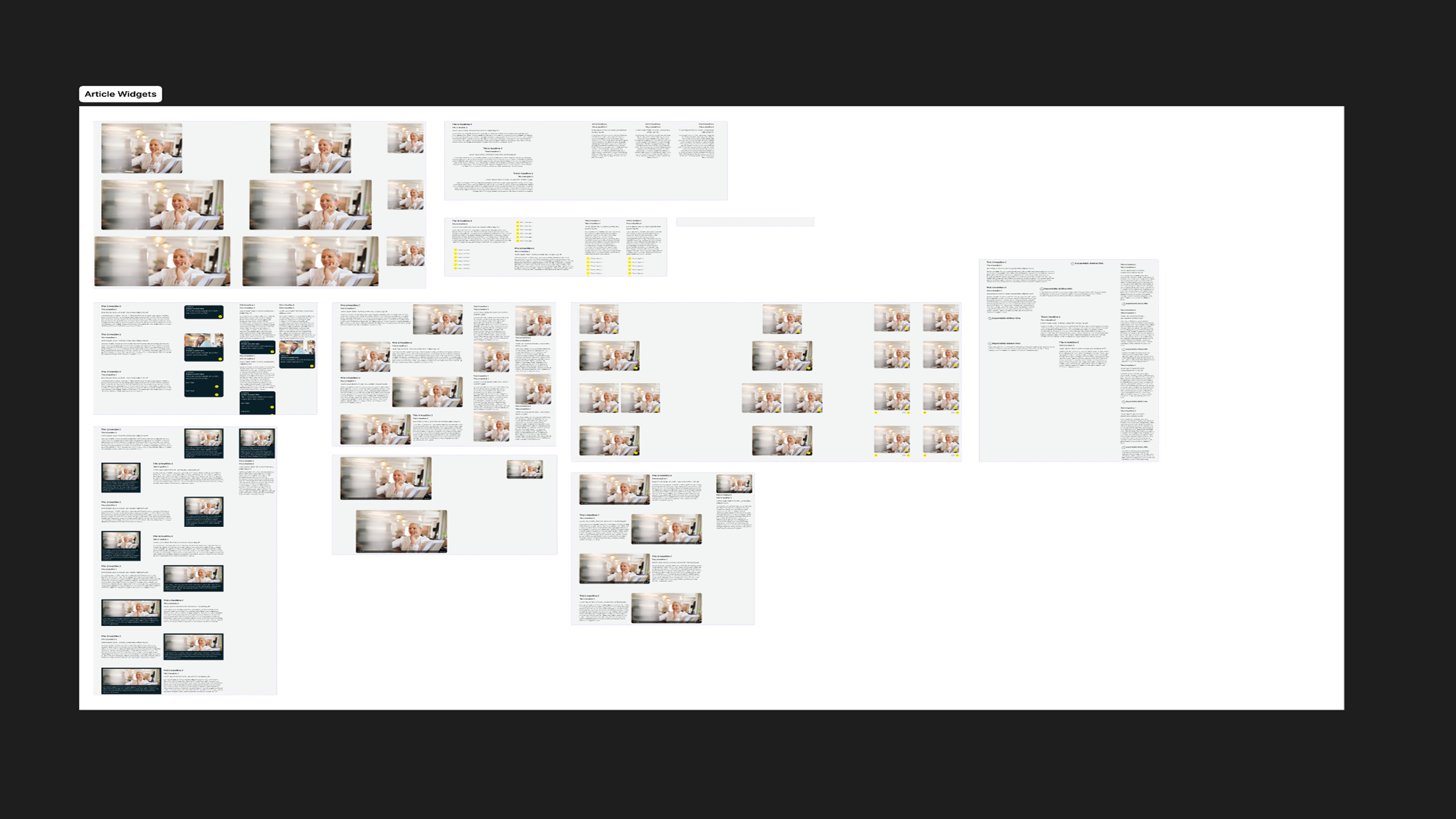
Structuring assets like illustrations, objects, and hero scenes proved particularly challenging due to their variability. To address this, I incorporated feedback through team discussions and stakeholder interviews, while also documenting patterns and usage guidance directly within Figma to improve discoverability and searchability.
Prioritization
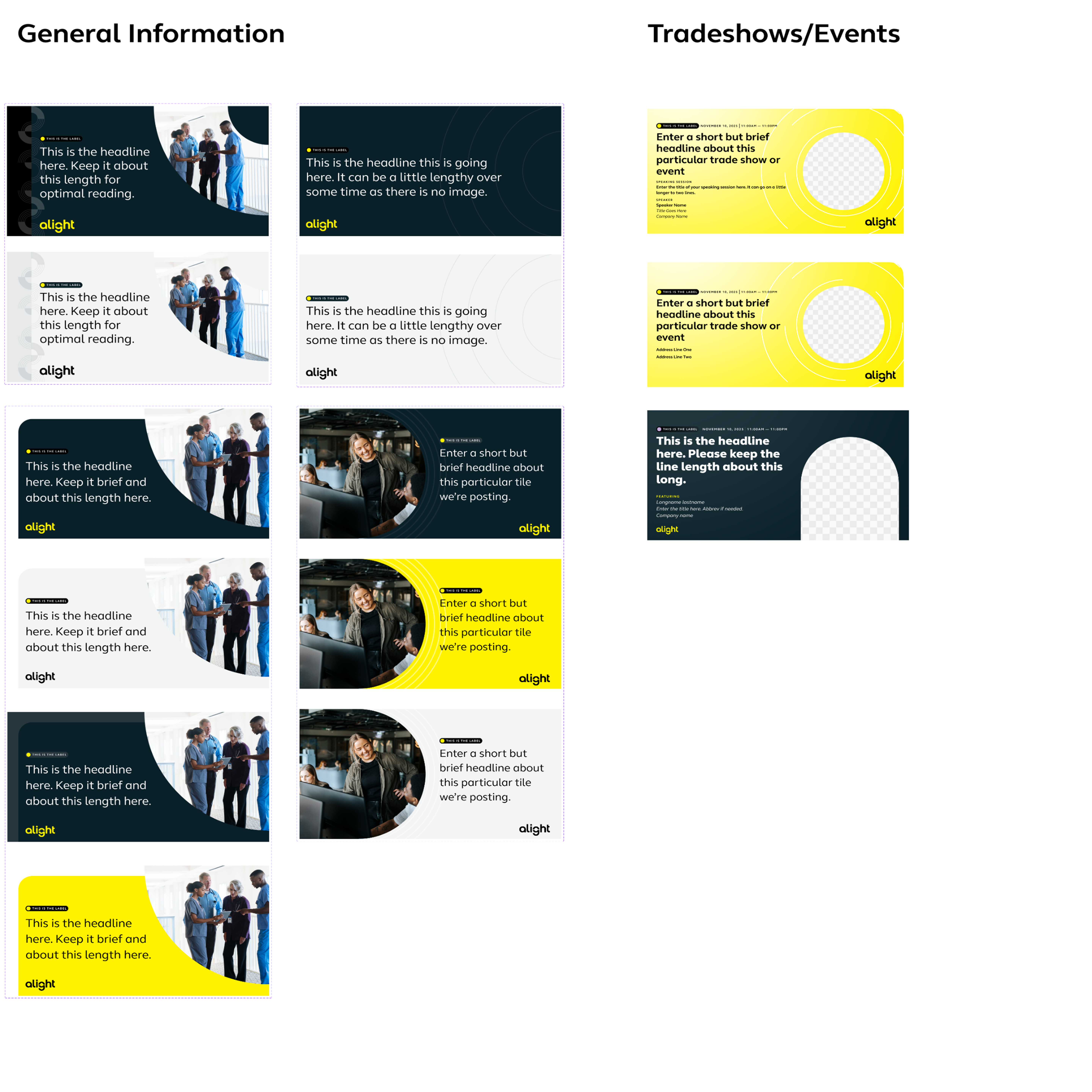
After establishing the foundational brand elements in Figma, I evaluated where to focus next, choosing between web and social channels. Given ongoing consistency challenges on social, I prioritized that area first. Drawing on insights from the audit, I identified recurring patterns and built reusable social templates.
These templates proved especially effective for an offshore production team working in a different timezone. Providing ready-to-use templates cut my review time by half and allowed me to focus on strategic guidance, including copy refinement, image selection, and ensuring alignment with broader brand and campaign objectives.
Focusing on Scale and Flexibility
After integrating all foundational elements, social templates, Dot Com, and Marketo landing page sections into the system, the focus shifted to scaling—not just in the number of components, but in team capability and internal conventions. As the team grew, opinions on naming, structure, and organization evolved. To address this, we reinforced the principle that the system serves the whole organization, not individual preferences.
This approach included establishing triage protocols, holding bi-weekly review meetings, monitoring analytics for broken components, and conducting periodic audits to ensure the system remained consistent and effective.
Impact & Results
The centralized design system streamlined workflows, reduced review time by 50% for offshore and internal teams, and ensured brand consistency across all channels. Designers could quickly access patterns, components, and templates, allowing more focus on strategic work, campaign quality, and alignment with the overall brand. The system also scaled with the team, maintaining organization, discoverability, and efficiency as production and design needs grew.
Benefits
- Gain more time to focus on strategy
- Ensure consistency across all channels
- Reduce complexity and ambiguity of patterns and elements
- Stronger brand governance
Key Takeaways and Things I'd Do Differently
- Invest more time in oboarding and adoption, and earlier.
- Focus more on how each item and piece of documenation enforces governance
- Have a stronger variant organziation in the beginning.
- Invite external and internal stakeholders sooner. They're the ones using this system and their opinions matter.
- Approaching building in an Atomic way is still a viable way to go.