Legacy brand audit
The Alight brand had been in market for over five years. While the foundation remained sound, the broader marketing system showed clear signs of drift. The issue was not any single element, but the system as a whole — lacking cohesion, consistency, and the flexibility to support evolving messaging.
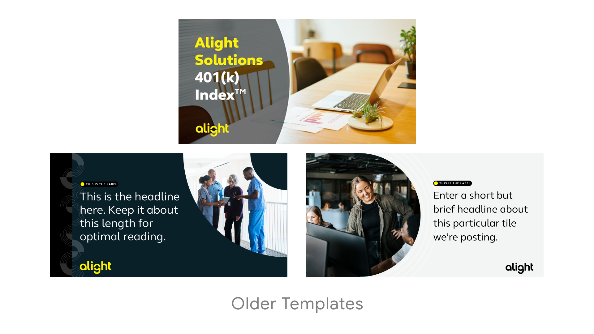
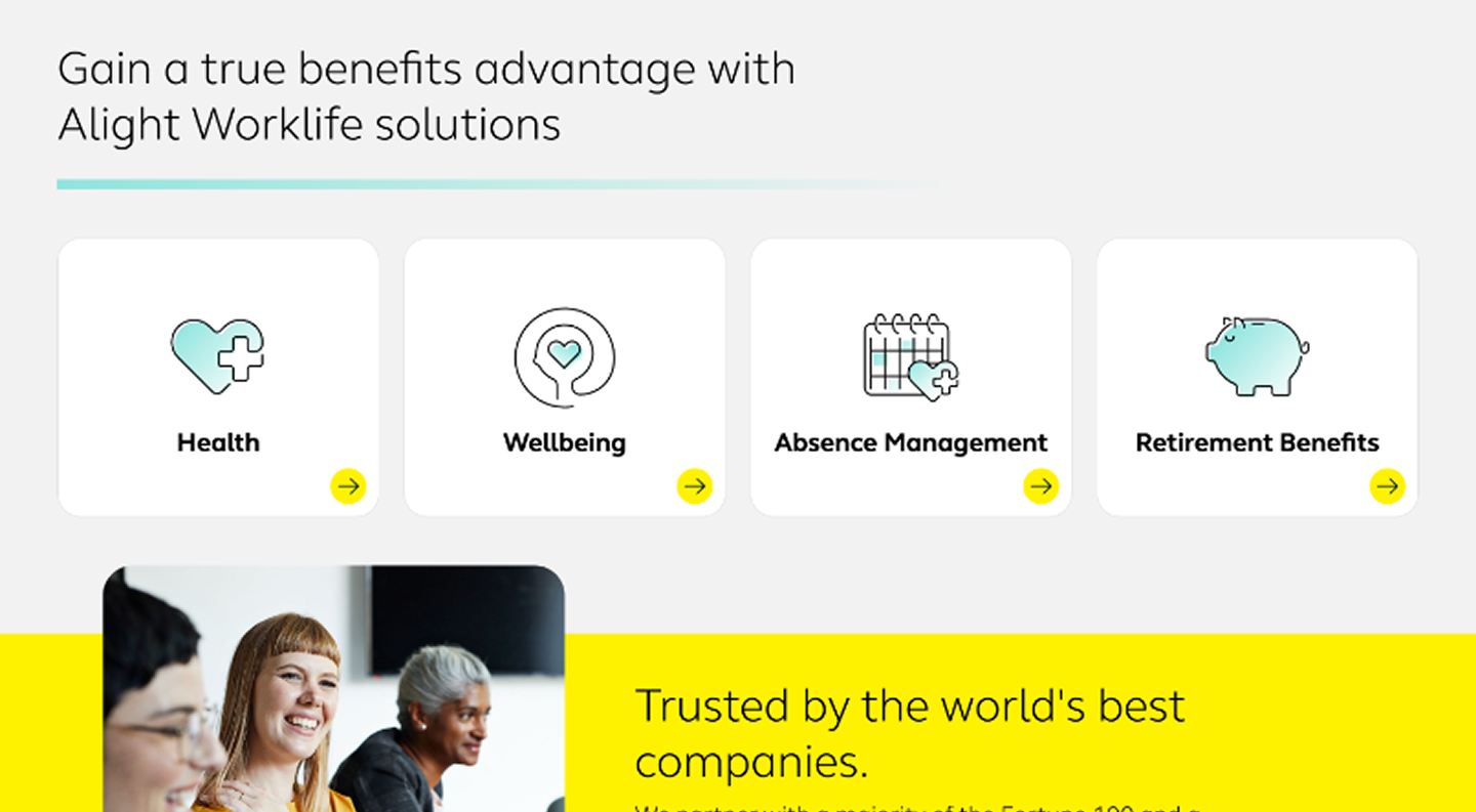
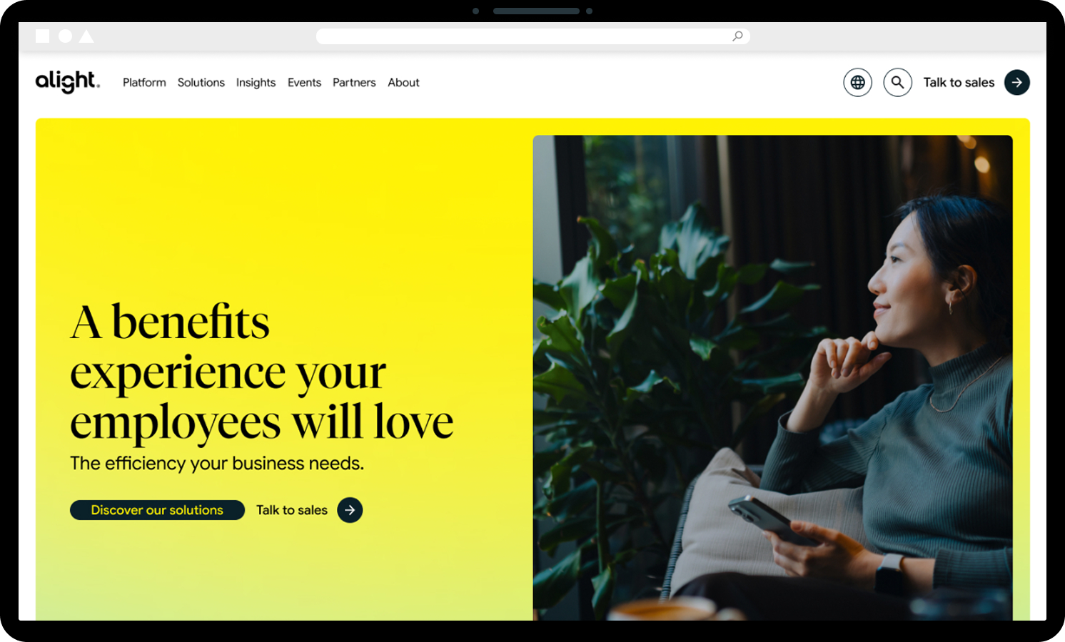
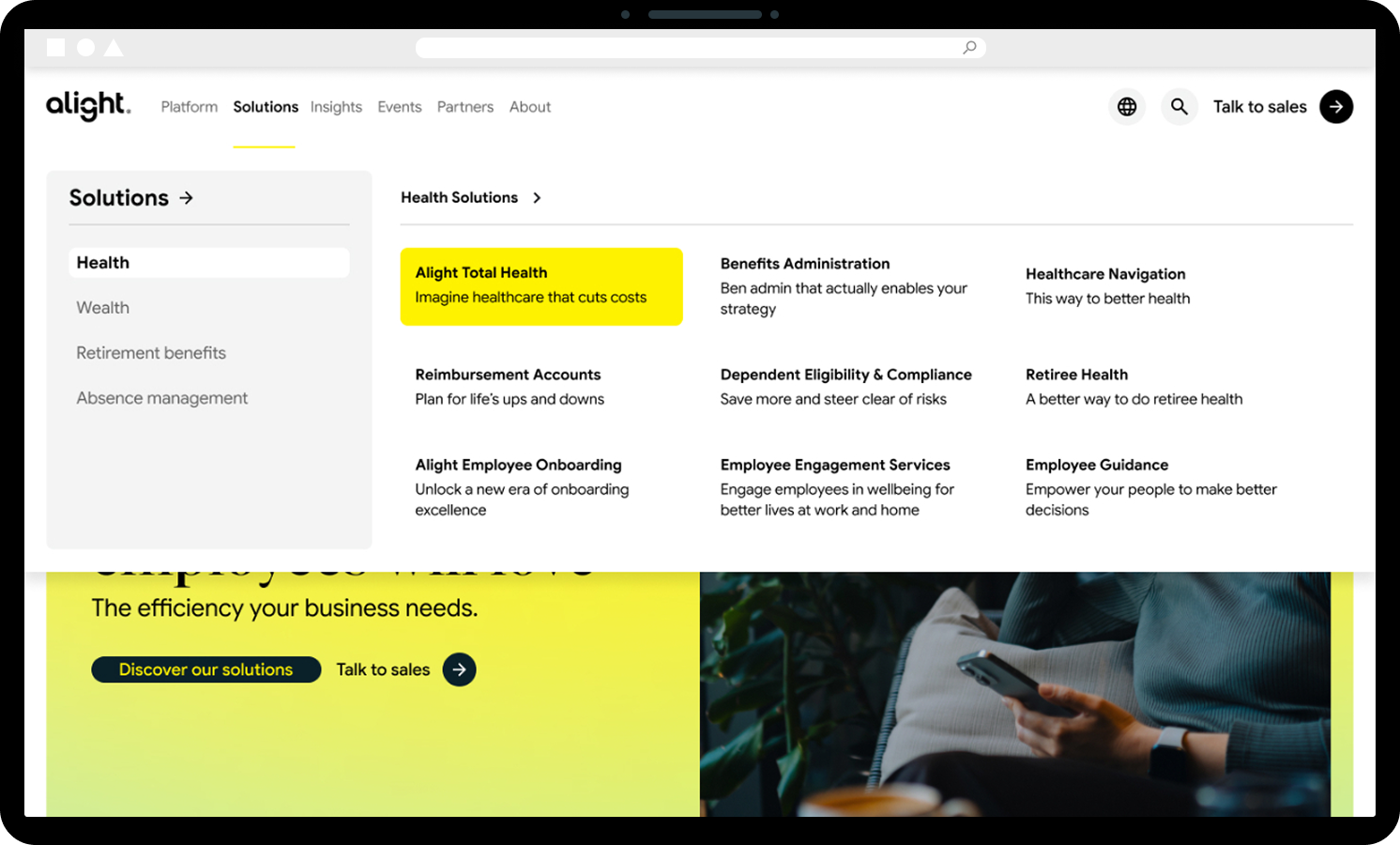
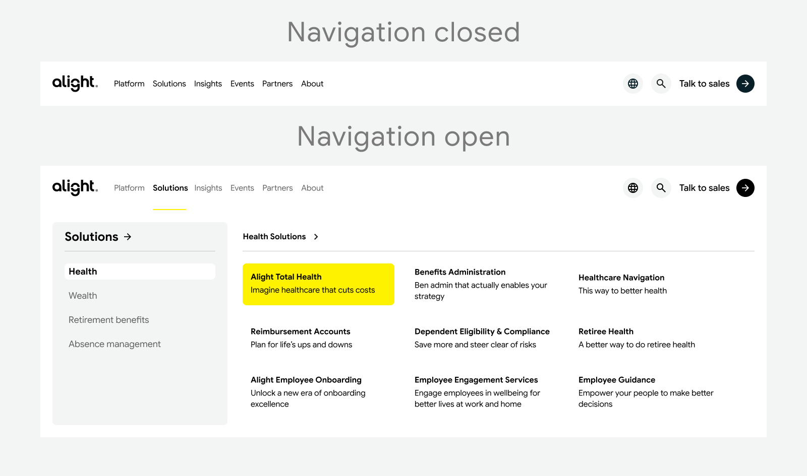
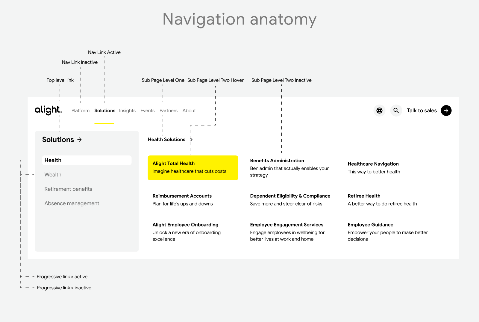
Key components had not kept pace. Social templates, widely used across campaigns, had remained largely unchanged for multiple years. On the website, inconsistencies in navigation and layout introduced friction. Pages relied on heavily segmented, banded sections and dense color usage, creating a visual weight that made the experience feel disjointed.
A central finding from the audit was the overreliance on gradient bars. Initially introduced to create emphasis, they had become a substitute for a clearly defined typographic hierarchy. Rather than reinforcing structure, they were compensating for its absence.
Scroll-depth data reinforced this. Users consistently engaged with solution and insight-driven content, with drop-off occurring around less structured sections. This pointed to a need for clearer prioritization and a more intentional narrative flow.
Worklife, Alight's product brand, became a useful reference point. Its more refined use of gradients and stronger internal consistency highlighted an opportunity to evolve the broader system — and informed the explorations that followed.
One of the more significant decisions to come out of the audit was rethinking the type system. FS Thrive Elliot, while functional, introduced a humanist quality that sat at odds with the geometric construction of the Alight logo. Moving to a pairing of Arquette and Tiempos Fine created stronger alignment — clearer hierarchy, improved readability, and a more distinct editorial voice.
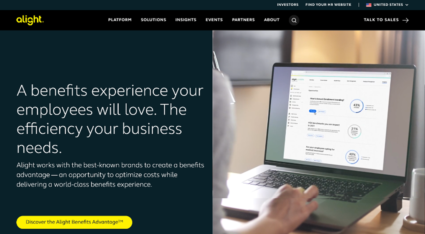

The layout and flow explorations were a direct response to what the audit surfaced — a site that was visually heavy, structurally fragmented, and asking users to work harder than necessary to find what they were looking for.
How the redesign addresses these issues
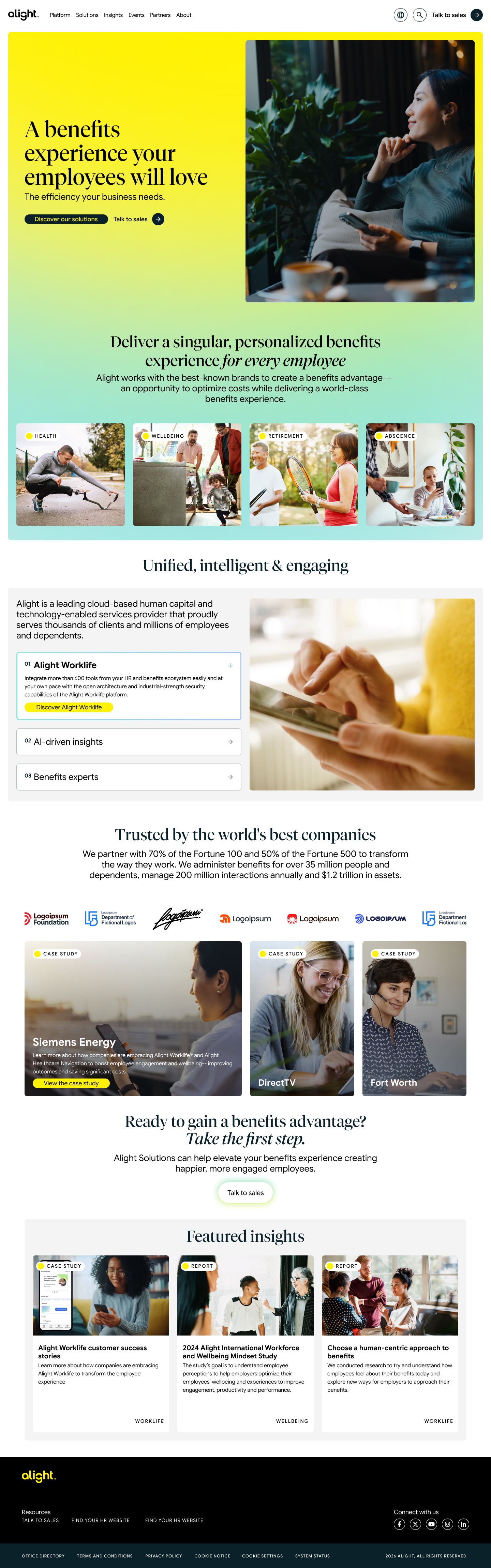
The redesign responds directly to audit findings of a visually heavy, fragmented experience that required unnecessary effort to navigate. The updated approach focuses on reducing friction while maintaining brand integrity.
The layout shifts from rigid, banded sections to a more continuous flow, improving scanability and creating a clearer narrative across the page. Visual weight is reduced through more intentional use of color and increased whitespace, allowing key moments—like calls to action—to stand out more effectively.
Gradients move from structural elements to subtle accents, with hierarchy now driven by a more deliberate typographic system. The introduction of Arquette and Tiempos Fine establishes a clearer, more cohesive hierarchy that aligns with the brand’s visual language.
Content has been reprioritized to better reflect user behavior, bringing high-value information higher in the layout and reducing overall scroll length for a more efficient experience. Calls to action are more clearly defined through spacing and contrast, guiding users more intentionally.
The result is a more cohesive, scalable system that aligns more closely across web, social, and product touchpoints.
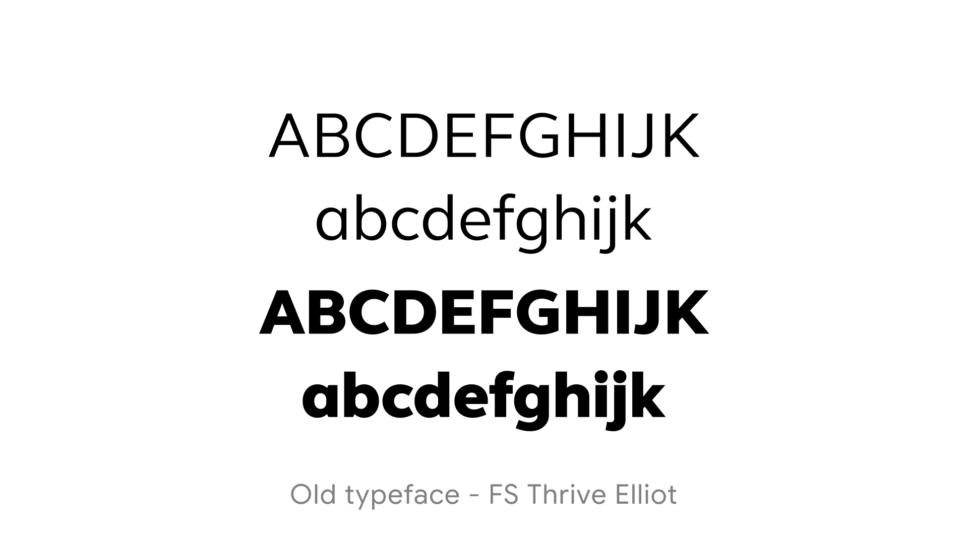
The type system was one of the clearest opportunities identified in the audit. FS Thrive Elliot — a rounded, humanist sans-serif — had been doing everything: headlines, body copy, UI text. That uniformity flattened hierarchy and created a subtle but persistent disconnect with the geometric construction of the Alight logo.
What the old system communicated
FS Thrive Elliot is friendly and functional, but it asked one typeface to do too much. The heavy bold cut is assertive, but with closed apertures and an even stroke width throughout, it had limited expressive range. In an HR and benefits context it signalled reliability — but not distinction.
What the new system introduces
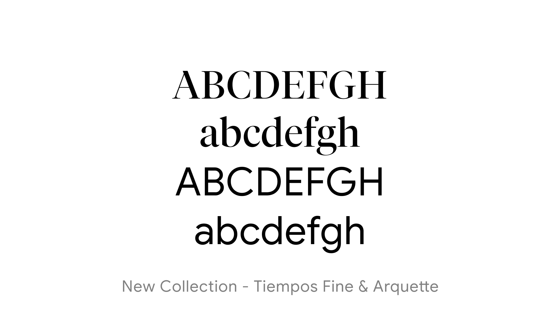
Tiempos Fine brings contrast and rhythm that the previous system couldn't achieve. Its high stroke contrast and tall x-height give headlines an editorial presence — they feel less like labels and more like statements. Arquette, as a geometric sans-serif, provides a clean and architectural counterpart. It carries weight without heaviness, and its geometric DNA creates a much more coherent relationship with the Alight wordmark.
Pairing logic and brand implications
The serif and sans pairing creates tonal range. Tiempos Fine can carry emotional, editorial headlines — language about wellbeing, transformation, and human outcomes — while Arquette handles functional copy, navigation, and UI text without competing. This is a combination that premium brands across healthcare and fintech have moved toward, and it positions Alight closer to that register.
Impact
The system moves from a single-weight, utility-first approach to one with genuine expressive range — capable of feeling authoritative in a business context and human in an employee-facing one. That dual register is exactly what the brand needs to support.
The Bigger Picture
| FS Thrive Elliot | Tiempos Fine & Arquette | |
|---|---|---|
| Voice | Friendly, functional | Editorial, confident |
| Register | Utility-first | Brand-first |
| Hierarchy | Weight-dependent only | Contrast + weight + style |
| Brand fit | Generic benefits co. | Premium, human-centered brand |
| Expressive range | Narrow | Wide |
For a brand repositioning from a back-office HR vendor to a more holistic wellbeing partner, this typographic shift plays a meaningful role. The system now has the range to feel authoritative in a business context while remaining human and accessible in employee-facing moments.
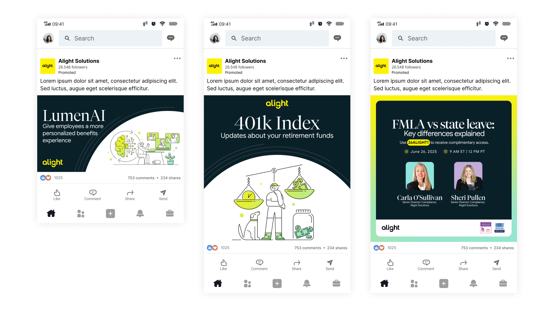
System consistency in the feed
One of the audit's core findings was that social, web, and product felt loosely connected. These tiles were an opportunity to close that gap. Yellow is used with more restraint — as a surface, a headline, or a highlight — rather than as a default fill. The darker backgrounds echo the updated web direction and create a more cohesive presence across touchpoints.
Illustration as a brand signal
The consistent line illustration style — single-weight strokes, yellow or green as the only accent — does real brand work at this scale. It's ownable and visually quiet enough to let the headline lead. On a platform where most B2B brands default to stock photography and heavy gradients, this approach creates distinction without adding noise.
Typographic hierarchy at scale
The updated type system holds at smaller social sizes. The combination of a strong headline weight with clean supporting copy brings the same editorial confidence the web direction is working toward — and the FMLA webinar tile in particular shows the system handling information-dense formats without losing clarity or brand presence.
Templates built for scale
A secondary goal of this exploration was understanding how these patterns would perform in a production context. The tile structures are intentional — reusable, flexible, and clear enough that a production team can execute them consistently without senior art direction on every post. That was one of the practical outcomes the audit pointed toward, and these tiles were a test of whether the system could support it.
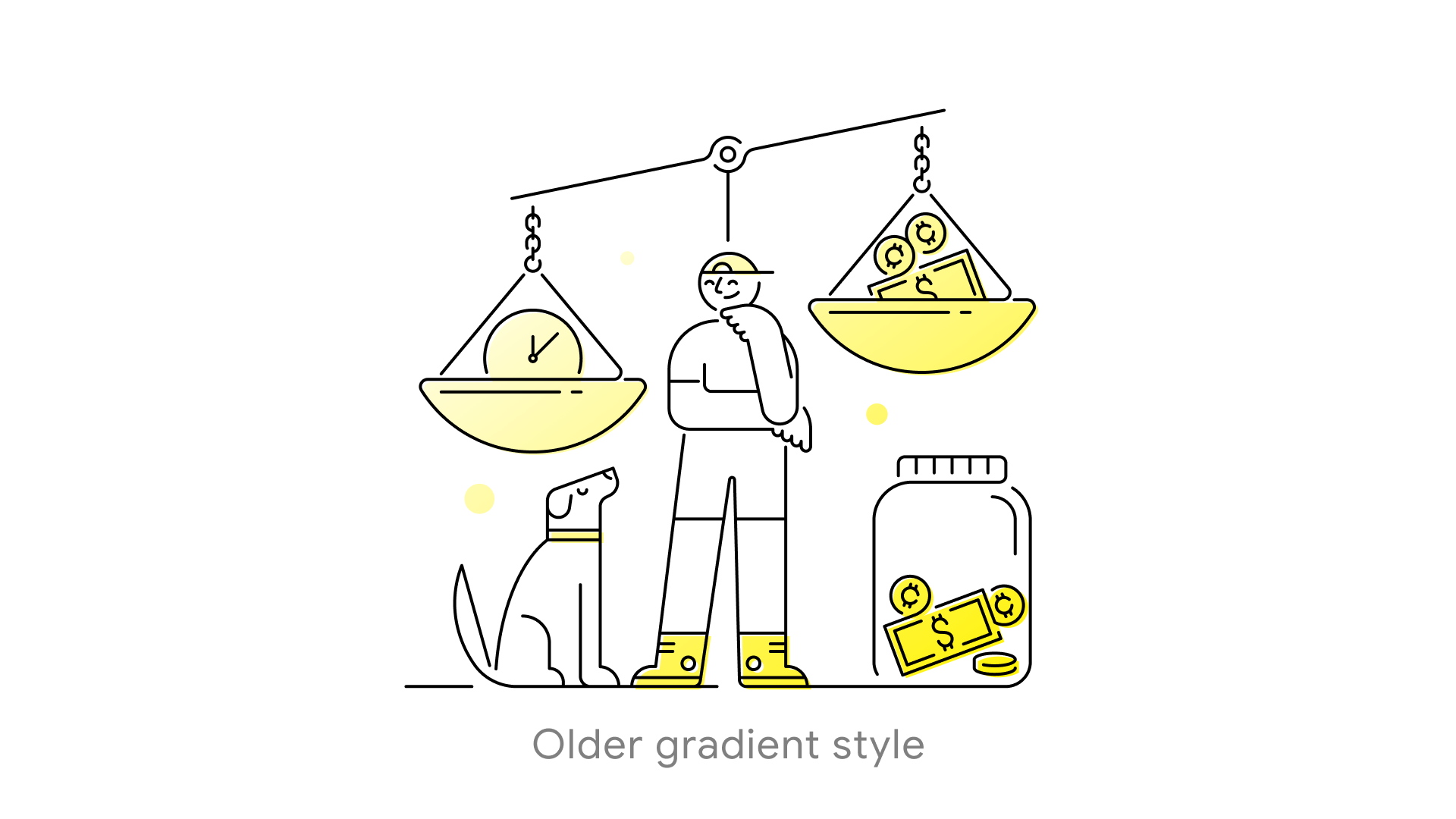
The older gradient style
The original approach used Alight yellow as a flat-to-light gradient fill. While warm and on-brand at first glance, the application lacked consistency — the fill bled across surfaces without clear logic, and elements like the money jar went unfilled entirely. It was a starting point that had never been fully resolved into a system.
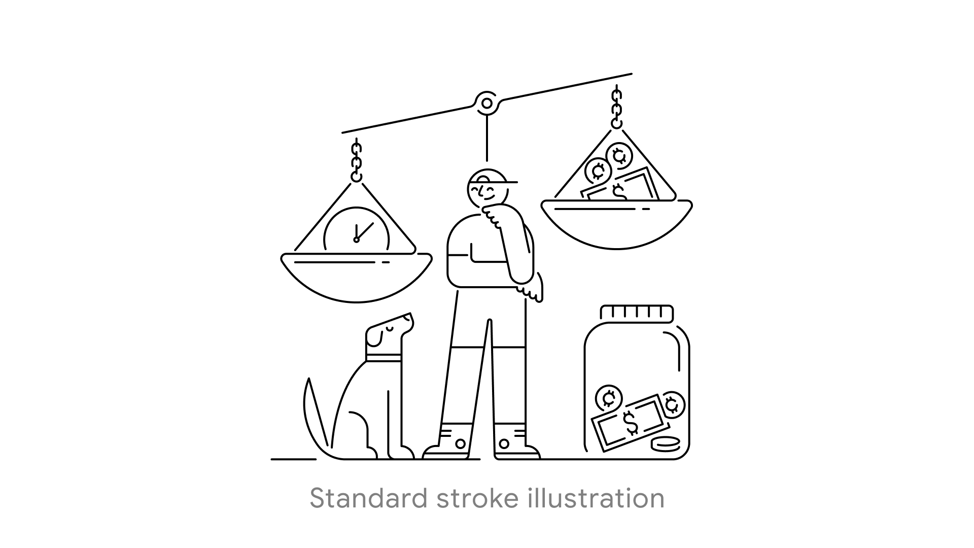
Standard stroke
The stroke-only variant addresses a specific production gap — contexts where a color fill doesn't work, primarily when the illustration sits over a dark or brand-colored background. Inverting to white or black stroke keeps the illustration legible and on-brand without competing with the surface beneath it. Having this in the system means illustration can function across the full range of layouts without requiring a workaround each time.
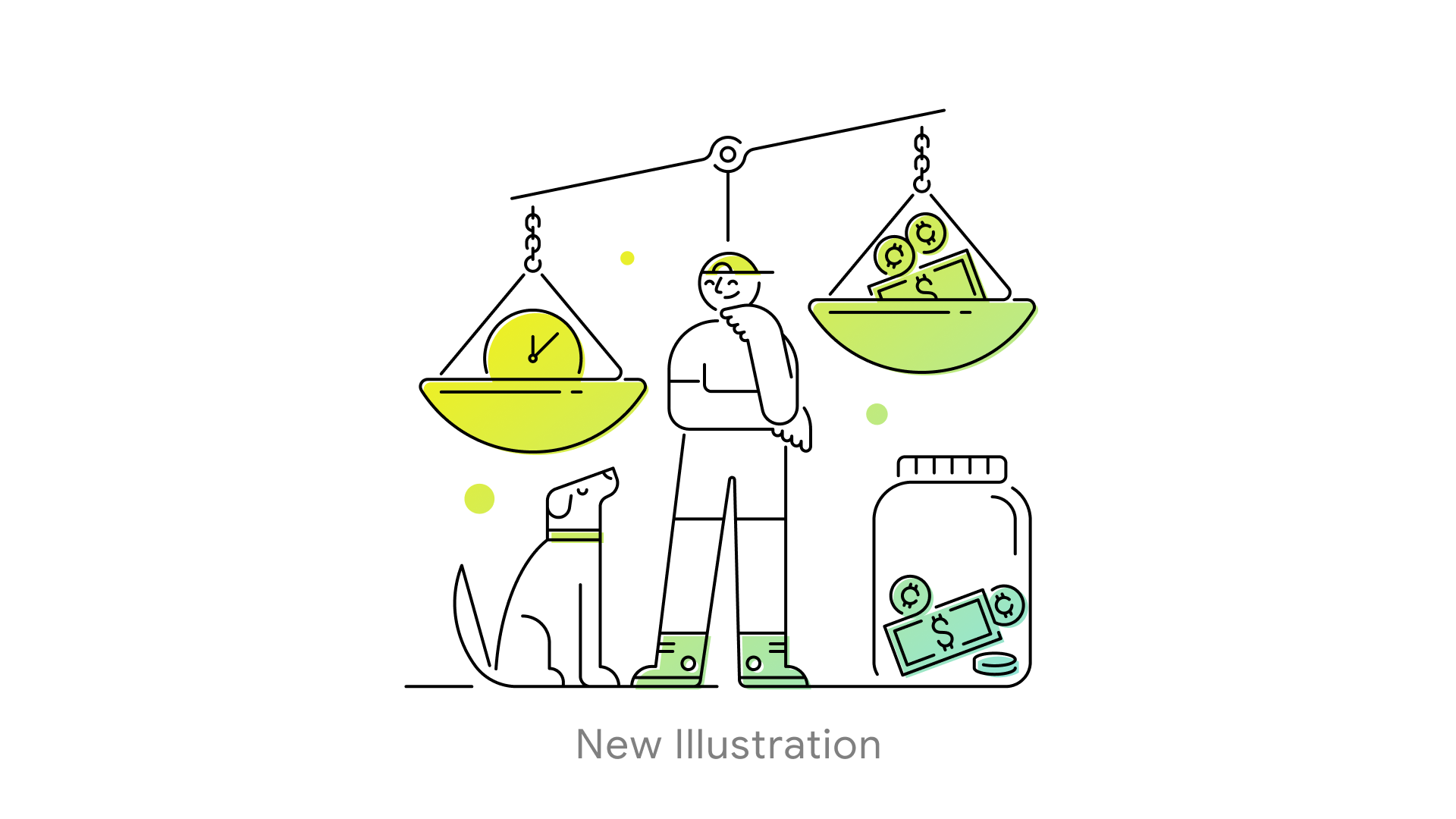
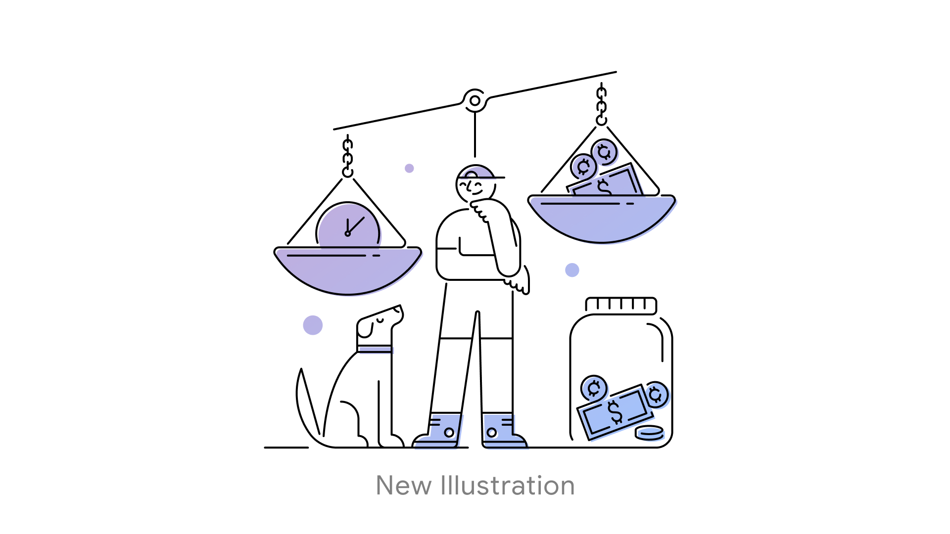
Defining fill logic
The new colorway explorations established a clear rule: fills apply to contained shapes — scale bowls, collar, shoes — while open line elements remain unfilled. That constraint is what separates a considered system from a decorative one, and it became the principle I used to evaluate every color decision from this point forward.
Expanding the system
The periwinkle variant came out of a need to extend the system beyond yellow without losing coherence. The cooler, more editorial tone creates visual range across a feed or a content-heavy page — and its alignment with the typographic direction we were developing in parallel reinforced that it was the right direction to explore. Both colorways follow the same fill logic, which is what keeps them reading as the same system despite the tonal difference.
Impact
The result is an illustration system that moved from a partially resolved decorative approach to a flexible, rule-based framework. The fill logic is consistent, the color range is intentional, and the line work is strong enough to carry multiple expressions — giving production teams real options without sacrificing brand coherence.