Using the existing logo only the assets shown represent my art direction, creative direction, and execution across brand, web, and campaign surfaces. The work focuses on repositioning CredEvolv within a category that often struggles with trust and differentiation.

Color
The credit repair category often leans into high-contrast, urgency-driven palettes—bright greens, aggressive blues, and sales-oriented accents. While attention-grabbing, these systems tend to feel transactional rather than trustworthy.
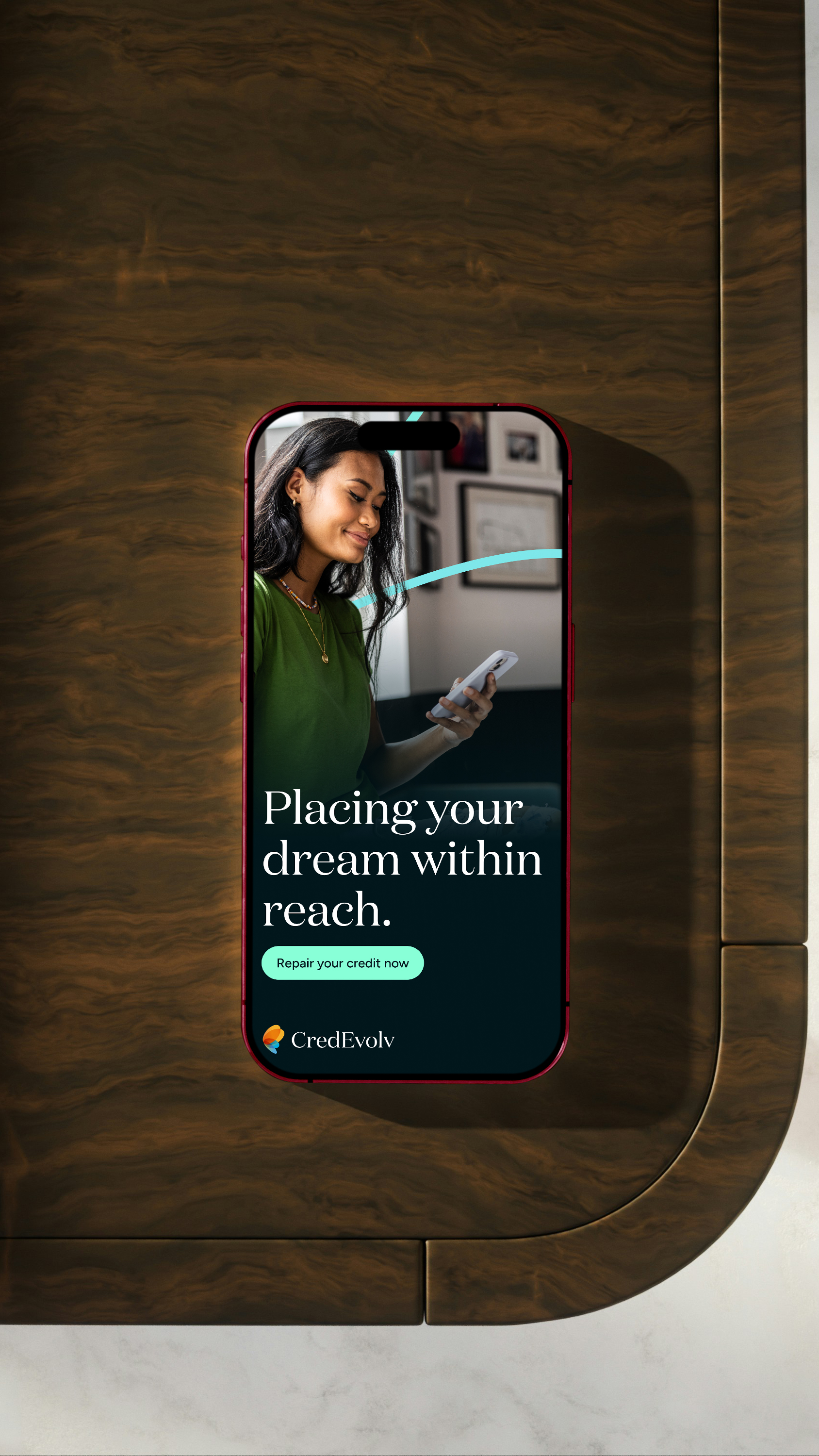
The updated palette for CredEvolv takes a different approach. A deep, desaturated teal anchors the system, creating a sense of stability and calm. This is paired with softer gradients that introduce motion and progression—subtly reinforcing the idea of evolution over time.
Rather than relying on contrast alone, the system uses color to communicate tone: measured, supportive, and forward-looking. It shifts the emotional experience from pressure to possibility.
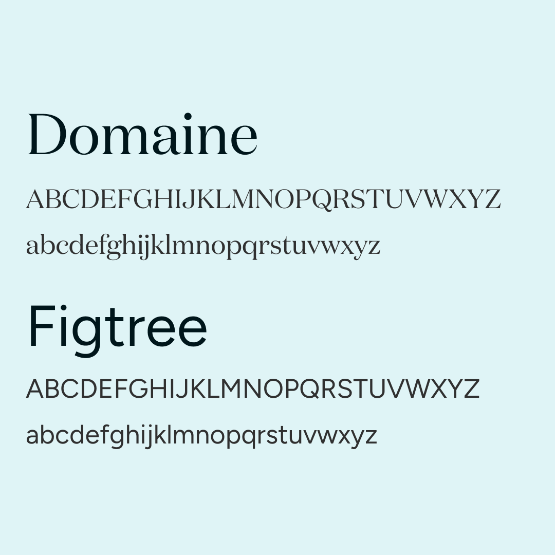
Typography
CredEvolv’s messaging sits at the intersection of education, reassurance, and action. The typography needed to support all three without feeling overly technical or overly promotional.
The system introduces a balance between clarity and expression—allowing informational content to remain highly legible while giving key messages a more human, aspirational tone.
This creates a hierarchy that feels intentional: structured where it needs to be, and expressive where it matters.
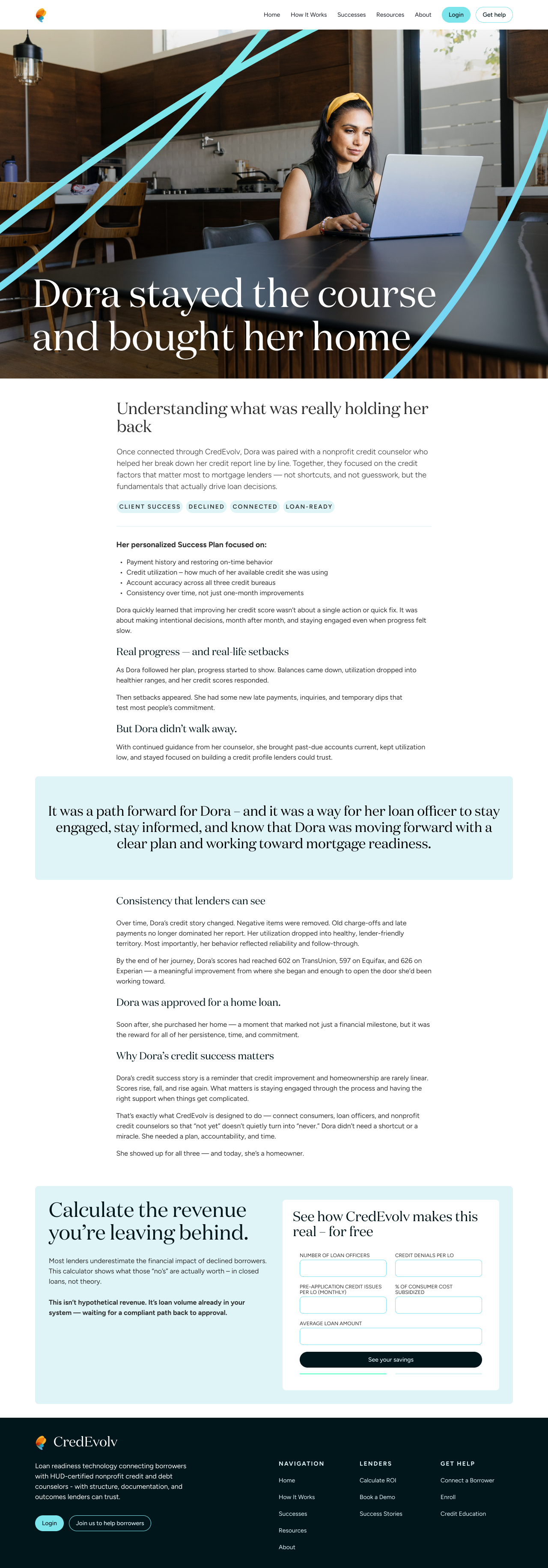
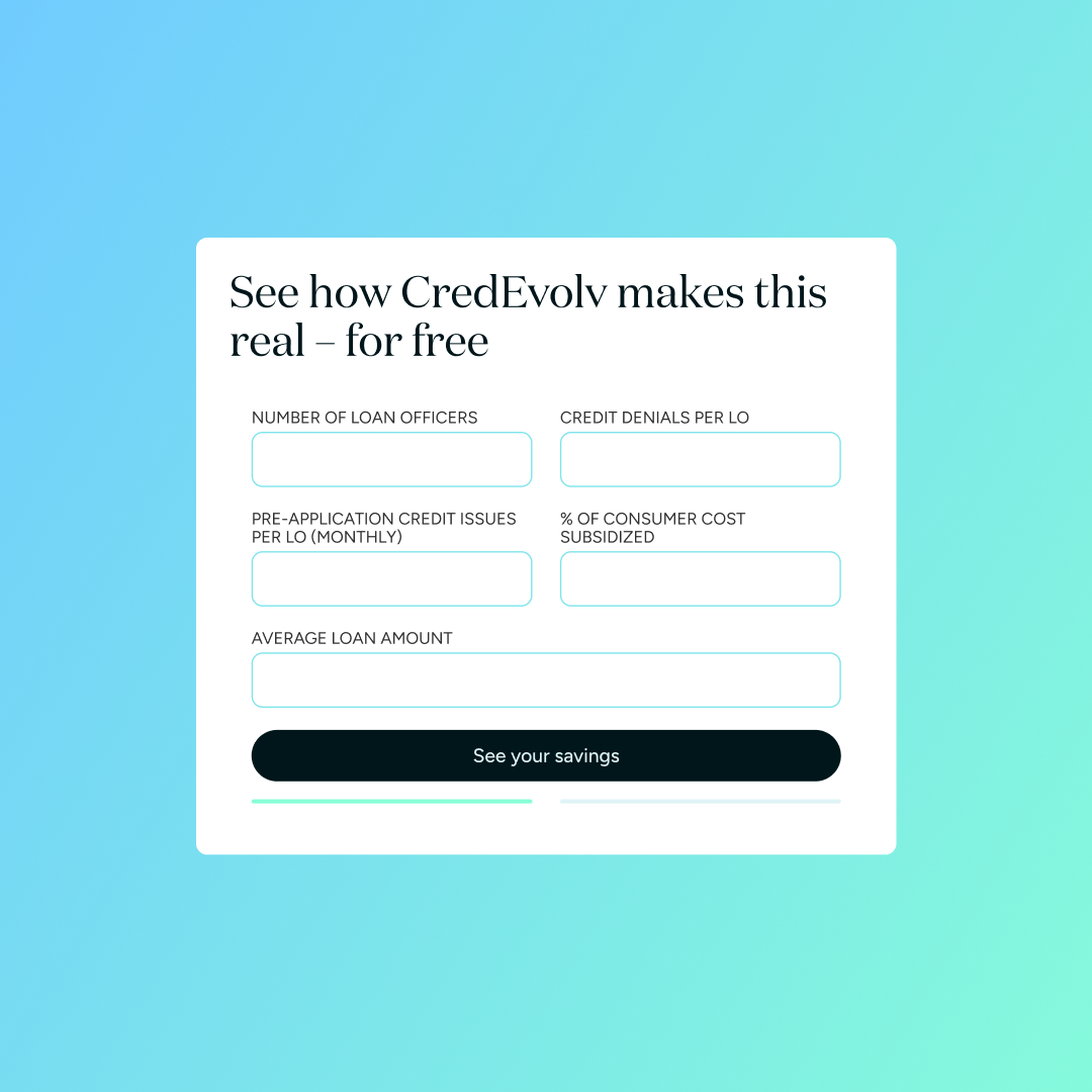
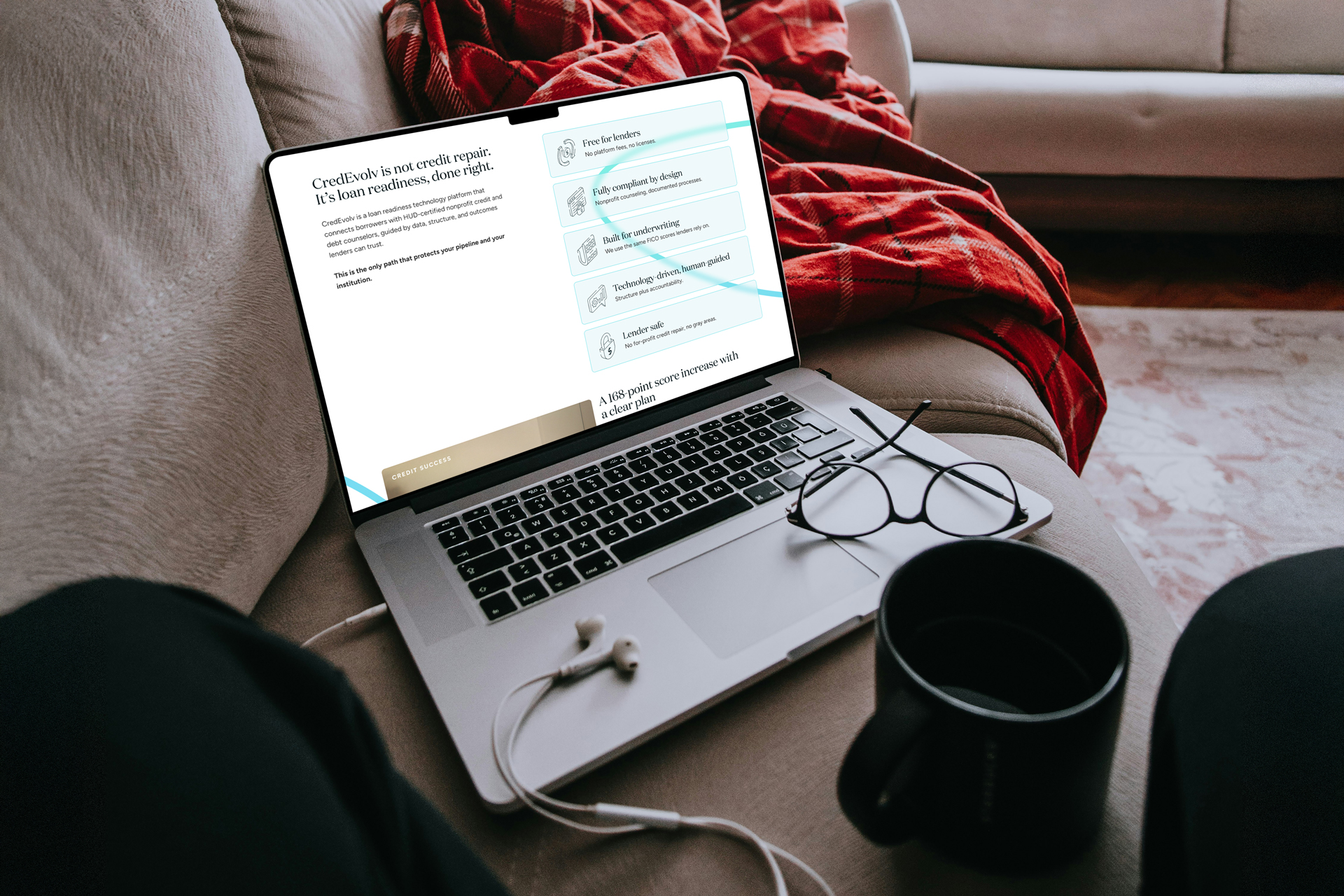
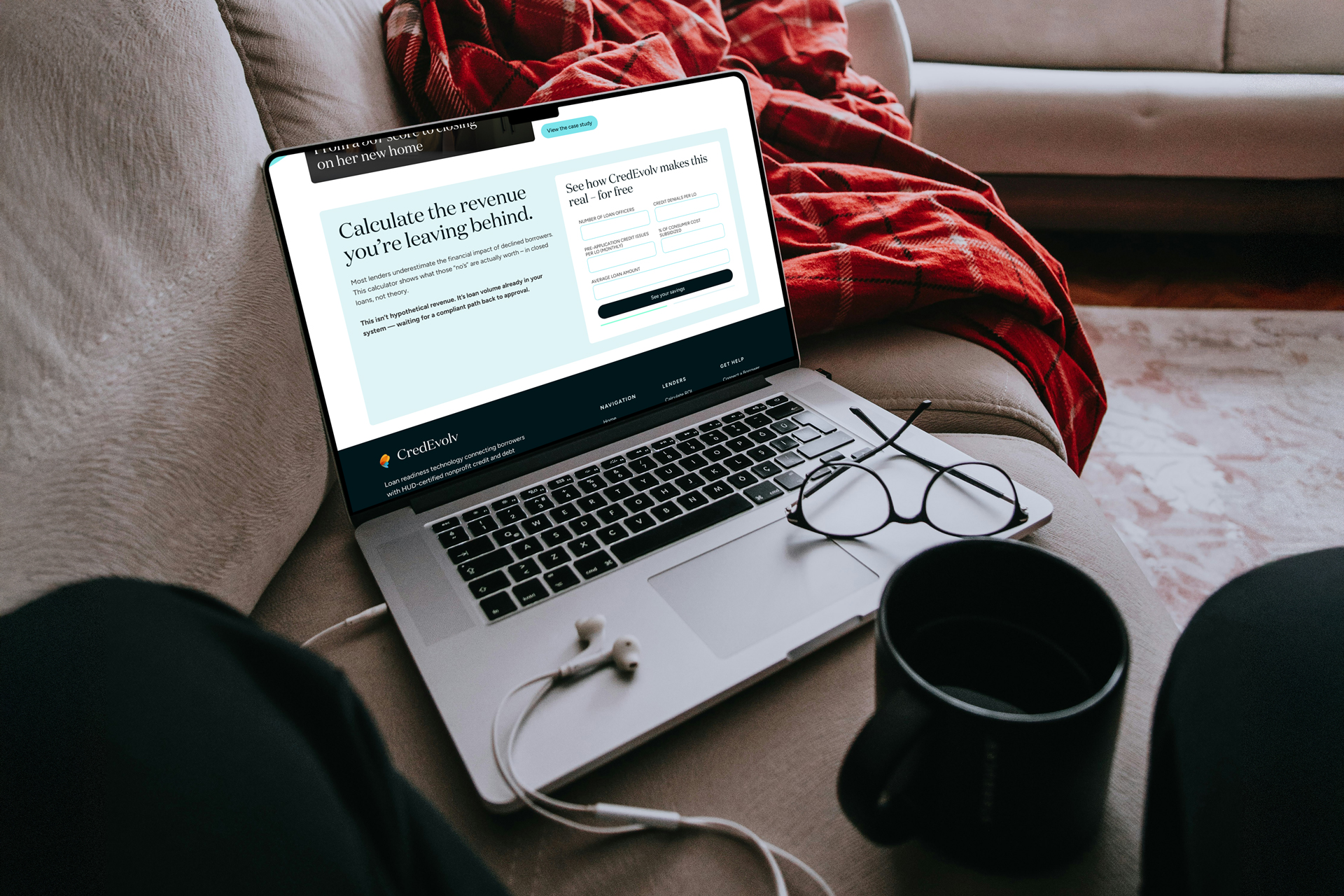
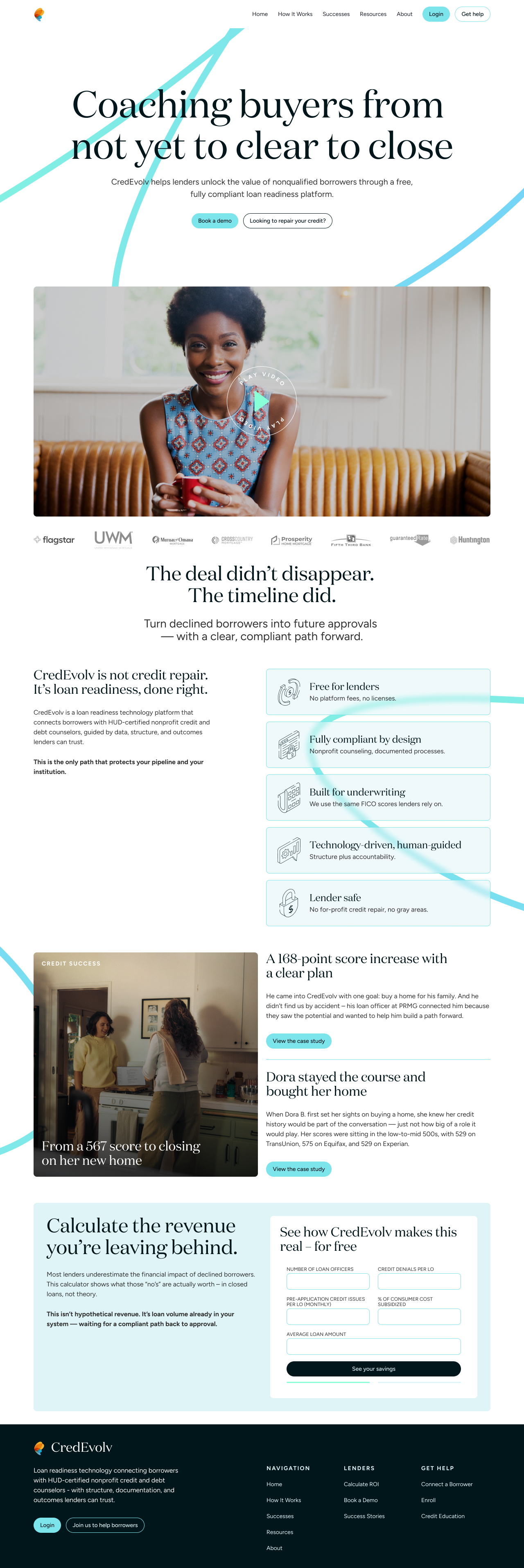
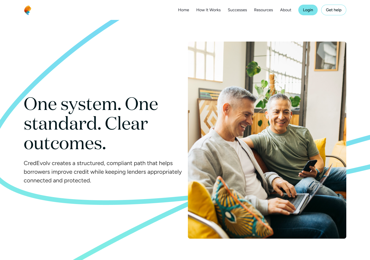
A system built for clarity and conversion
The platform communicates complex ideas—credit scores, financial health, and long-term improvement—in a way that needs to feel accessible without oversimplifying.
The design system supports this by:
- Establishing clear typographic hierarchy for scannability
- Using consistent spacing and layout patterns across pages
- Reducing visual noise to focus attention on key actions
At the same time, it avoids the common pitfalls of the category:
- No aggressive visual urgency or countdown-driven design
- No overly dense or intimidating financial UI patterns
- No reliance on generic stock-heavy layouts
The result is a system that feels calm, intentional, and easy to navigate—supporting both understanding and action.
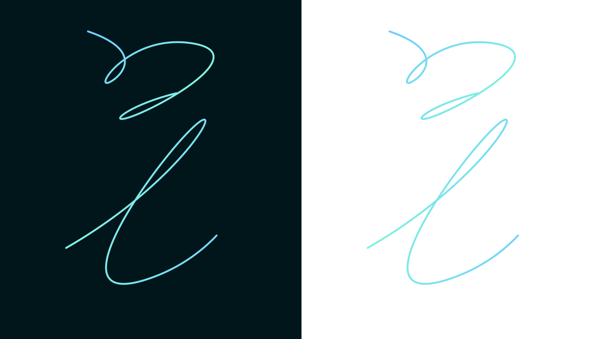
Motion-inspired graphics as a core idea
A defining element of the identity is the use of flowing, continuous line graphics. These shapes act as a visual metaphor for progress—non-linear, evolving, and personal.
Unlike rigid geometric systems, these forms introduce:
- A sense of movement and forward momentum
- Visual softness that offsets financial rigidity
- A recognizable and ownable brand language
These elements scale across touchpoints—from web to social to campaign creative—creating continuity without feeling repetitive.
They also help differentiate CredEvolv within a crowded space, where most competitors rely on static, templated design systems.
The previous experience leaned heavily on generic marketing patterns—stock imagery, inconsistent hierarchy, and messaging that prioritized urgency over clarity. While functional, it lacked a sense of identity and long-term trust.

From transactional messaging to guided progression
Credit repair is not an instant outcome—it’s a process. The redesign reframes the experience around that reality.
Instead of pushing immediate conversion, the platform introduces a clearer narrative:
- Where the user is today
- What steps they can take
- What progress looks like over time
This shift transforms the experience from transactional to supportive.
Users aren’t being sold to—they’re being guided. The design reinforces that through pacing, hierarchy, and tone, making the journey feel achievable rather than overwhelming.


The updated system aligns the brand with its core promise: helping users make meaningful, long-term financial progress through clarity, structure, and support.
Impact
The redesign doesn’t change the service—it changes how it’s understood.
By aligning brand, messaging, and experience, CredEvolv becomes more than a credit repair tool. It becomes a partner in financial growth.
- The experience feels more trustworthy and less transactional
- Users can more easily understand and navigate their next steps
- The brand stands apart from competitors through clarity and tone