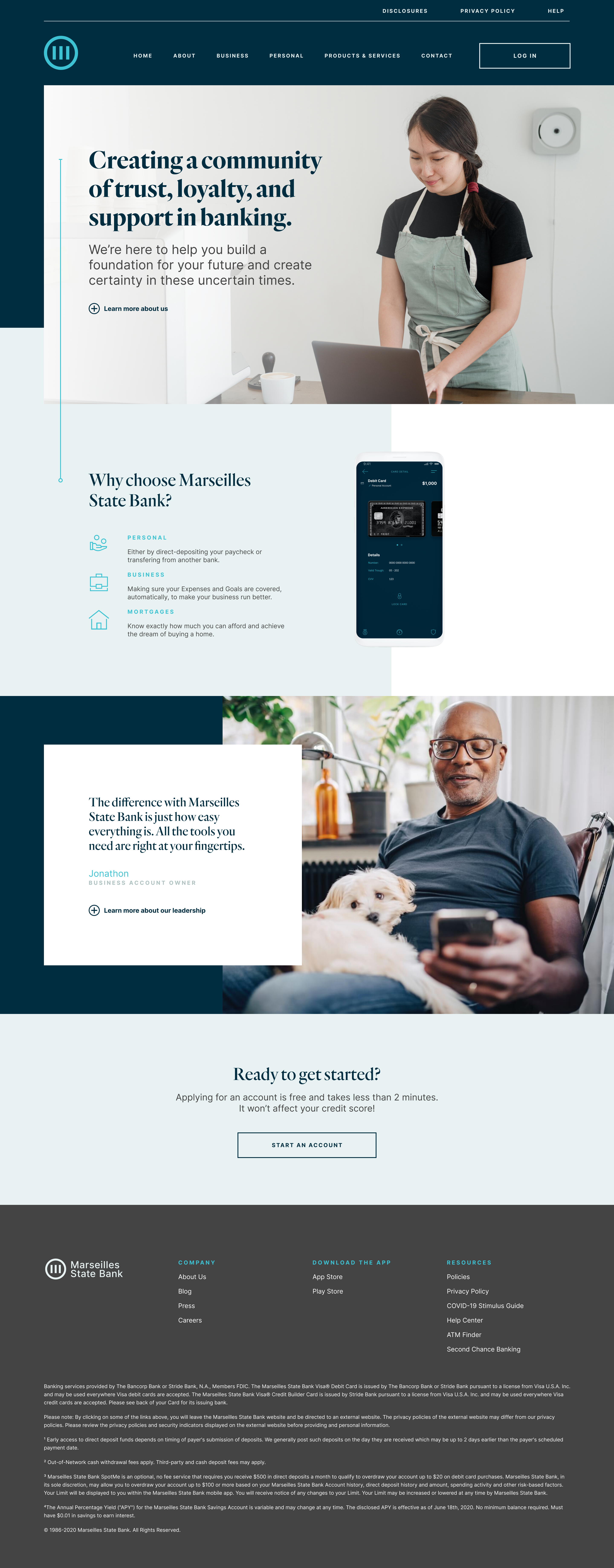
Updated branding for a local bank looking to become stronger. Updated branding for a local bank looking to become stronger. Updated branding for a local bank looking to become stronger. Updated branding for a local bank looking to become stronger. Updated branding for a local bank looking to become stronger. Updated branding for a local bank looking to become stronger. Updated branding for a local bank looking to become stronger. Updated branding for a local bank looking to become stronger. Updated branding for a local bank looking to become stronger. Updated branding for a local bank looking to become stronger. Updated branding for a local bank looking to become stronger. Updated branding for a local bank looking to become stronger.
Case Study
Marseilles Bank
Problem
Marseilles Bank doesn't specialize in mortgages, real estate, auto loans, or personal loans. They specialize in support, trust, and loyalty. They found that they were losing customers to banks like Chase, Bank of America, and a slew of online banks.
Solution
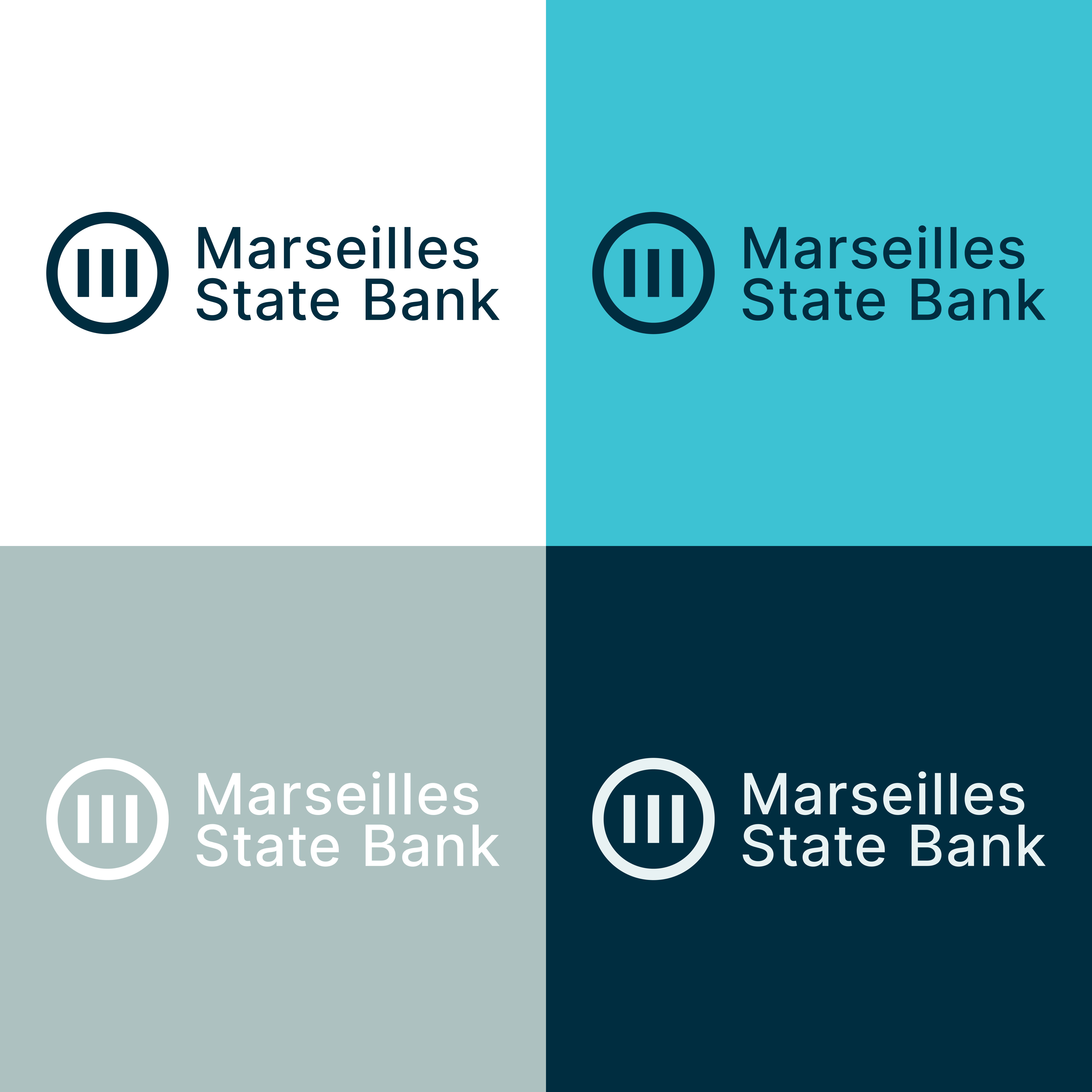
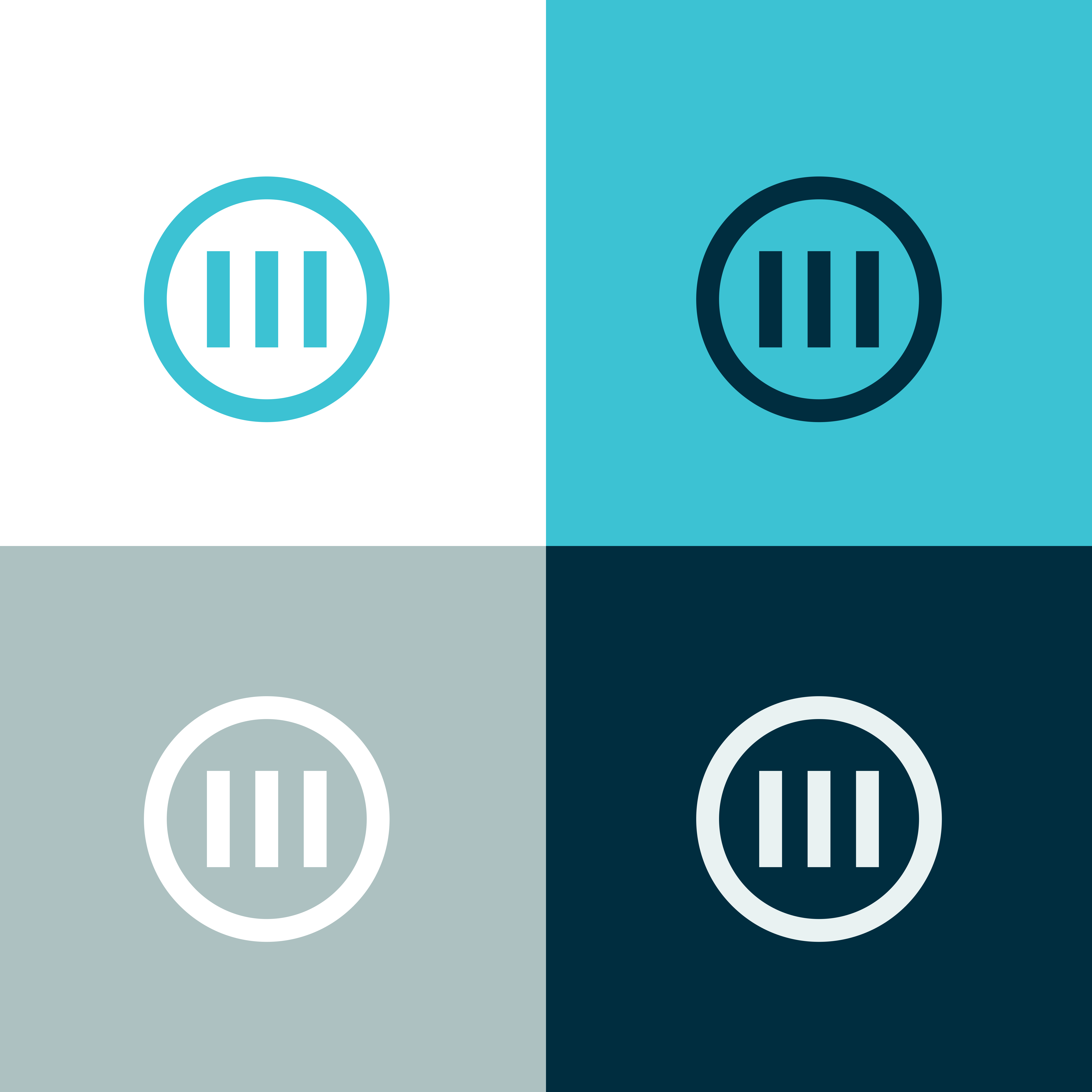
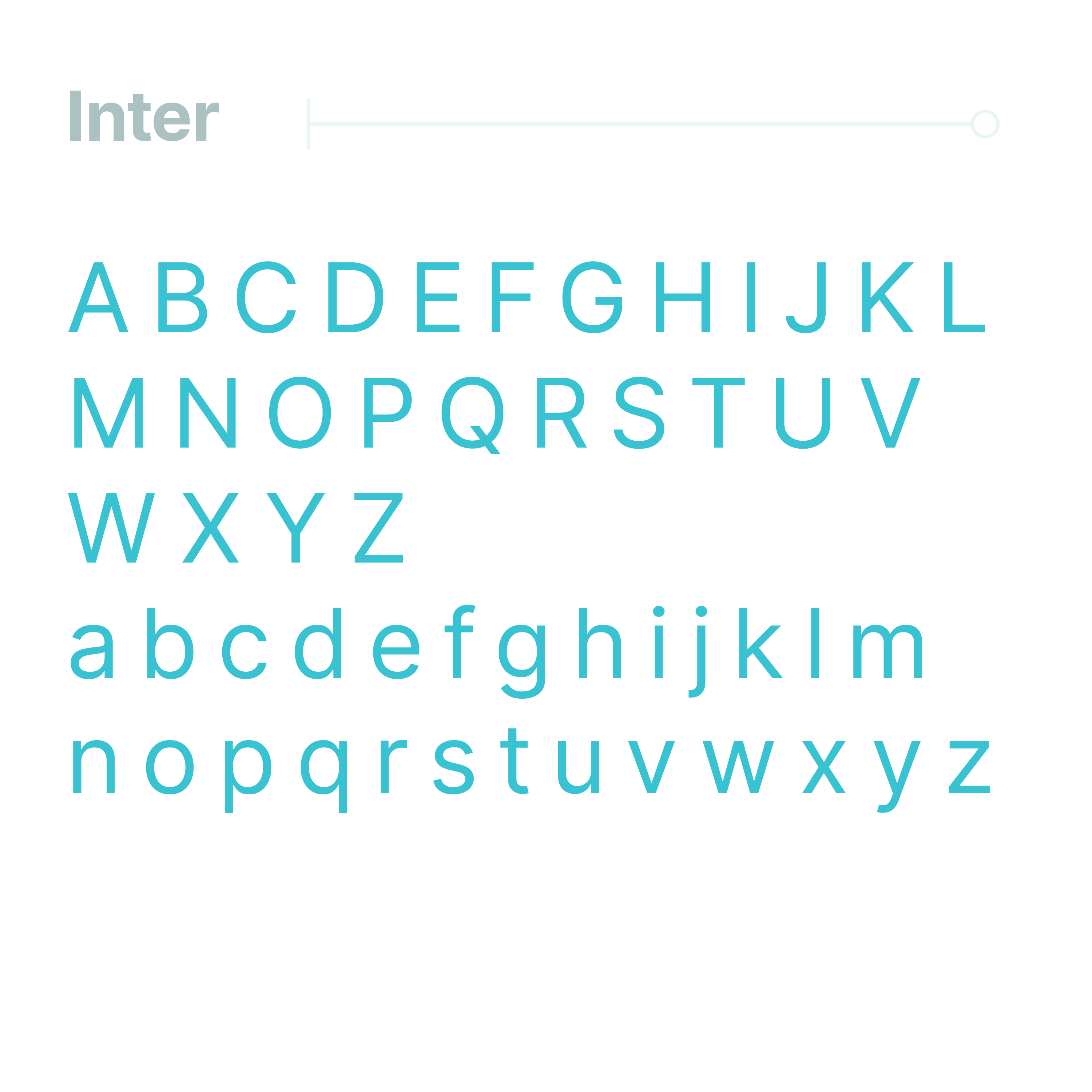
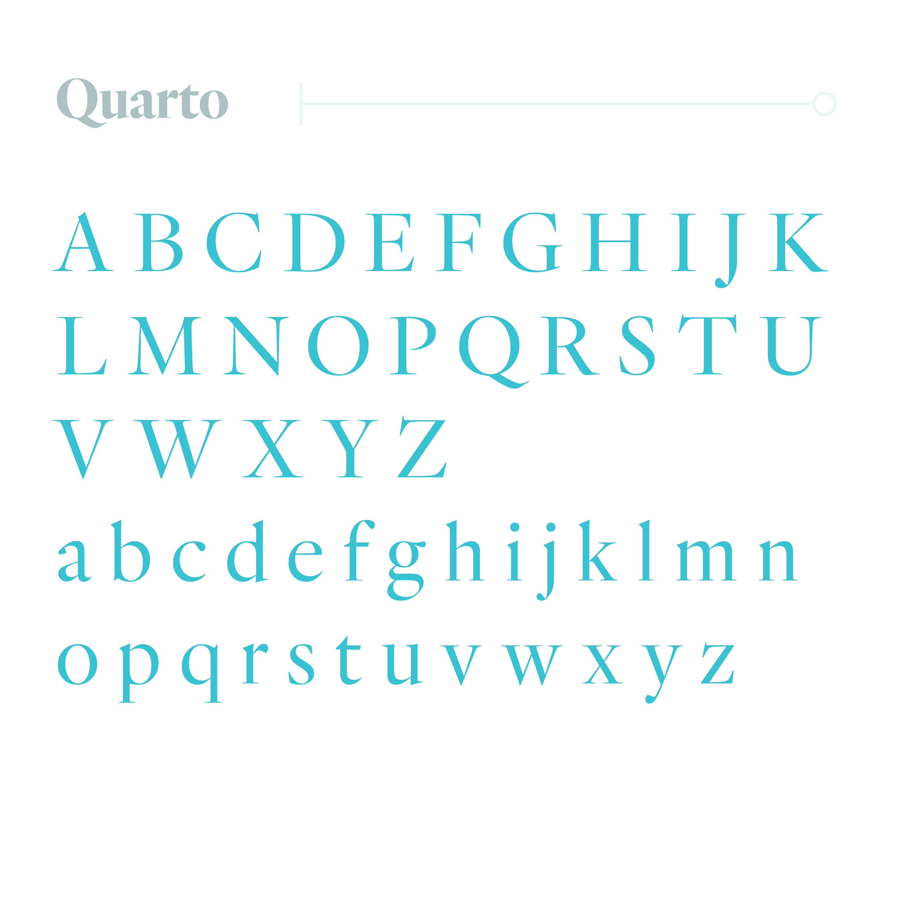
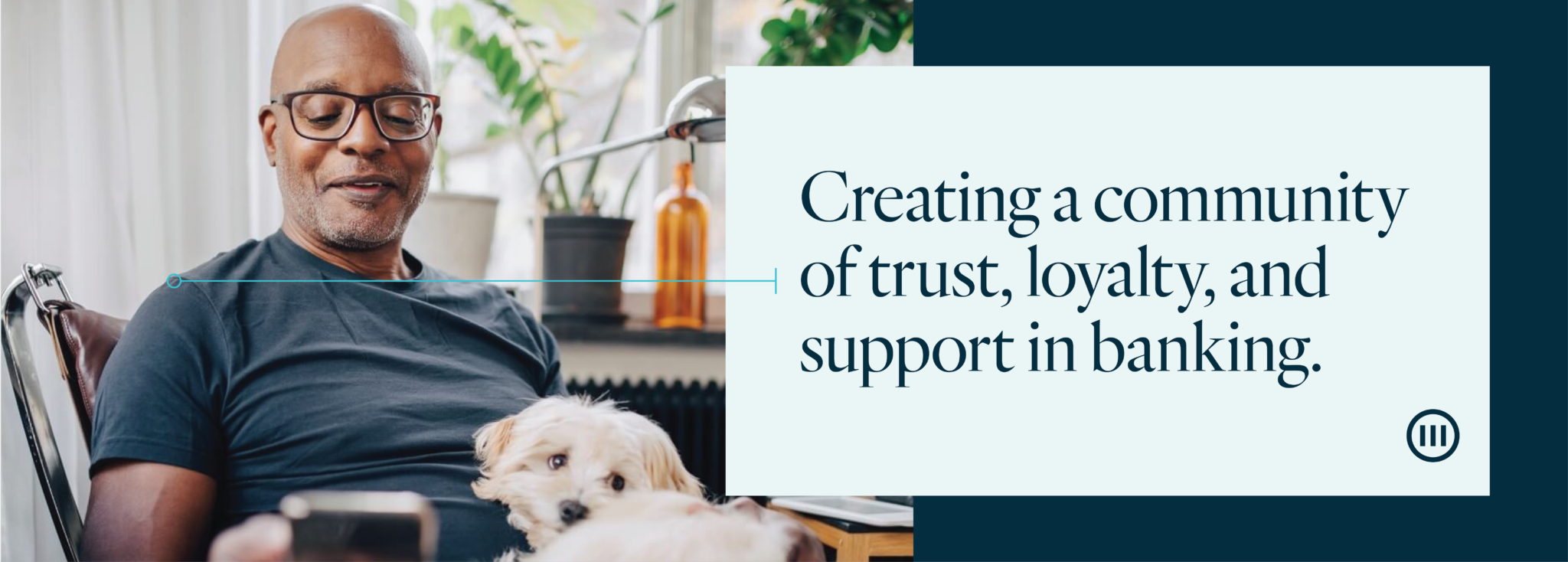
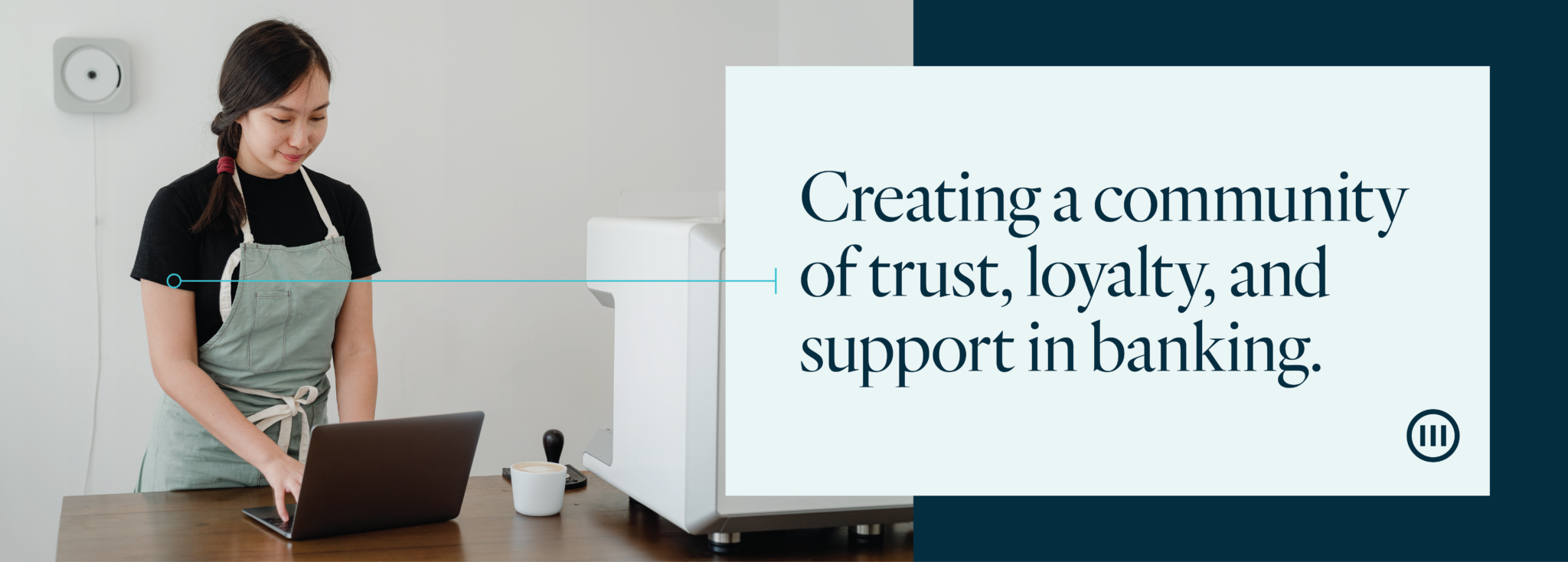
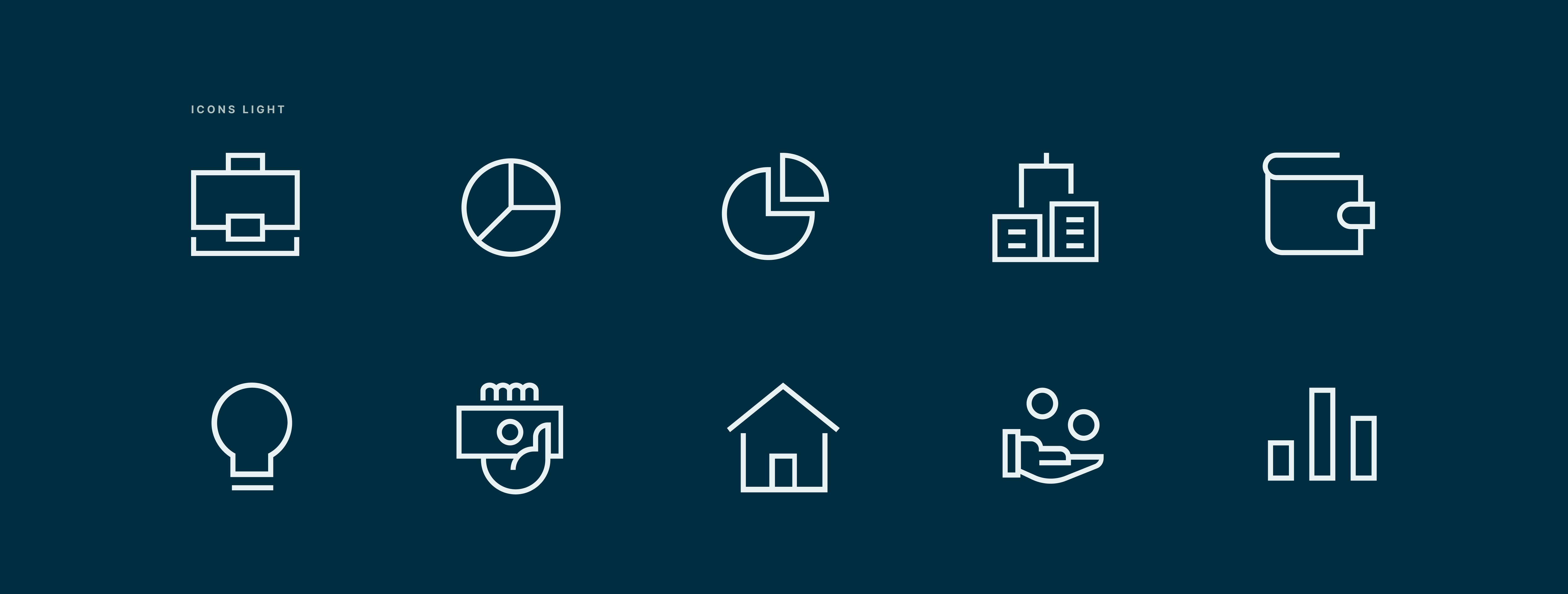
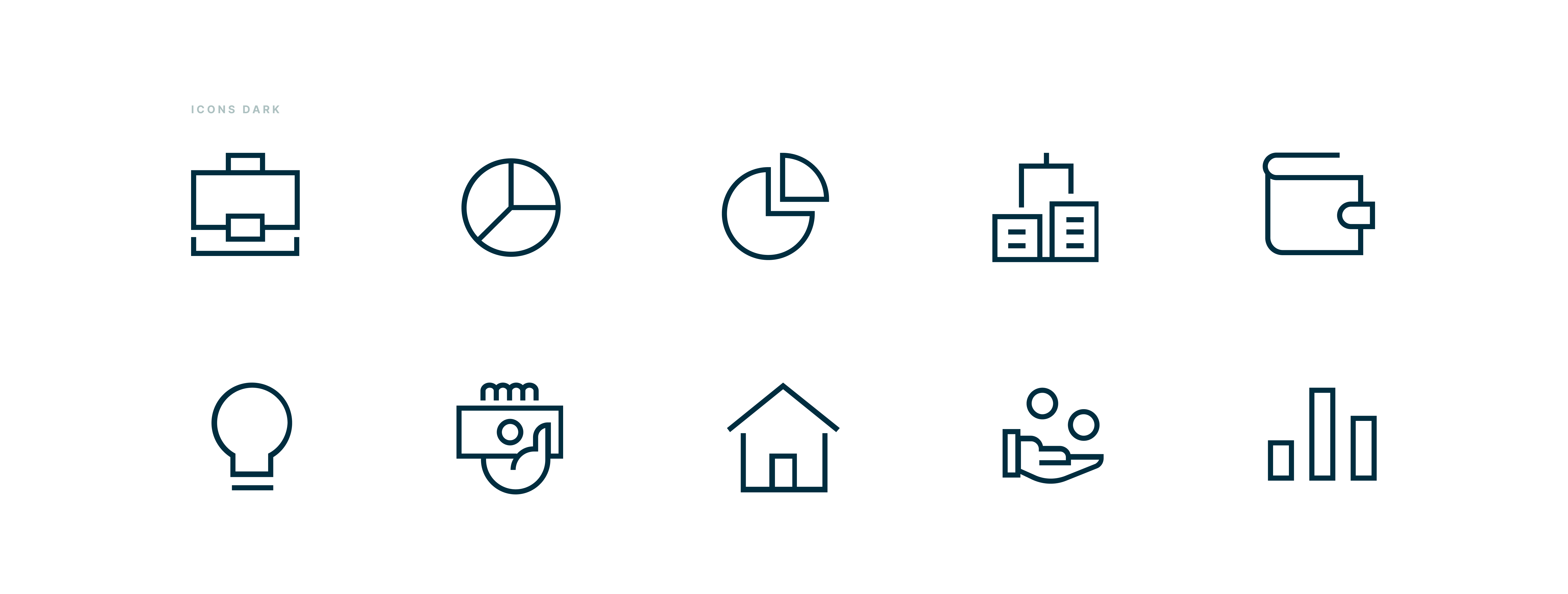
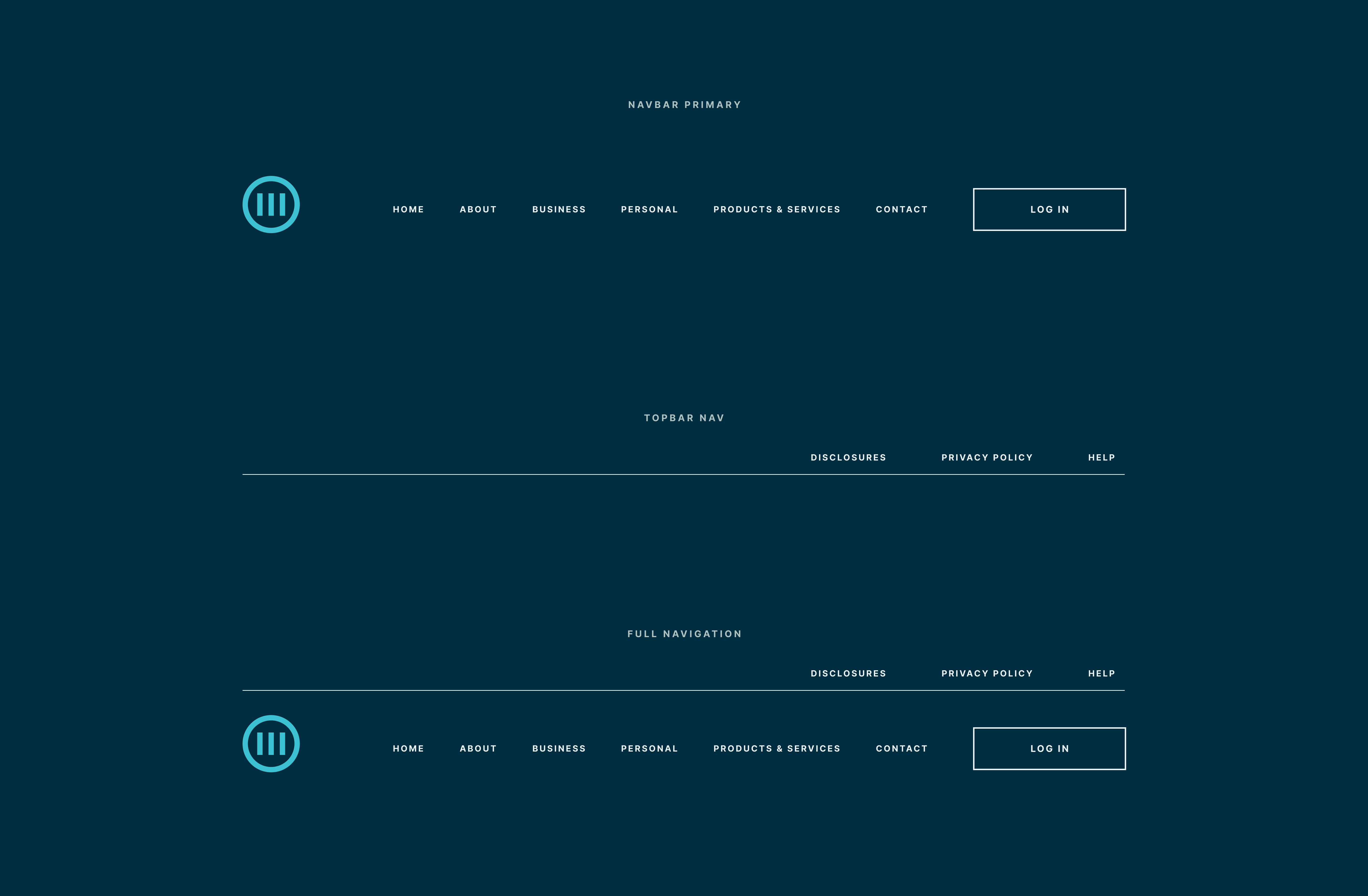
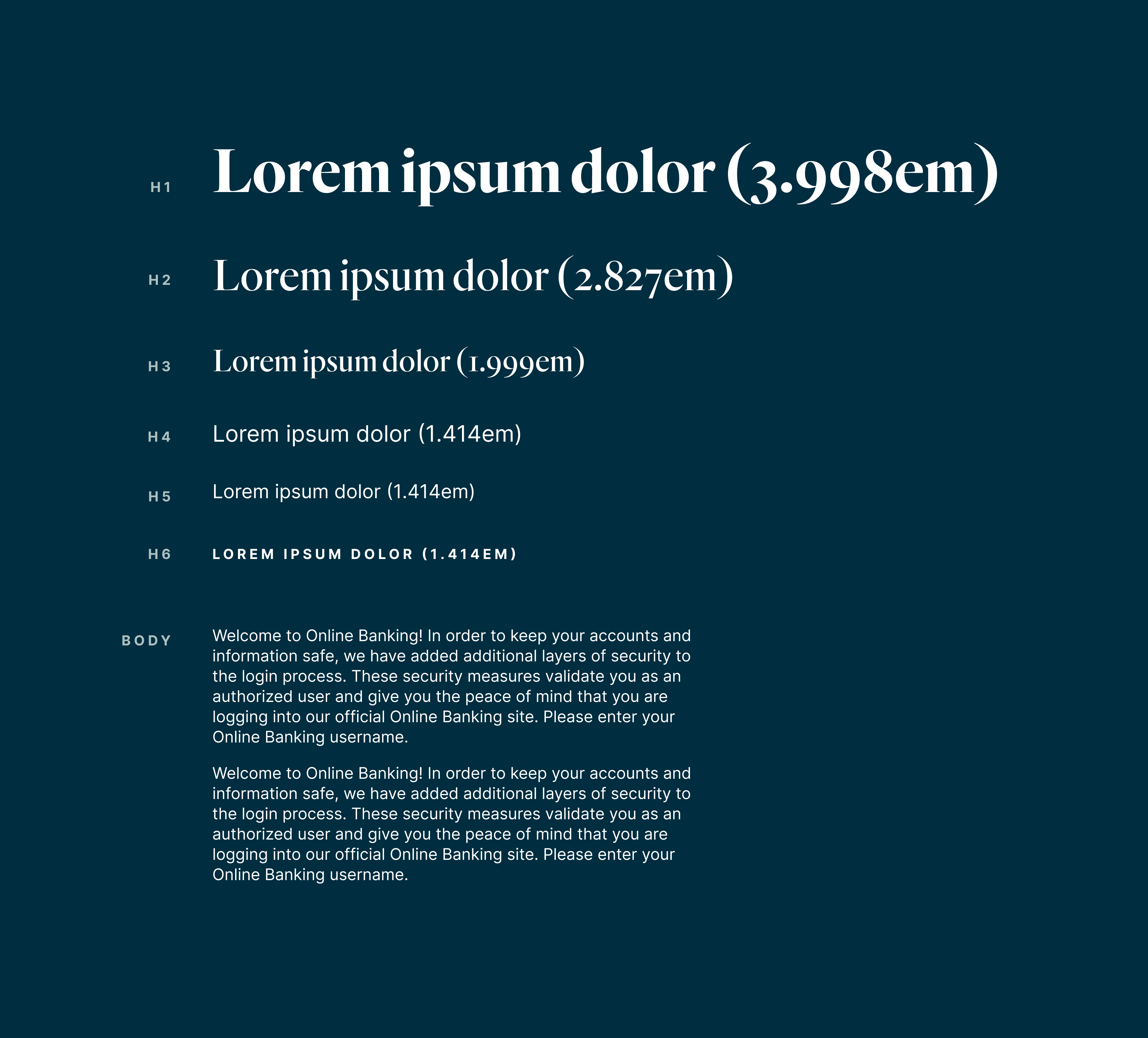
With the primary objective of building a design system that can compete with large commercial banks, I looked to what made Marseilles different. Their three pillars of how they operated — support, trust, and loyalty. Using those three pillars the M monogram was born. They didn't want to stray too far from their colors (blue like most banks) but were willing to spend some money on a premium typeface (Quarto) with a free pairing (Inter).
Services
- Web Design
- Branding
- Front End Development
- Design System
