Assets shown represent my art direction, creative leadership, and assets I executed throughout the project. MDGuidelines is a subsidiary of Alight Solutions, where I lead design initiatives.
Color
The first step in the redesign was re-evaluating the color system. The existing MDGuidelines palette relied heavily on primary blues and yellows, which lacked depth and visual weight. While functional, these colors contributed to an experience that felt dated—leaning toward a clinical, almost textbook-like aesthetic reinforced by overly literal patterns and rigid applications.
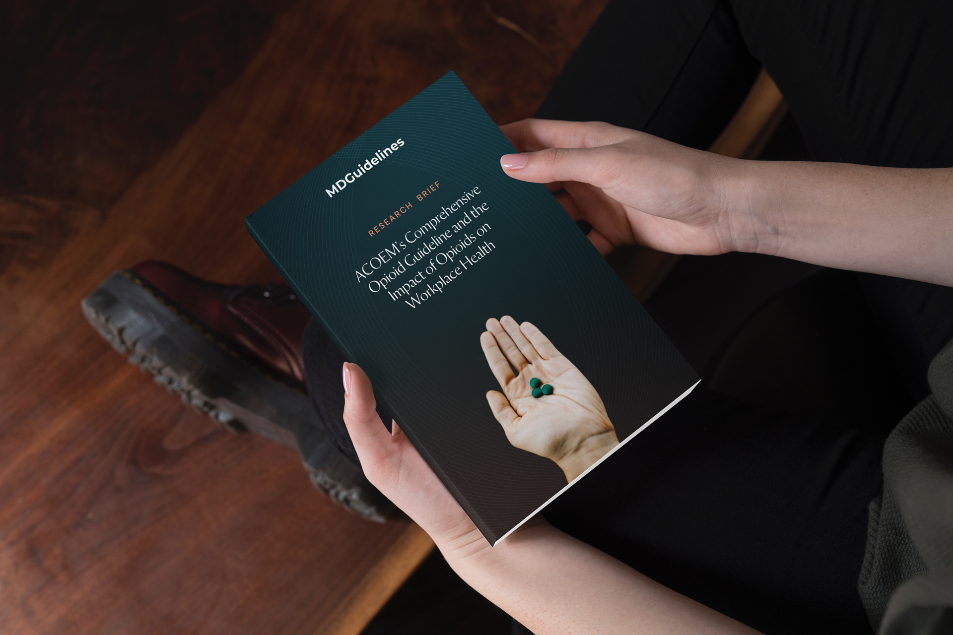
The updated approach introduced a more refined and intentional palette. Deeper, more saturated blues establish a stronger foundation, conveying trust and authority while adding a sense of sophistication that was previously missing. These are complemented by a muted red, used selectively to introduce warmth and softness into the system. Beyond contrast, this red also serves a strategic role—subtly referencing historical medical iconography, grounding the brand in a visual language that feels both familiar and credible.
Together, this shift moves the color system away from something purely functional and toward one that carries tone and meaning. It creates a more balanced visual experience—one that feels professional and contemporary, while still maintaining the clarity and trust expected within a healthcare context.
Typography
MDGuidelines is, at its core, an information-dense clinical platform—housing treatment recommendations, recovery timelines, and research-backed data. The typography therefore isn’t just aesthetic—it’s functional infrastructure.
The previous system leaned too heavily on a single typographic voice, which limited hierarchy and made complex content feel flatter than it should.
The introduction of Orleans and DM Sans addresses that directly by separating expression from utility.
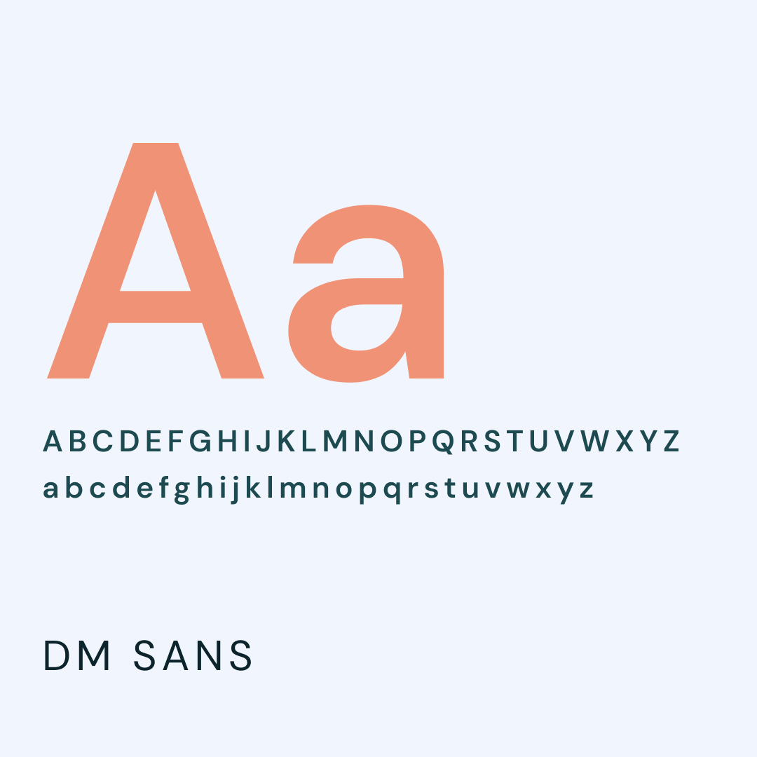
DM Sans as a functional foundation
DM Sans is purpose-built for digital interfaces. Its low-contrast, geometric construction and tall x-height make it highly legible at smaller sizes—especially in data-heavy environments. In the context of MDGuidelines, that matters:
- Clinical content often appears in dense blocks, tables, and UI components
- Users are scanning for specific terms, not reading linearly
- Misreading even a single character can have real implications
DM Sans performs well here because:
- High legibility at small sizes supports dashboards, metadata, and long-form content
- Clear character differentiation reduces ambiguity in technical contexts
- Neutral, geometric structure keeps the interface calm and unobtrusive
It essentially becomes an invisible system layer—doing its job without drawing attention.
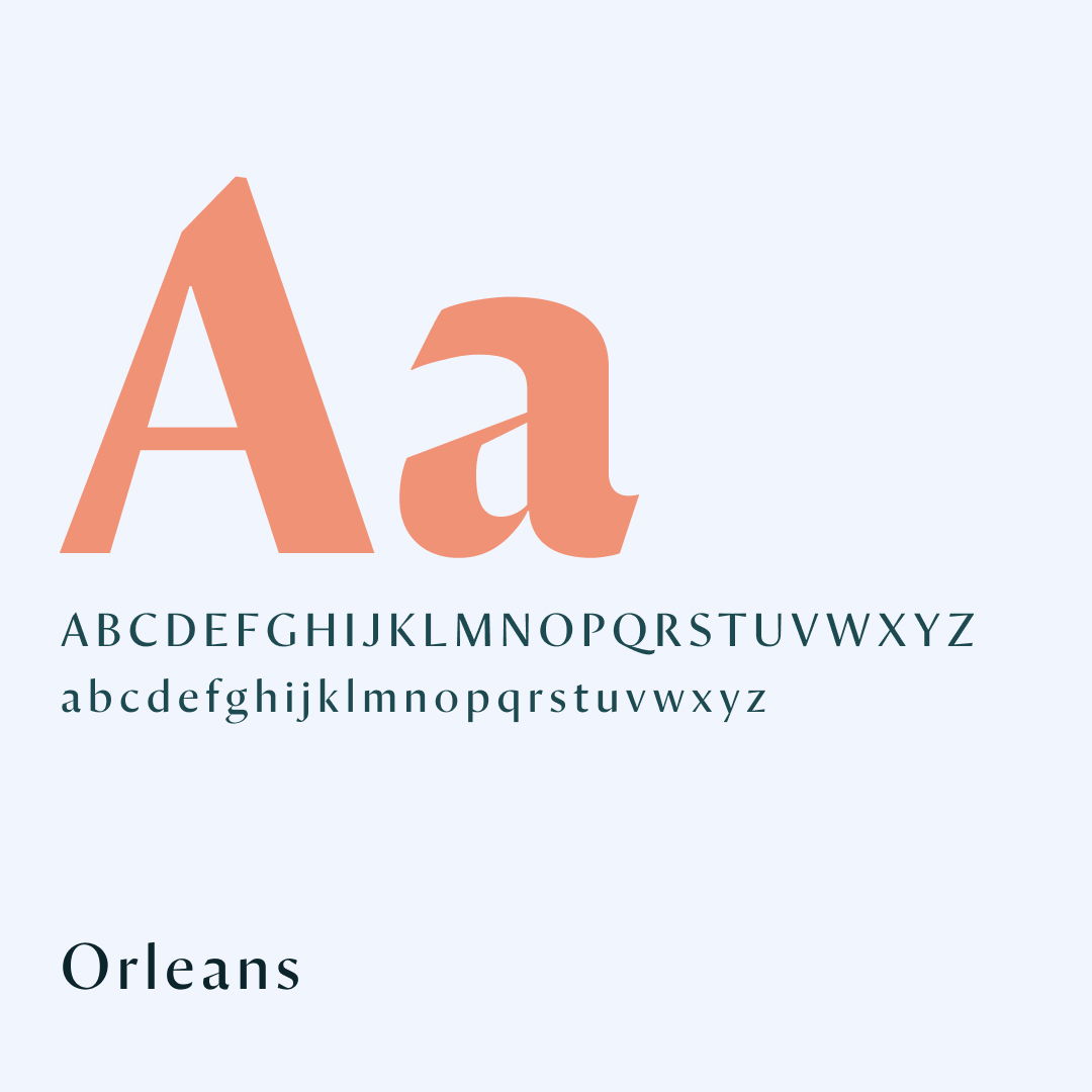
Orleans as a voice and differentiator
Where DM Sans is functional, Orleans introduces tone. A serif (or serif-adjacent) display face like Orleans brings:
- Contrast in rhythm and texture
- Editorial presence in headlines
- A sense of authority and credibility
This is particularly important in healthcare.
MDGuidelines needs to feel:
- Trustworthy
- Established
- Human—not purely technical
Orleans helps bridge that gap. It gives headlines weight and personality, allowing key messages—insights, research highlights, section headers—to feel intentional rather than purely utilitarian.

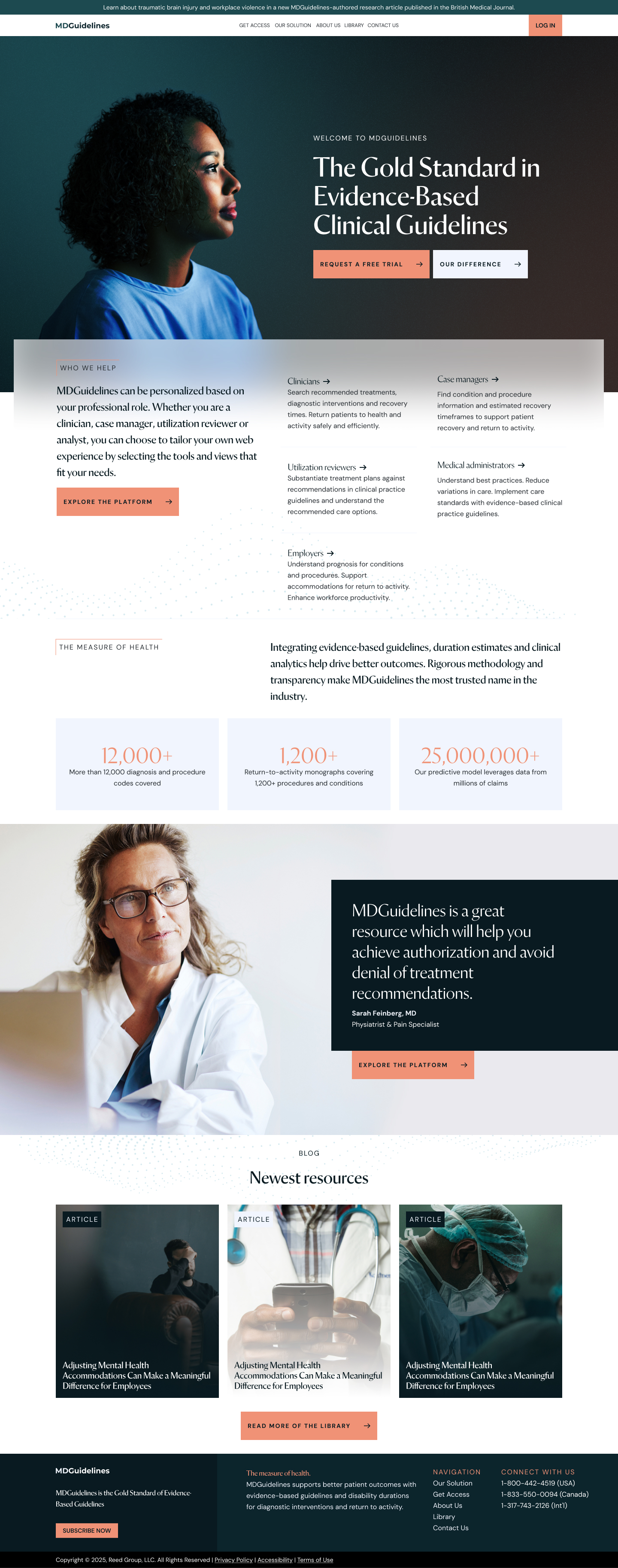
The experience leaned heavily on default UI patterns, primary colors, and flat hierarchy—making complex information feel heavier and harder to parse than it needs to be.
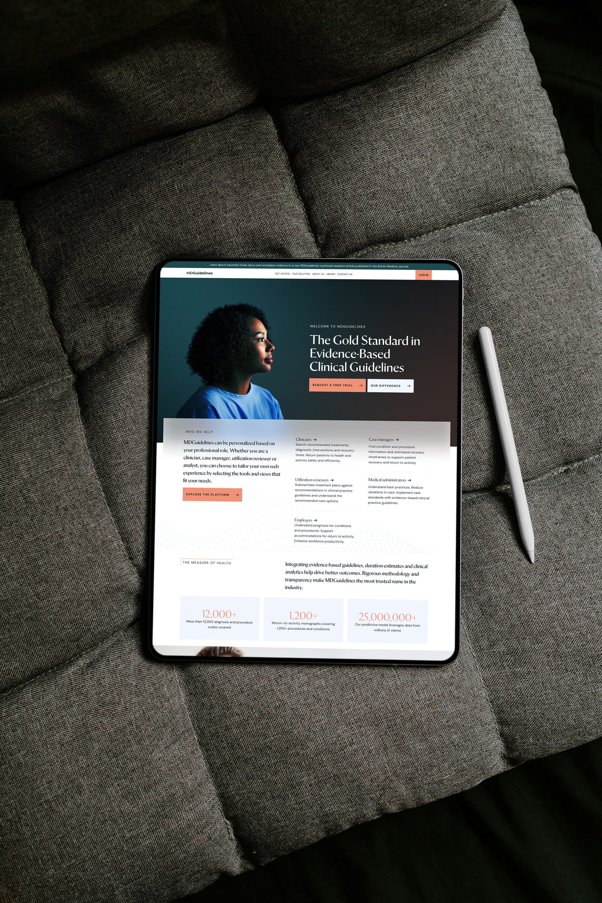
Shifting from clinical utility to designed clarity
The existing MDGuidelines platform is fundamentally built for speed and access—helping clinicians quickly find treatment recommendations, recovery durations, and clinical data.
However, the visual layer doesn’t reflect that sophistication. The experience leaned heavily on default UI patterns, primary colors, and flat hierarchy—making complex information feel heavier and harder to parse than it needs to be.
The redesign reframes that experience. Instead of simply presenting information, it organizes and prioritizes it—bringing clarity to an already powerful system.

Ultimately, the improvements bring the visual and experiential layer in line with the product’s core value: trusted, structured, evidence-based decision support—delivered with clarity.
Impact
The redesign doesn’t change the product—it reveals it.
Ultimately, the improvements bring the visual and experiential layer in line with the product’s core value: trusted, structured, evidence-based decision support—delivered with clarity.
- Complex information becomes easier to scan and act on
- The interface feels lighter, faster, and more intentional
- The brand moves from generic clinical utility to a more credible, modern platformx