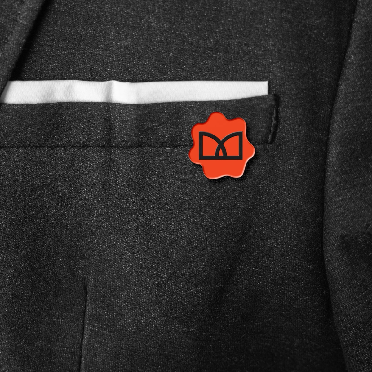
The chosen logo was built on architecture symbols for doors creating an M shape that could be applied stand alone or in the wider system with a seal.
Typography and Colors
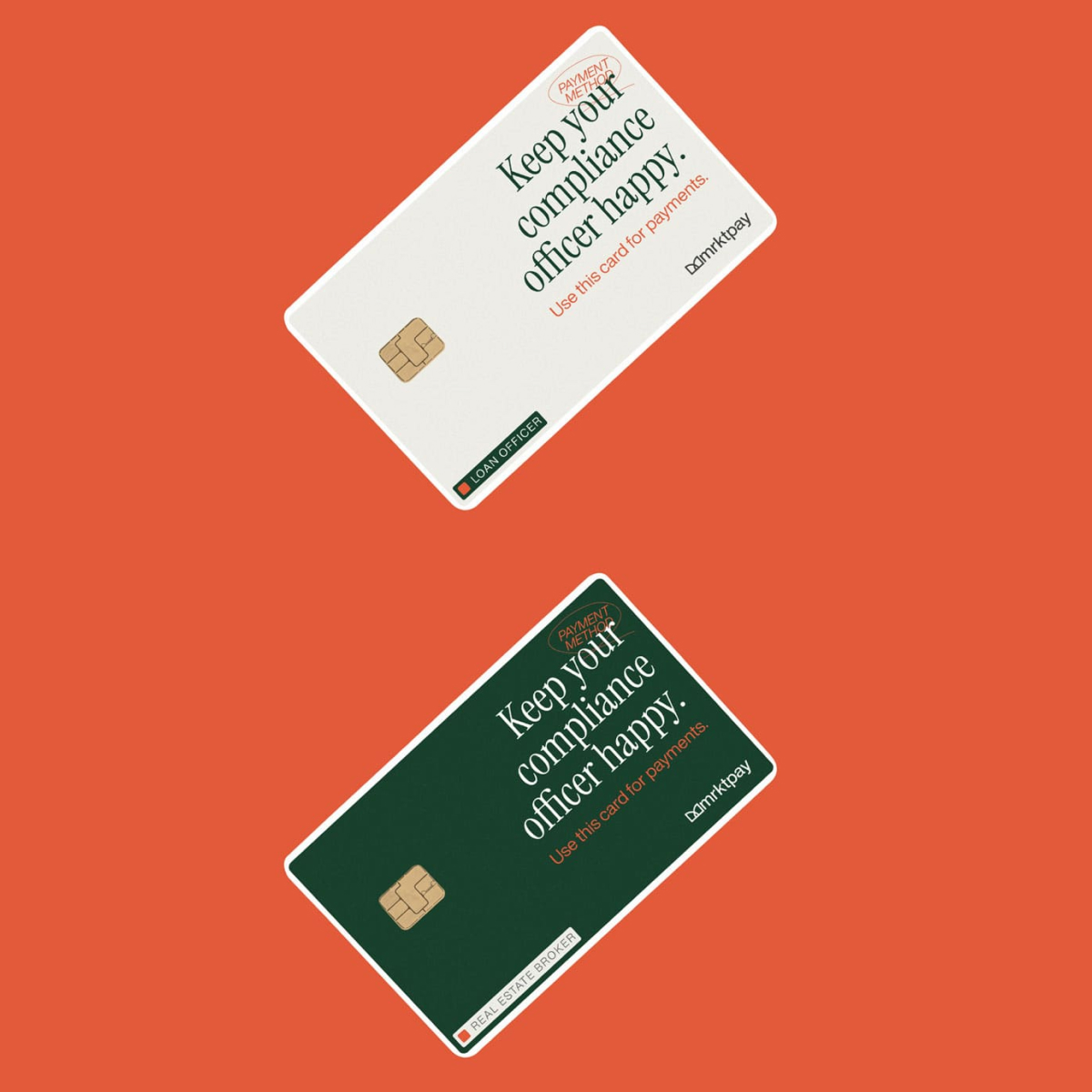
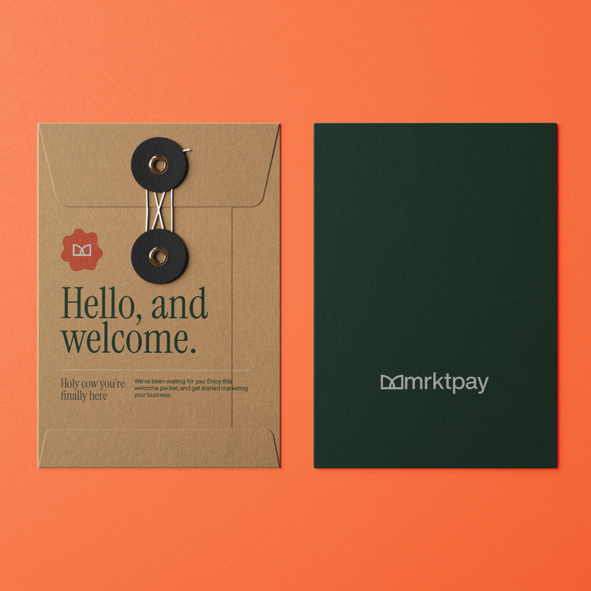
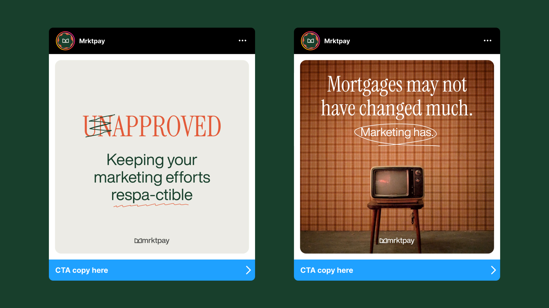
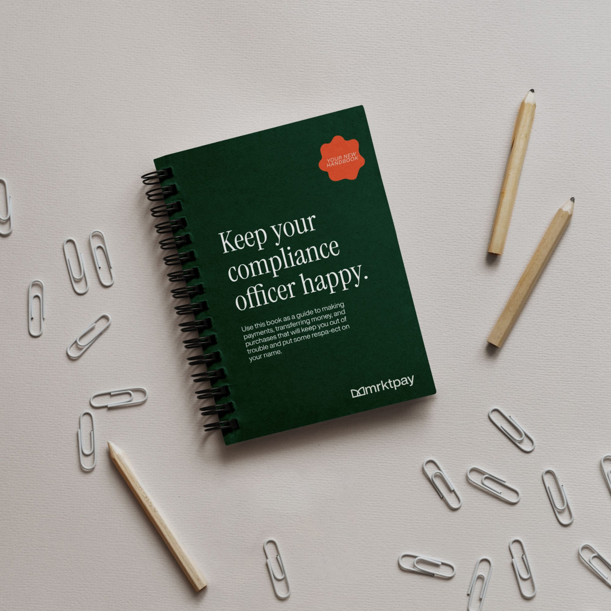
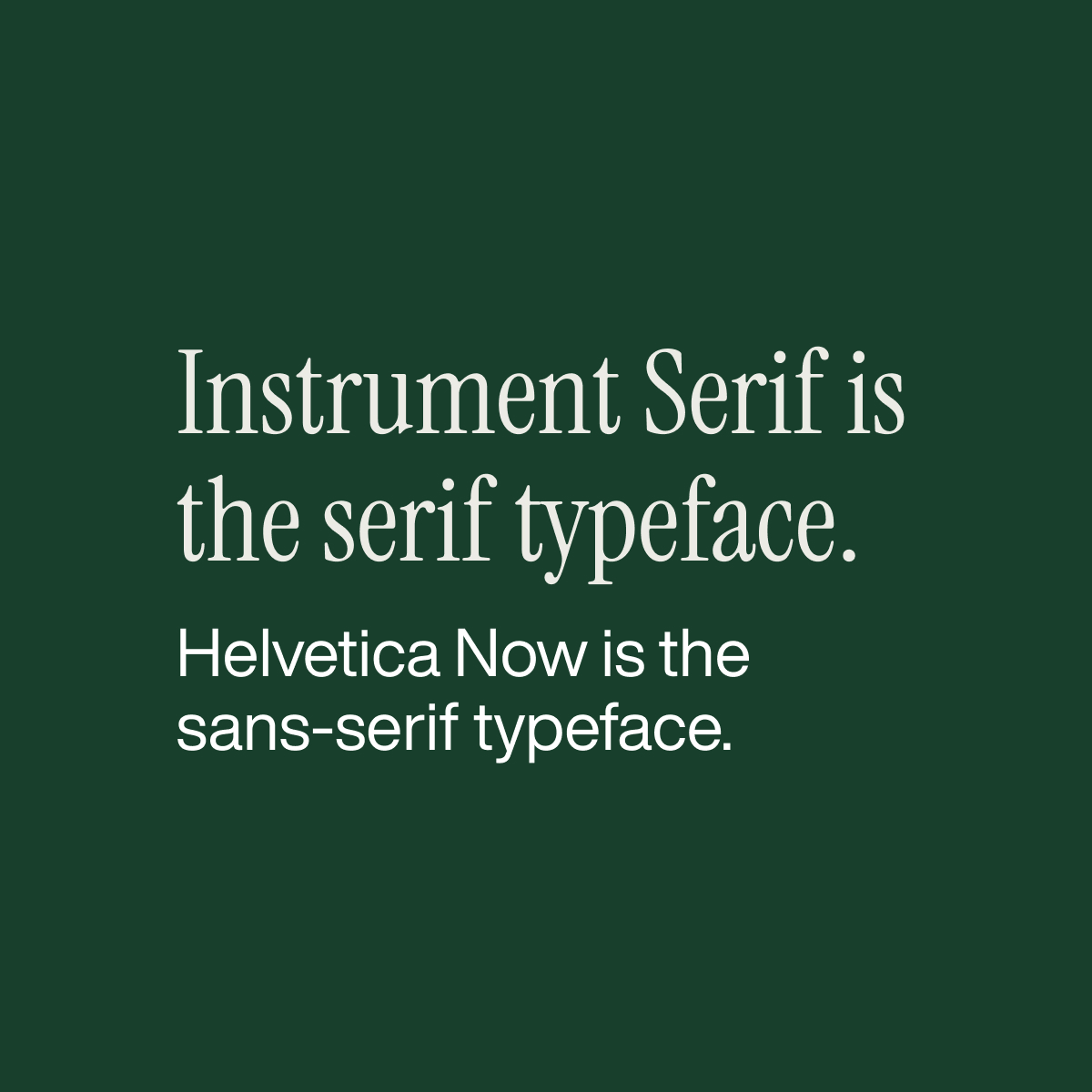
The typographic system was intentionally designed to evoke the tone of a bygone era in advertising. Drawing inspiration from classic campaigns by Apple, Volkswagen, and other corporate brands, the pairing of a vintage-inspired serif with Helvetica references a time when advertising was more restrained, direct, and concept-driven.
This approach serves as more than a stylistic choice. It is a conceptual one. Real estate and mortgage industries still operate on processes that can feel outdated and rigid, often lagging behind more modern digital experiences. By referencing this older visual language, the design creates a subtle tension, applying a familiar, almost nostalgic aesthetic to a contemporary product.
The result is a system that feels intentional and self-aware. It acknowledges the legacy and inertia of the industry while positioning Mrktpay as a more thoughtful, modern layer on top of it, bridging the gap between established practices and evolving expectations.
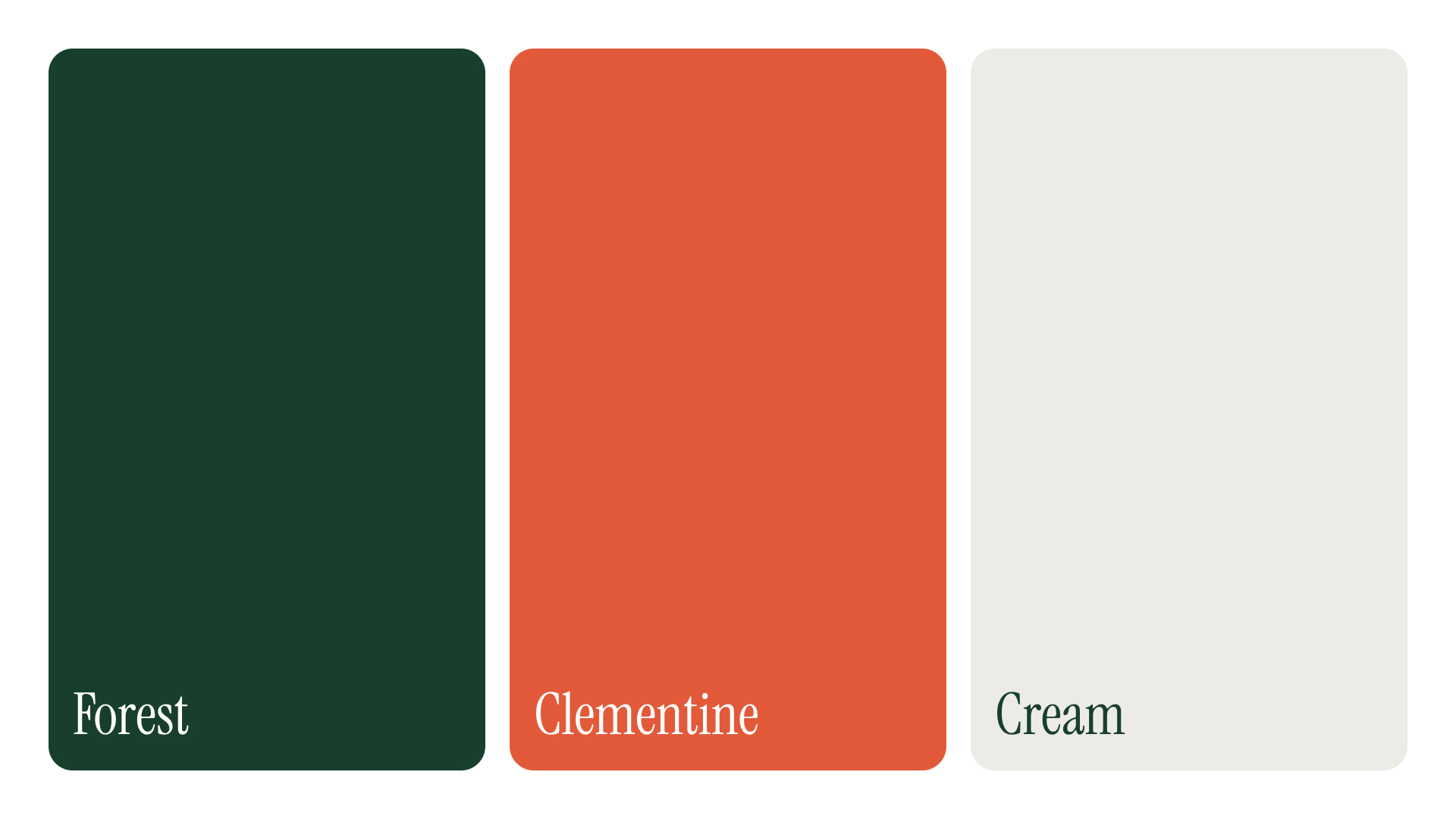
The color palette follows a similarly intentional approach, balancing restraint with subtle character. Rather than relying on overly saturated or contemporary digital color trends, the system leans into a more muted, controlled range, drawing from the tonal qualities often found in mid-century advertising and print.
Off-whites, soft neutrals, and slightly desaturated hues create a grounded foundation, allowing typography and layout to carry the primary voice. These tones feel familiar and understated, reinforcing the reference to legacy systems and traditional processes within real estate and mortgage workflows.
Accent colors are used sparingly and with purpose. When introduced, they provide moments of contrast and emphasis without overwhelming the composition, mirroring the disciplined use of color in older advertising where every element had to justify its presence.
This palette does more than establish a visual style; it reinforces the concept. It reflects an industry rooted in legacy while creating space for a more modern, refined experience. The result is a system that feels calm, deliberate, and confident, avoiding trend-driven aesthetics in favor of something more enduring and contextually relevant.