Open Casket is a found goods and handmade skincare shop. The work covers brand identity and creative direction across packaging, print, photography, and environmental applications. The result is a brand that knows exactly who it is talking to and does not waste a word getting there.
Name and Mark
The name Open Casket is intentionally arresting. It earns a second look, and on that second look it reframes itself: not morbid, but about preservation. What survives. What is worth holding onto.
The coffin mark carries that idea into a symbol. The OC monogram sits inside it, making the icon do double duty as both a brand mark and a letterform. It scales cleanly to a hang tag eyelet or an embossed surface.
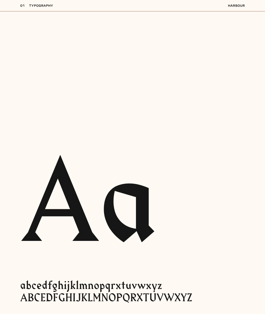
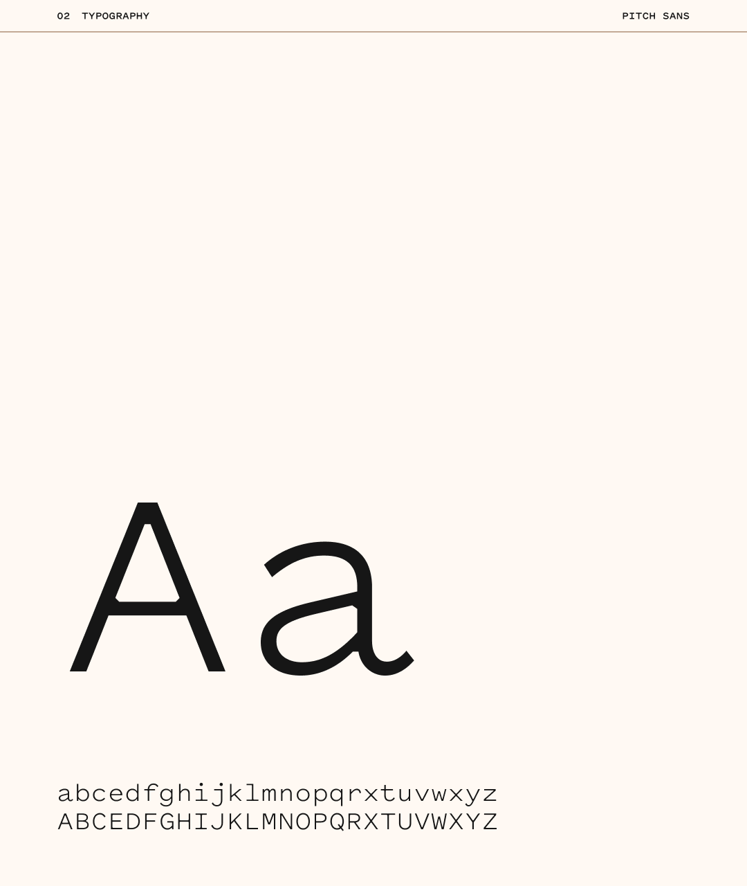
Color and Type
The palette centers on a warm cognac against near-black. The combination reads as premium and tactile without tipping into luxury brand territory. It photographs well on kraft paper, fabric, and skin.
The blackletter wordmark carries weight and character without feeling like a costume. Paired with a clean, spaced sans for secondary text, the hierarchy is clear and the contrast does the heavy lifting.
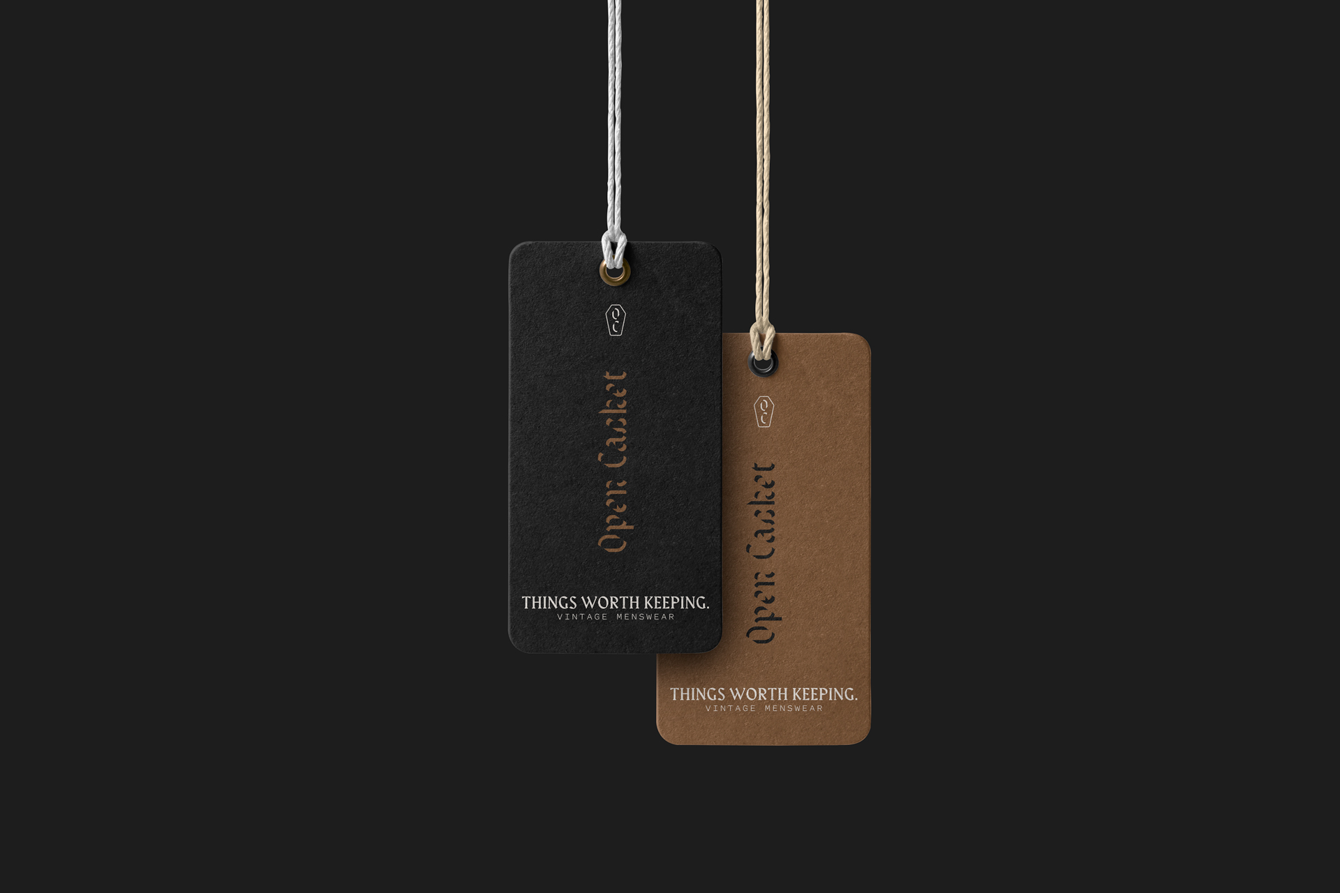
Hang Tags
The hang tags carry the full brand system in a small format. The dark variant uses the coffin mark, the vertical wordmark, and the tagline. The gold variant uses the same structure on the cognac ground.
Together they give the brand two voices in the same language: one heavier, one warmer. Both work depending on what they are attached to.
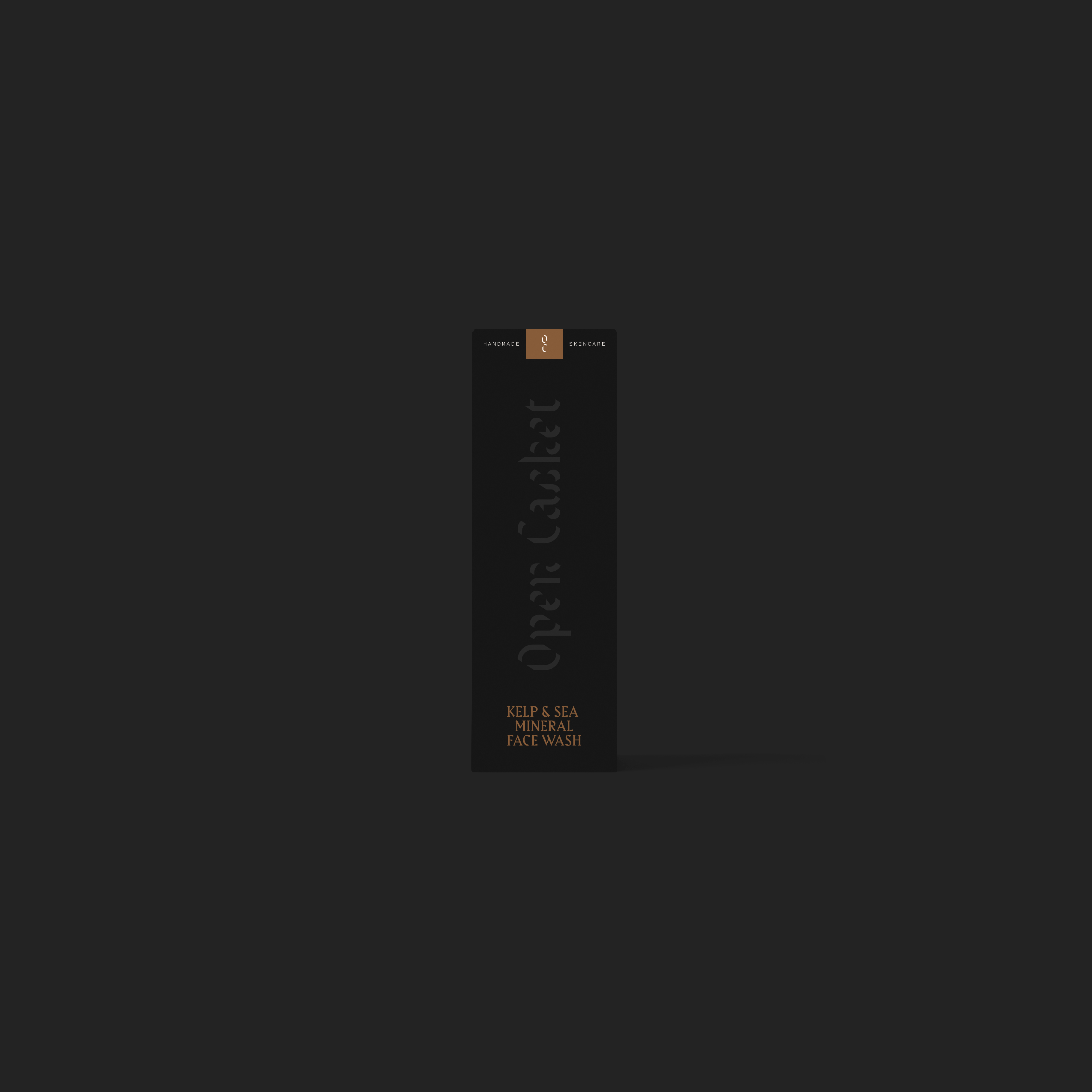
Product Packaging
The skincare packaging uses a matte black tube with the wordmark running vertically. Product names like “Skin Defense” and “Kelp & Sea Mineral Face Wash” are set in a small spaced sans, keeping the label honest and functional.
Nothing on the packaging oversells. The ingredients and the name do the work.
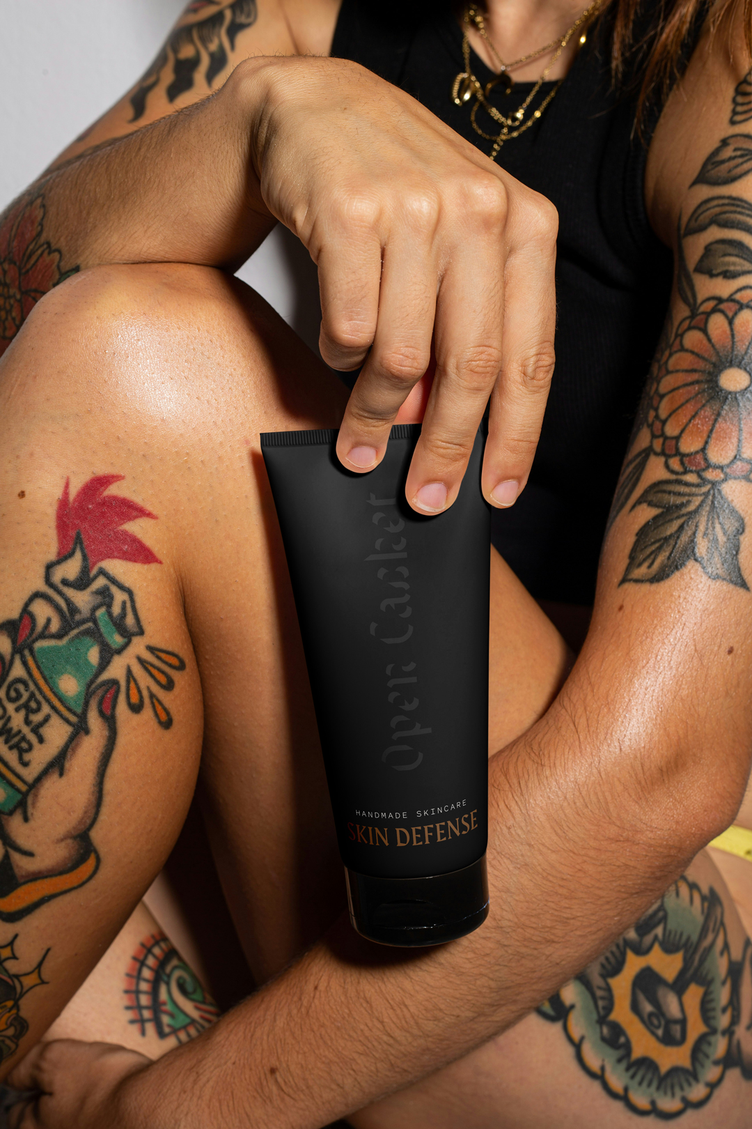
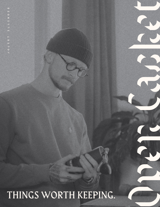
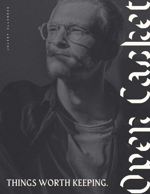
Photography
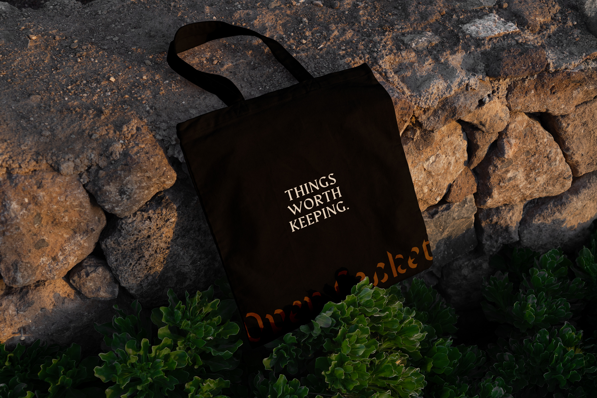
The campaign photography uses black and white portraiture with the vertical wordmark overlaid. The subjects are unglamorous in the best sense: real people, real texture, real hands. The brand does not perform. It just shows up.
The tote bag shot anchors the lifestyle side of the brand. Shot on raw stone with “Things Worth Keeping.” printed clean across the front, it says everything without saying much.
Tone
The campaign does not explain itself. It does not list ingredients or describe the sourcing process or ask you to feel good about your purchase. It trusts the customer to get it.
That restraint is intentional. The target customer has seen enough over-designed independent brands to know the difference between a brand with a point of view and one performing a point of view. Open Casket is the former.
The best brands do not need to convince you of anything. Open Casket knows what it is, who it is for, and what it stands for. A name that stops you. A mark that holds up at any size. A tagline that ties two different product categories into one honest idea. That is the whole brief, met.