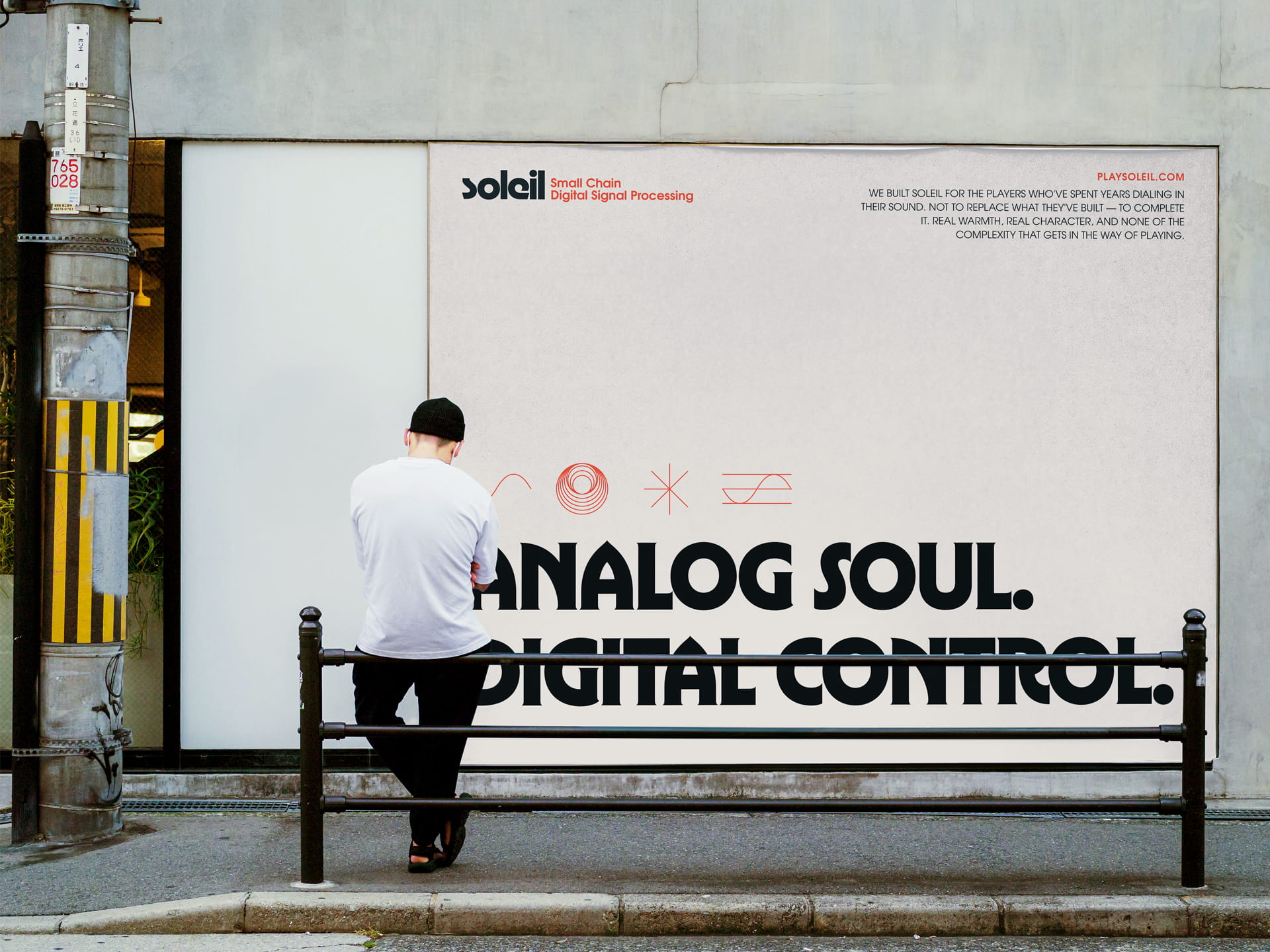
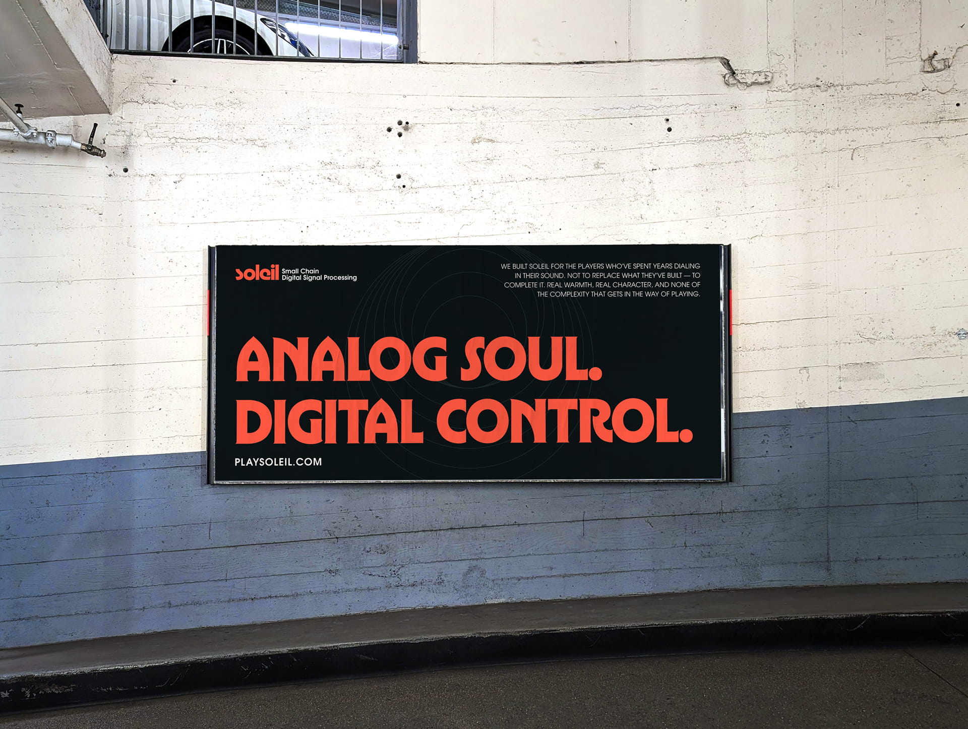
Soleil is a small chain DSP pedal built for players who already have their sound dialed in. Four FET-driven effects, one compact unit, and a preset system built on mobile. The work covers brand identity, hardware design direction, icon system, and web design.
Logo and Type
The “soleil” wordmark uses a rounded, slightly retro letterform that carries personality without being gimmicky. All lowercase, it reads as confident and direct. The name, French for sun, anchors the warmth metaphor at the core of the brand.
The tagline “Small Chain Digital Signal Processing” functions as a technical descriptor paired with the mark in formal applications.
Color
The palette is built on a high-contrast pairing of near-black and a warm red-orange. The accent color runs across the hardware itself, the icon system, and the web experience, creating continuity from the physical product to the digital touchpoints.
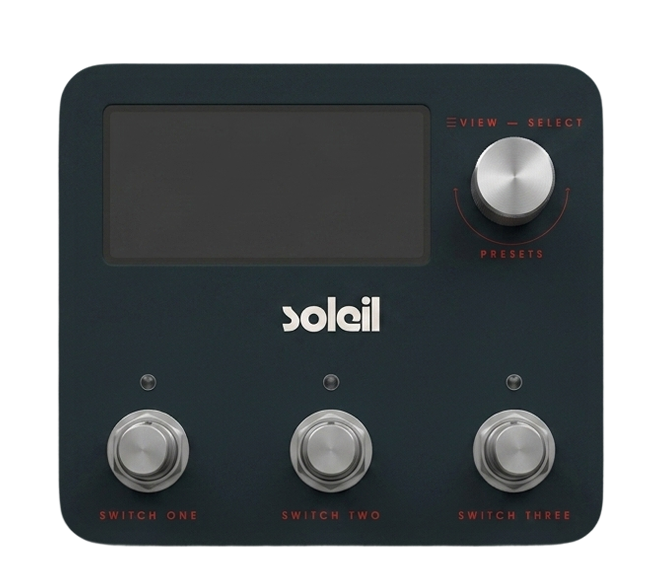
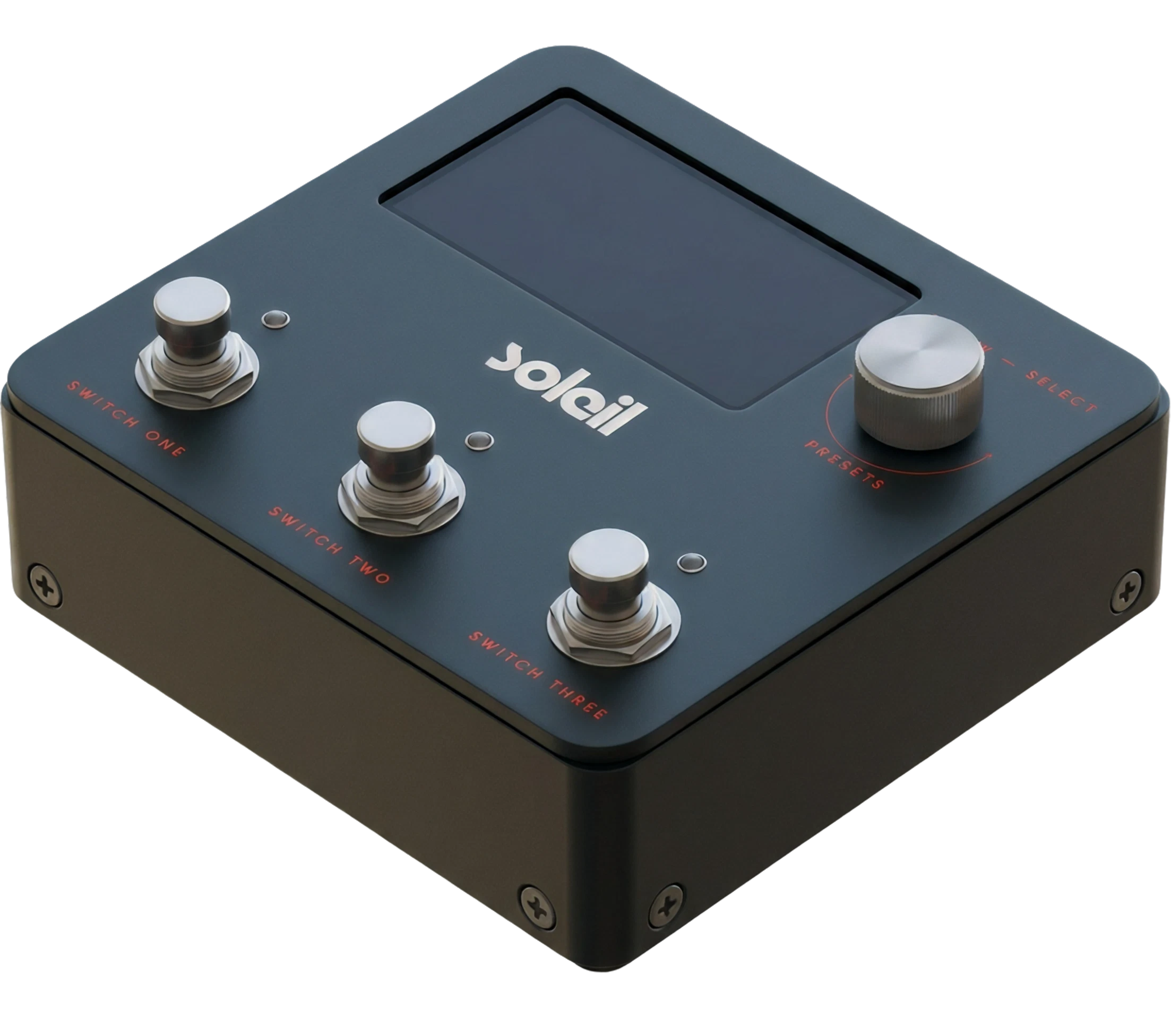
On the pedal, the red appears as the arc indicator on the select knob and as the switch labels, grounding the brand color in the product.
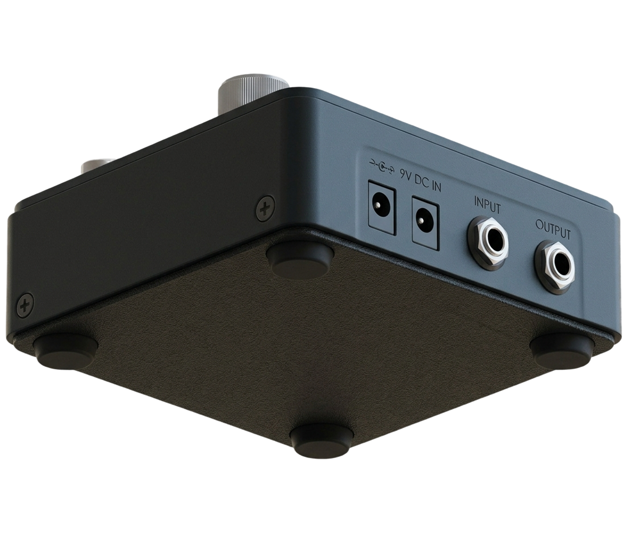
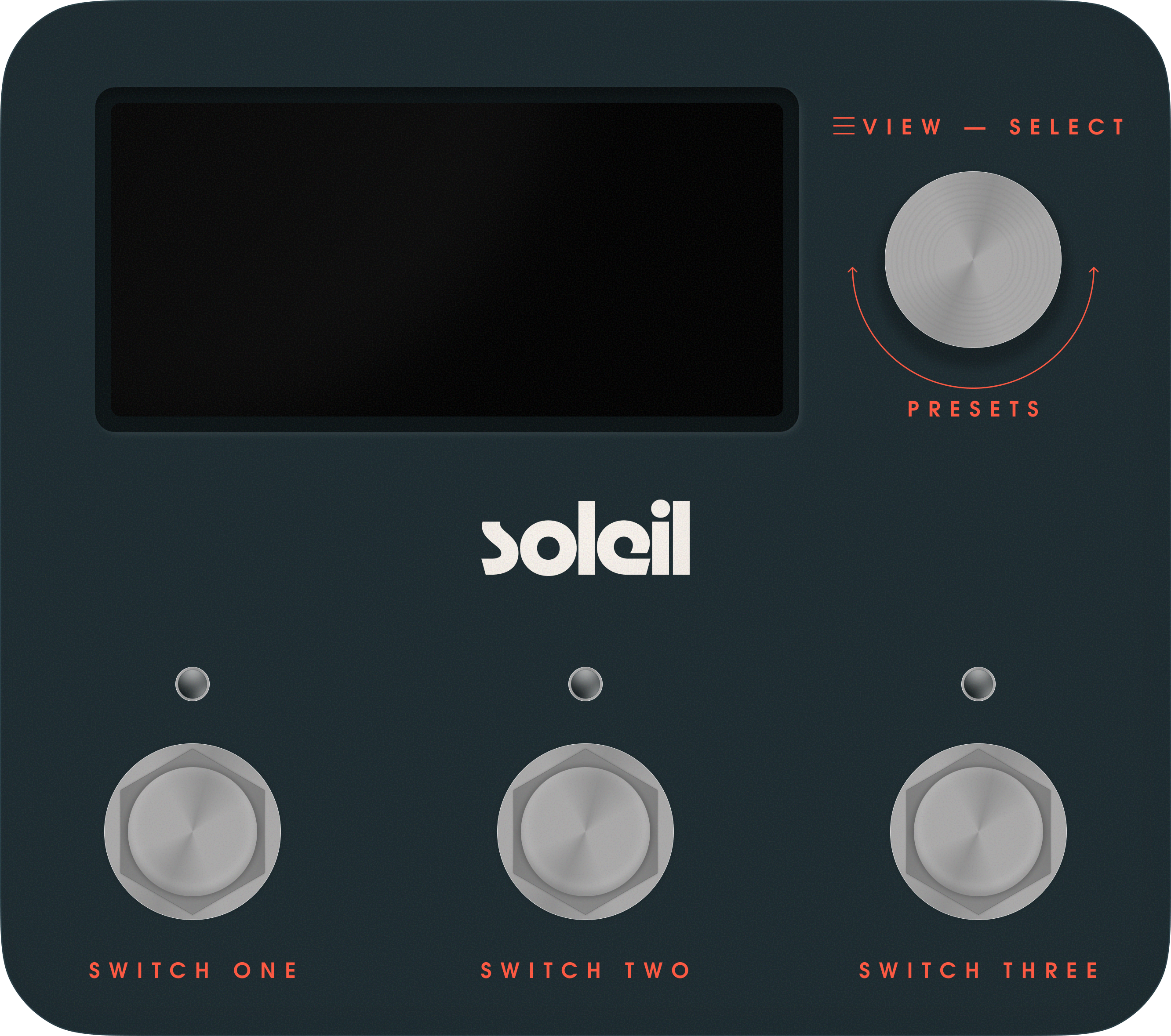
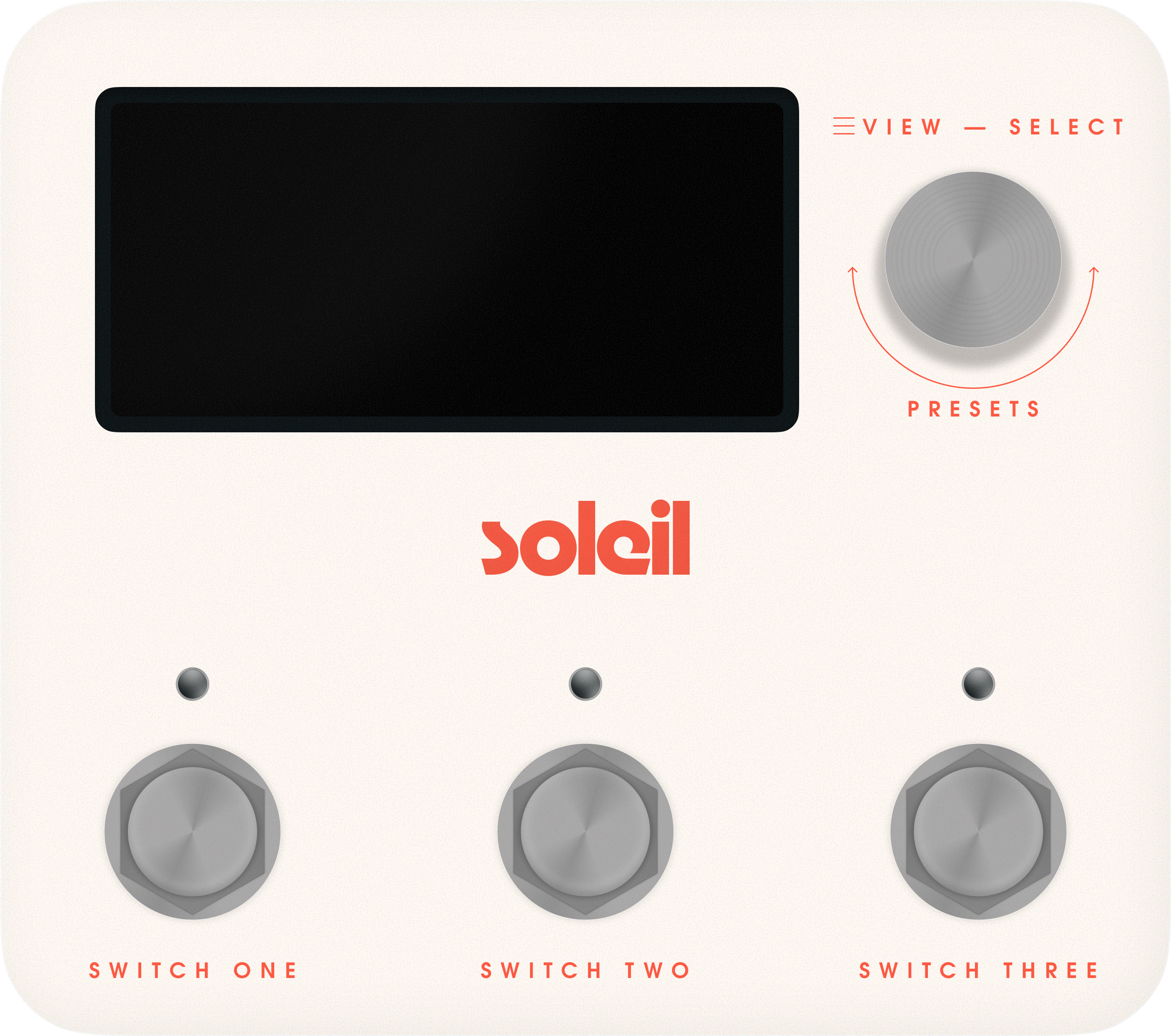
The Pedal
The Soleil enclosure uses a slate teal finish with silver hardware. The layout is intentional: a wide display and select knob on top, three footswitches across the bottom, each mapping directly to one of the three toggleable effects in the chain.
The fourth effect, compression, runs always-on in the background. No switch needed. No decision to make mid-set.
Controls
The single select knob navigates and loads presets. The display shows what is active. Three switches toggle effects on or off. That is the entire interface on the floor, by design.
The complexity lives in the mobile app, where players build their chain before the show. On the board, Soleil gets out of the way.
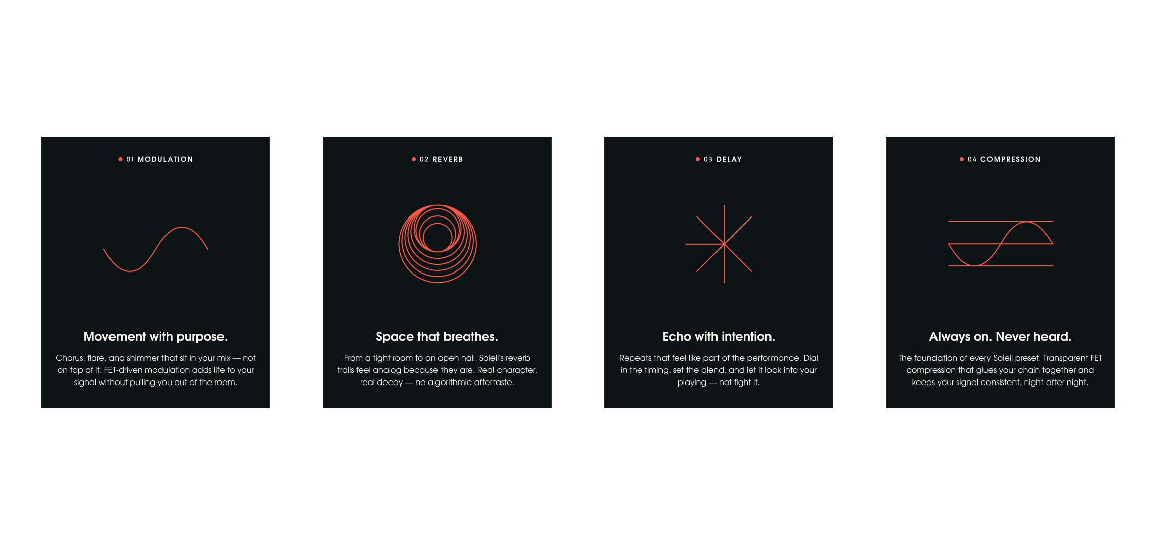
Icon System
Each of the four effect types has a dedicated icon built from a consistent visual language: thin geometric lines, circular forms, and a uniform stroke weight. The set reads as a family at any size.
Modulation uses a loose sine curve. Reverb uses concentric arcs anchored to a baseline. Delay uses a full circle paired with a half circle ghost. Compression uses a circle sandwiched between two horizontal bars.
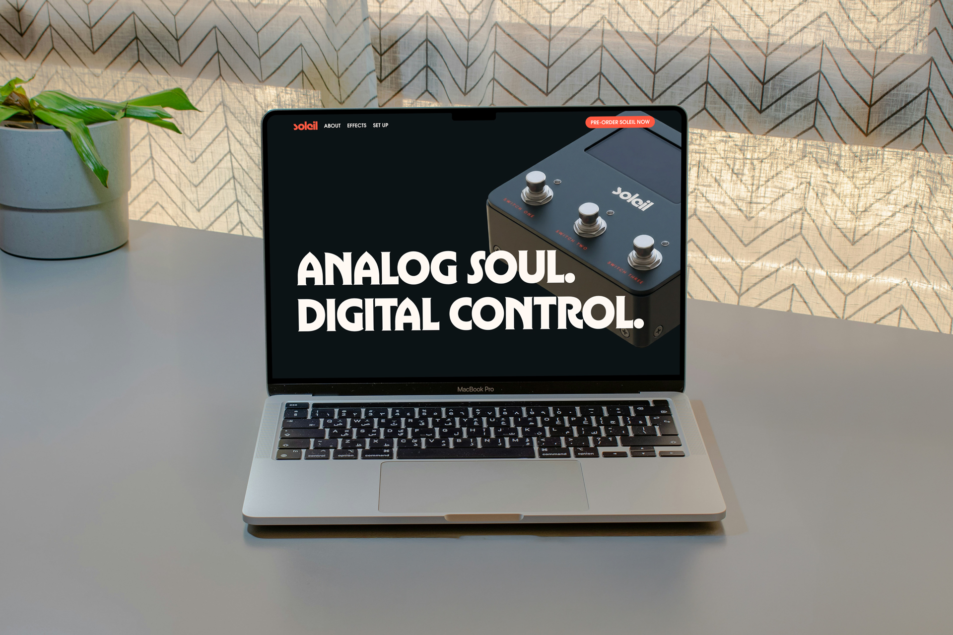
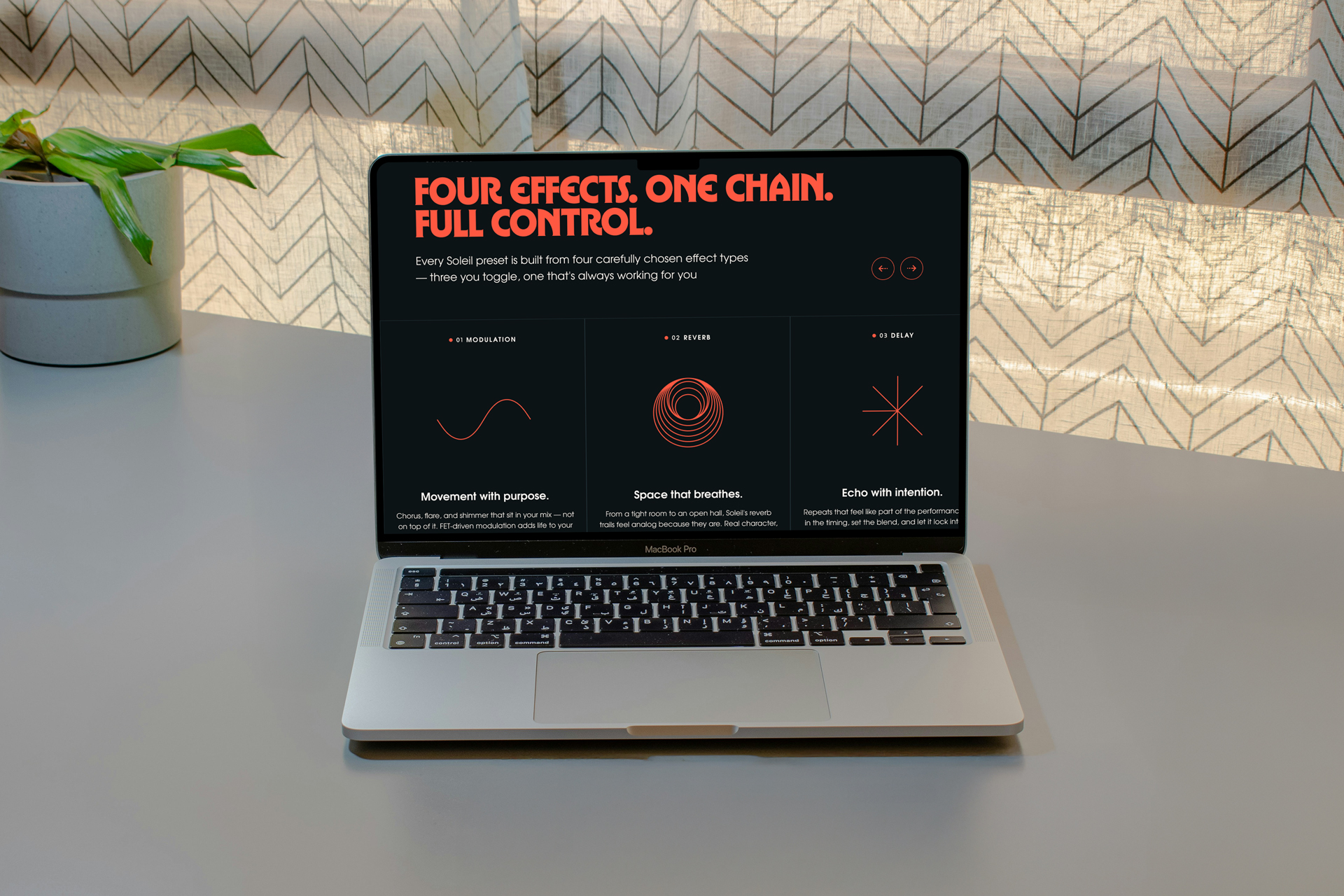
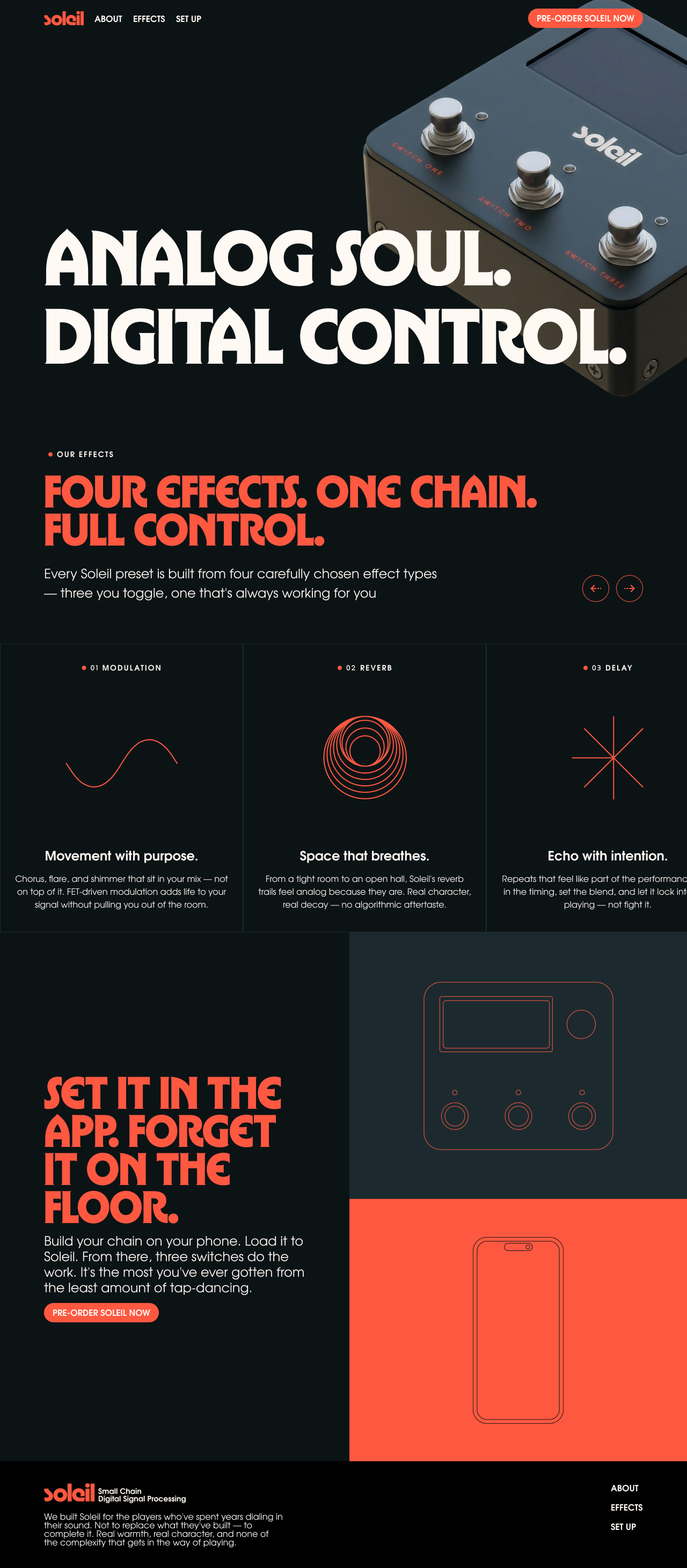
Landing Page
The pre-launch landing page is structured around three ideas: what it is, how it works, and why it fits your rig. The hero leads with the product and the headline. The effects section breaks down the chain. The app section explains the workflow.
The page uses full-bleed dark sections with large red type to carry the brand voice through the scroll experience.
Copy Direction
The tone is direct and player-first. It does not explain what DSP is. It does not compete with modeling. It speaks to the guitarist who already has their sound and just wants more of it.
Headlines like “Set it in the app. Forget it on the floor.” and “The missing piece. Not a replacement.” do the positioning work without over-explaining the technology.
The best piece of gear on your board is the one you never have to think about. Every decision in the Soleil brand, from the hardware layout to the web copy, points toward the same idea: build your sound, load it, play. The product gets out of the way. That is the whole point.